This is color-forward contemporary eclectic — sometimes called dopamine decor, sometimes soft maximalism, sometimes just “a person actually lives here.” The point is to use color as a primary design element, not garnish.
It’s for you if:
– You’re tired of greige and Instagram-beige rentals
– You want personality without going full maximalist clutter
– You’re willing to commit to a few real choices instead of nibbling around the edges with small accessories
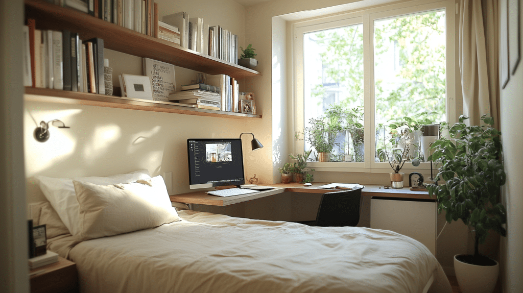
It works in studios, two-bedrooms, and everywhere in between. Compact spaces actually benefit, because repeating two or three colors across rooms makes a small apartment feel connected and bigger, not smaller.
Skill level: Beginner for styling and swapping textiles. Intermediate if you’re painting walls, ceilings, or hanging peel-and-stick wallpaper.
Time: A weekend for a textile and accessory refresh. One to three weeks if you’re painting or replacing a sofa, rug, or curtains.
Cost: A light refresh runs roughly $100–$400 for pillow covers, art prints, a few ceramics, and plant pots. A full room redo with a large rug, curtains, a lamp or two, and a standout chair lands closer to $500–$2,500+ depending on whether you’re shopping IKEA or Anthropologie.
The Color Palette: Pick a Lane
This is where most colorful rooms fall apart. Too many colors with no relationship to each other reads as chaos, not eclecticism.
Build your palette like this:
– One calm base color — warm white, soft beige, light gray, or a muted putty
– One or two dominant accent colors — the stars of the room
– One supporting color — used in smaller doses to bridge things
Combinations I’ve actually used or watched work well:
– Cherry red + lilac (with warm white walls and natural wood)
– Plum + sky blue (my current living room, very forgiving)
– Cobalt + mustard + dusty pink on a cream base
– Terracotta + olive + blush for something warmer and earthier
– Emerald + brass + soft cream if you want the room to feel a little grown-up
The trick is checking undertones. Warm reds fight cool grays. A dusty pink with yellow in it will clash with a baby blue that has green in it. Hold paint chips and fabric swatches next to each other in daylight. If something looks “off” and you can’t say why, it’s almost always an undertone problem.
Hero Pieces: Where to Spend Color
If you only do small accents, the room will look beige with confetti on it. You need a few pieces doing real work.
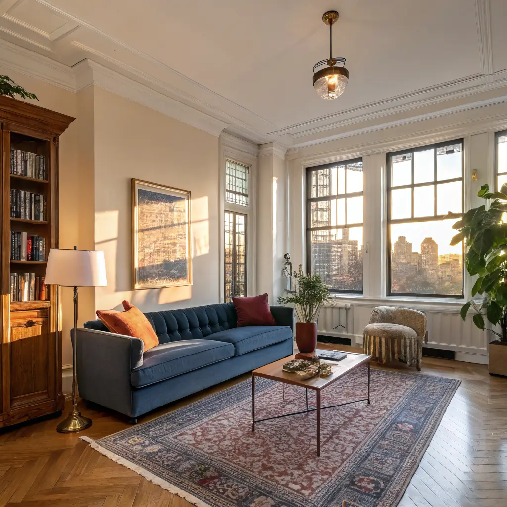
The rug. This is the single highest-impact purchase. A solid-color 8×10 or 9×12 in a saturated tone grounds the whole room. I’d rather have a great rug and a thrifted sofa than a designer sofa floating on bare floor.
The sofa or accent chair. A velvet sofa in forest green or a linen one in rust changes the whole conversation. If you can’t replace the sofa, a single accent chair in a strong color does most of the same work for a fraction of the price.
A painted wall, ceiling, or color-drenched nook. Color-drenching means painting the walls, trim, and ceiling all the same hue. It sounds intense and looks incredible — especially in a small entry, a reading corner, or a powder room. Renters: peel-and-stick wallpaper or a removable paint primer gives you most of this effect without forfeiting your deposit.
A patterned focal surface. In kitchens, a checkerboard backsplash (peel-and-stick tile works) or a painted cabinet color delivers serious impact for under $200.
Supporting Cast
Once the heavy hitters are in place:
– Curtains that go floor-to-ceiling in a strong color or print. Hang the rod 4–6 inches above the window frame, not on it. This is the cheapest way to make a room look taller.
– Throw pillows in two or three coordinated colors, never as the only colorful element
– Art that repeats your palette colors — this is what stitches the room together
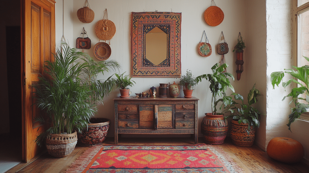
– Plants. A 4–5 foot fiddle leaf, a trailing pothos on a high shelf, a snake plant in a colored ceramic pot. Greenery softens bright color the way a squeeze of lemon balances a sauce.
– Ceramics, books, candles, trays — small objects that echo the palette in smaller doses
– Sculptural lighting. A mushroom lamp, a paper pendant, a colored glass sconce. Lighting is where I’d splurge after the rug.
Putting It Together: The Order That Works
I’ve redone my own living room three times. This order saves the most regret:
1. Lock in the neutral backdrop — paint, flooring, or large rug
2. Place the largest color statement — sofa, painted wall, or curtains
3. Layer a second color through artwork, pillows, or an accent chair
4. Add one pattern — checks, florals, or a geometric — sharing at least one color with the rest of the room
5. Finish with plants, books, ceramics, and lamps that repeat the palette in smaller doses
6. Carry one or two colors into the next room so the apartment reads as one place, not five
Test the lighting before you commit. A color that sings in afternoon sun can turn muddy under a single overhead bulb at night. I always live with a paint sample or fabric swatch for at least 48 hours and look at it morning, evening, and lamp-only.
Where to Spend, Where to Save
Spend on:
– The rug. A bad rug ruins a good room. Aim for wool or a dense flatweave.
– The sofa, if you’re buying new. You sit on it daily for years.
– Lighting. Cheap lamps look cheap.
Save on:
– Art. Etsy prints, vintage finds, your own framed photos, postcards in nice frames
– Pillow covers (not inserts). Cover your existing pillows seasonally for $15 each instead of buying new
– Ceramics and vases. Thrift stores and estate sales are full of them
– Plant pots. Spray paint a $4 terracotta pot in your accent color
My favorite piece in my apartment is a chartreuse ceramic lamp I paid $12 for at a church rummage sale. The shade was hideous; I replaced it with an $18 linen drum from Amazon. Total: $30 for a lamp that looks like it cost $200.
Common Mistakes
Things I’ve personally gotten wrong:
– Too many unrelated colors. Three to four colors with a clear relationship beats eight that don’t talk to each other.
– Only using tiny accents. A few colorful candles on a beige coffee table won’t carry a room. Go bigger.
– Ignoring undertones. Warm + cool can work, but only when it’s intentional. Random mixing reads as accidental.
– Filling every surface. Negative space — the empty parts of a wall or shelf — is what lets your color choices breathe. A bookshelf packed corner-to-corner just looks loud.
– Ornate furniture in small rooms. Clean-lined pieces in bold colors look modern. Carved, fussy pieces in bold colors look like a haunted Victorian doll house.
– Skipping the lighting layer. One overhead bulb kills color. You need at least two lamps and ideally a third light source per room.
Renter-Friendly Swaps
If you can’t paint:
– Peel-and-stick wallpaper on one wall or inside bookshelf backs
– Removable peel-and-stick tile for kitchen backsplashes
– Tension rod curtains in a saturated color across a full wall, not just the window — this fakes a painted wall for around $60
– Large framed textile (a vintage scarf, a tapestry) in place of a painted statement
Seasonal Refreshes Without Repainting
Swap these twice a year and the apartment feels new:
– Pillow covers — terracotta and rust in fall, sky blue and coral in spring
– Throws — chunky knit in winter, washed linen in summer
– Flowers and branches on the dining table
– A single new art print rotated through the same frame
Mixing Colorful with Other Styles
This look plays well with others:
– + Boho: Layer woven jute, rattan, macramé, and lots of plants over your color palette
– + Coastal: Lean into sky blue, sandy beige, pale washed wood, and one saturated accent like coral or deep navy
– + Modern: Keep furniture clean-lined and minimal, then let one saturated piece — a tomato red sofa, an electric blue chair — do all the talking
The Budget Escalation Path
If you’re starting from a beige rental and want to build up over time, this is the order I’d go:
1. Art and textiles (pillow covers, a throw, prints)
2. A real rug
3. Curtains, hung high and wide
4. A lamp or two with character
5. An accent chair or repainted/reupholstered piece
6. Paint or peel-and-stick wallpaper on one wall
7. Sofa, if it still needs replacing
You can stop at any rung and the apartment will look better than where you started. The whole point of doing color well is that it doesn’t require buying everything at once — it requires choosing carefully when you do buy.
That’s the part nobody tells you. Restraint is what makes a colorful room look intentional. The willingness to walk past the mustard pillow because it doesn’t actually fit your palette is the same instinct that makes the room work.
Colorful apartment decor works when you stop trying to prove something and start building a space you actually want to come home to. My rental living room has a $40 thrifted rug, a hand-me-down yellow chair, and a pothos I have nearly killed three times, and it feels like mine because every piece has a reason for being there. Pick three colors, add one plant, and let the rest accumulate slowly.
Conclusion
The colorful apartment decor that worked for my friend was not a rainbow. It was a studio with white walls, a single mustard yellow sofa, a teal rug, and a collection of ceramic vases in shades of coral and rust. The colors did not match, but they talked to each other, and the white walls gave them room to breathe. She said she had tried all-white once and felt like she was living in a hospital. Now she feels like she lives in a garden.