What “Colorful” Actually Means (And Who This Is For)
A colorful kitchen sounds fun until you’re standing in the paint aisle holding three swatches that all looked great online and now look like a fight. I’ve been there. My first attempt at “adding color” involved a coral KitchenAid, a teal runner, a yellow tea towel set, and zero plan — the room read like a toy box. The second attempt worked, because I stopped collecting colored things and started designing around one.
Here’s how I’d do it now, whether you’ve got a weekend and $300 or a few months and a real budget.
Colorful doesn’t mean rainbow. The kitchens I keep saving on Pinterest have one hero color carrying the whole room, supported by wood, stone, and a single metal finish. That’s it. The chaos comes when people try to make every drawer pull a different mood.
This works for you if:
– You’re tired of the all-white kitchen and want the room to feel like yours
– You cook a lot and want a space that doesn’t feel clinical at 7am
– You’re renting and need reversible changes that still make a dent
– You’ve got an open-plan layout and want the kitchen zone to read as its own thing
The four directions I see working right now:
– Modern eclectic — saturated cabinets, patterned zellige or cement tile, mixed metals
– Shaker with color — classic doors in sage, navy, olive, or clay
– Scandi-plus-color — mostly oak and white with one strong accent (an island, a single wall)
– Playful retro — pastel Smeg appliances, checkerboard floor, milk-glass pendants
Pick one before you buy anything.
The Colors That Actually Hold Up
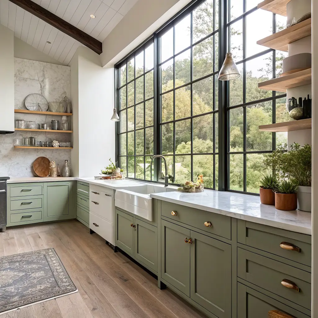
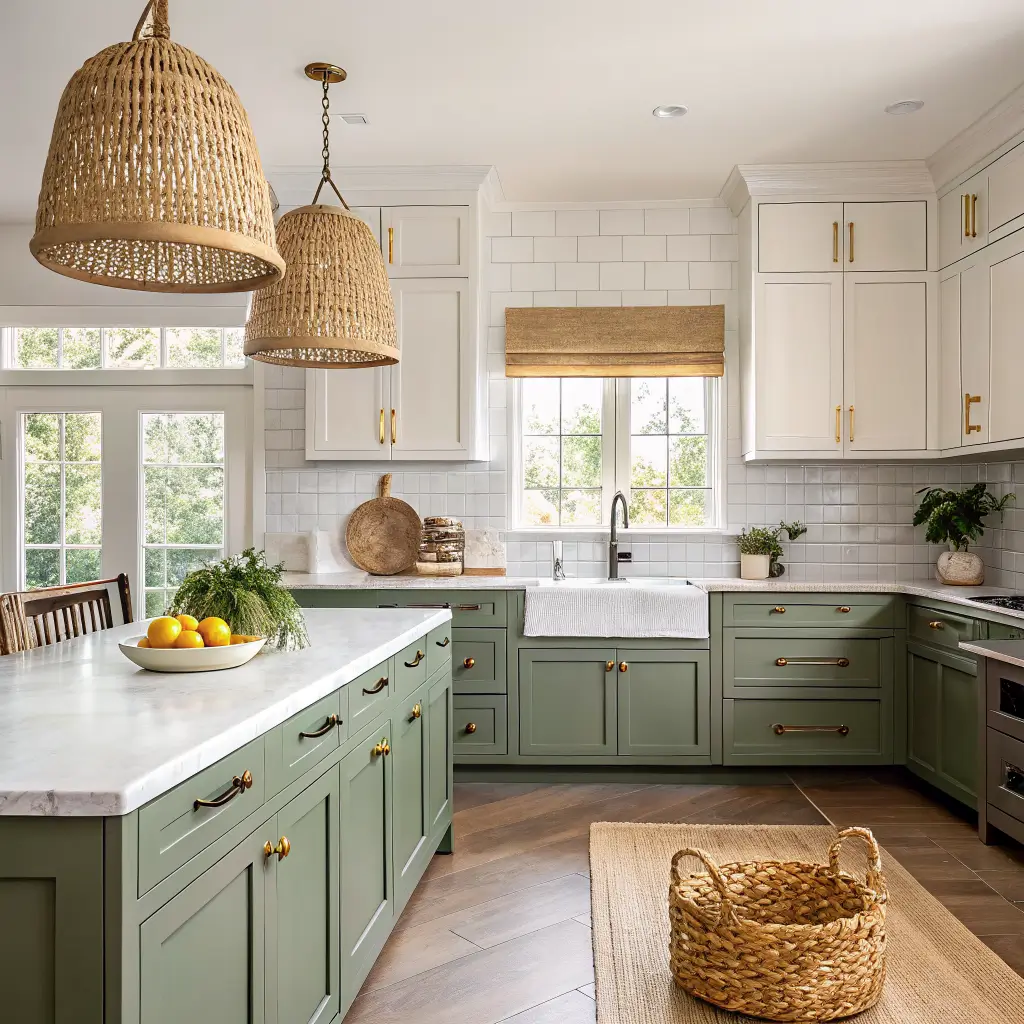
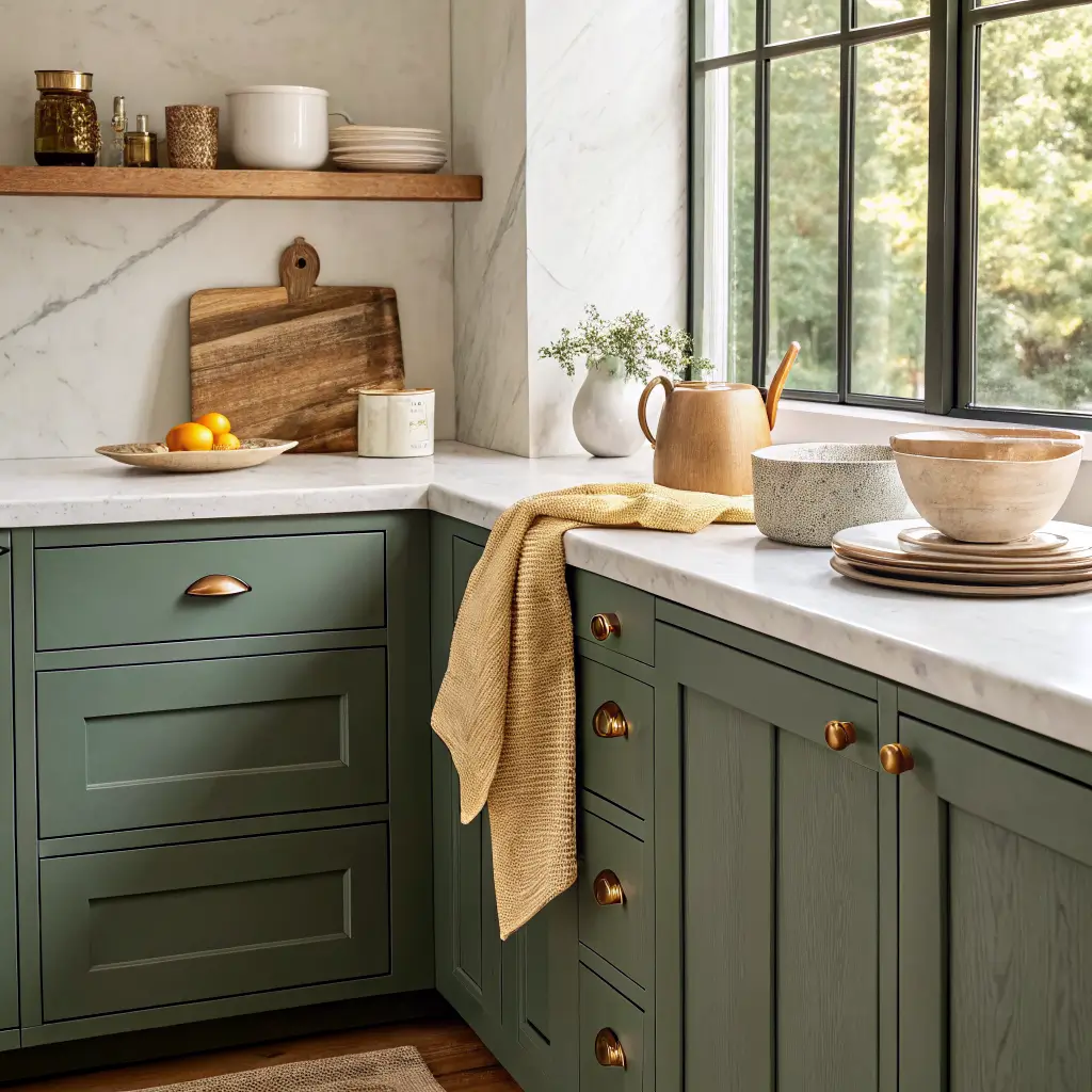
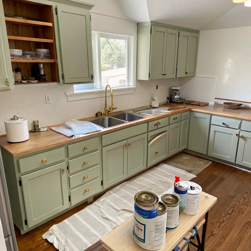
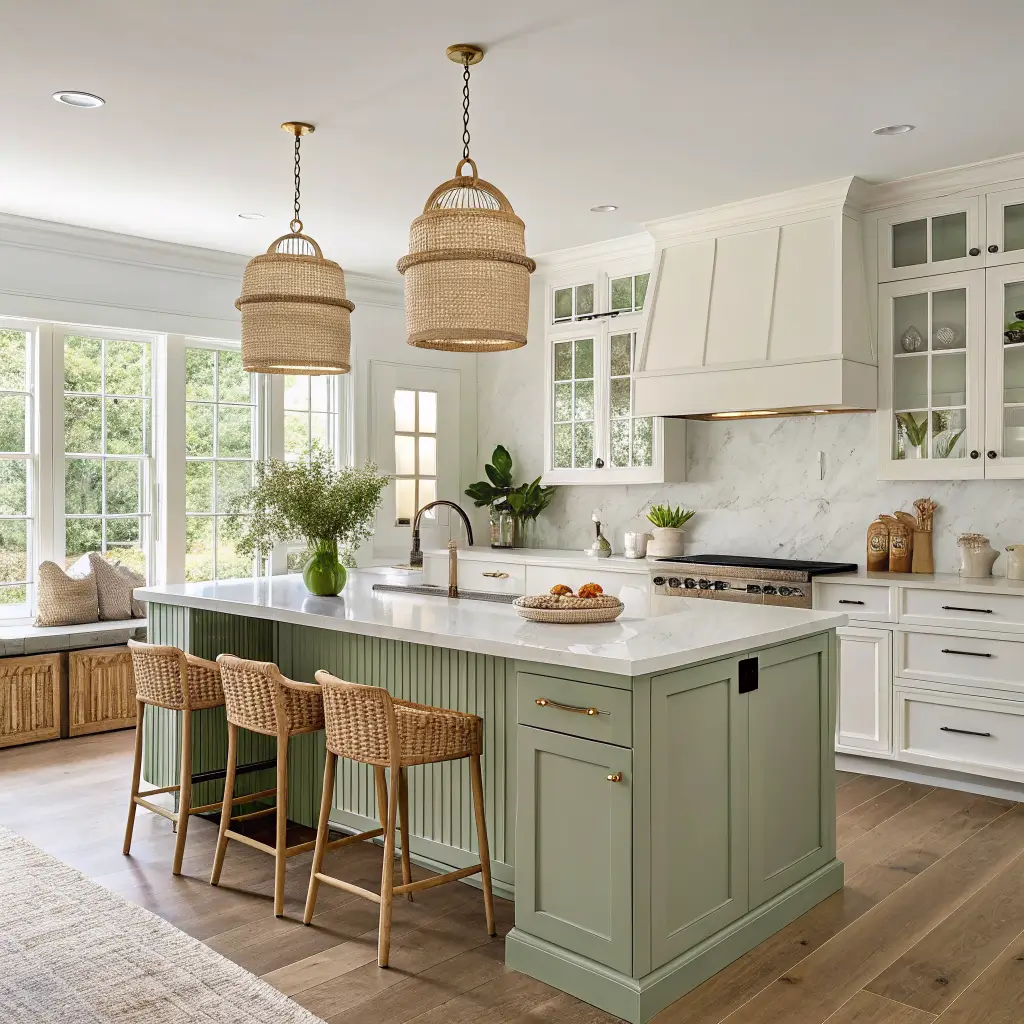
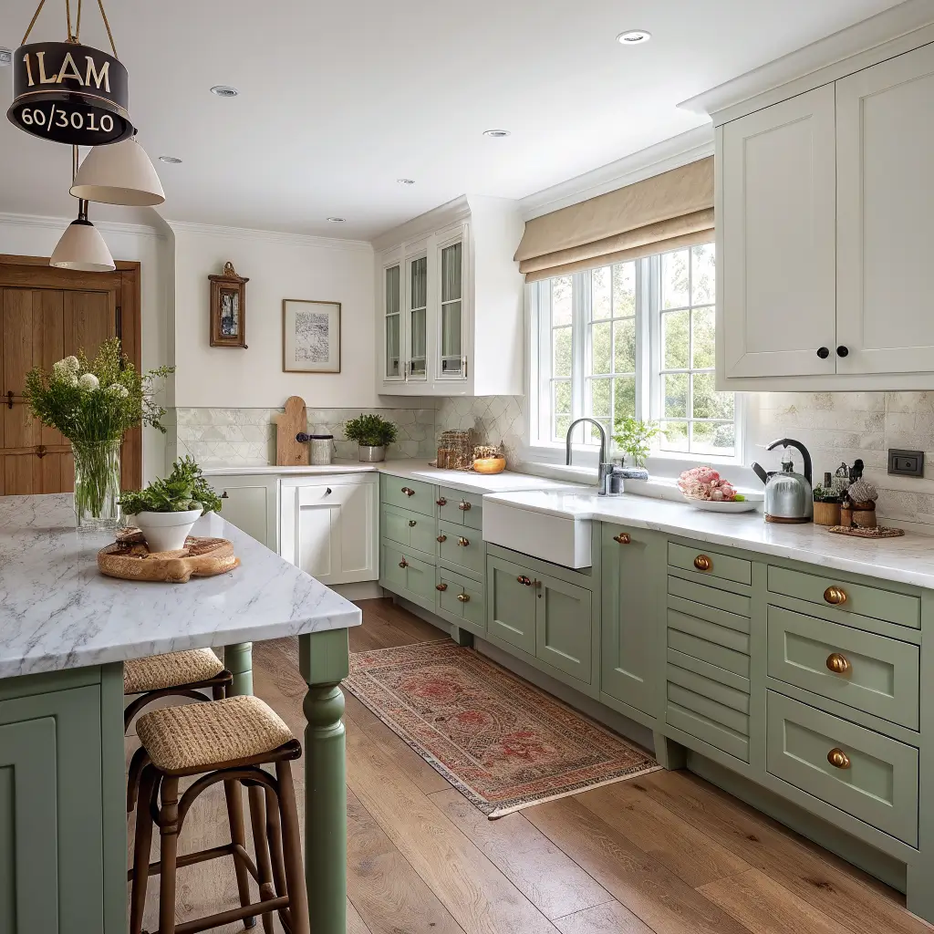
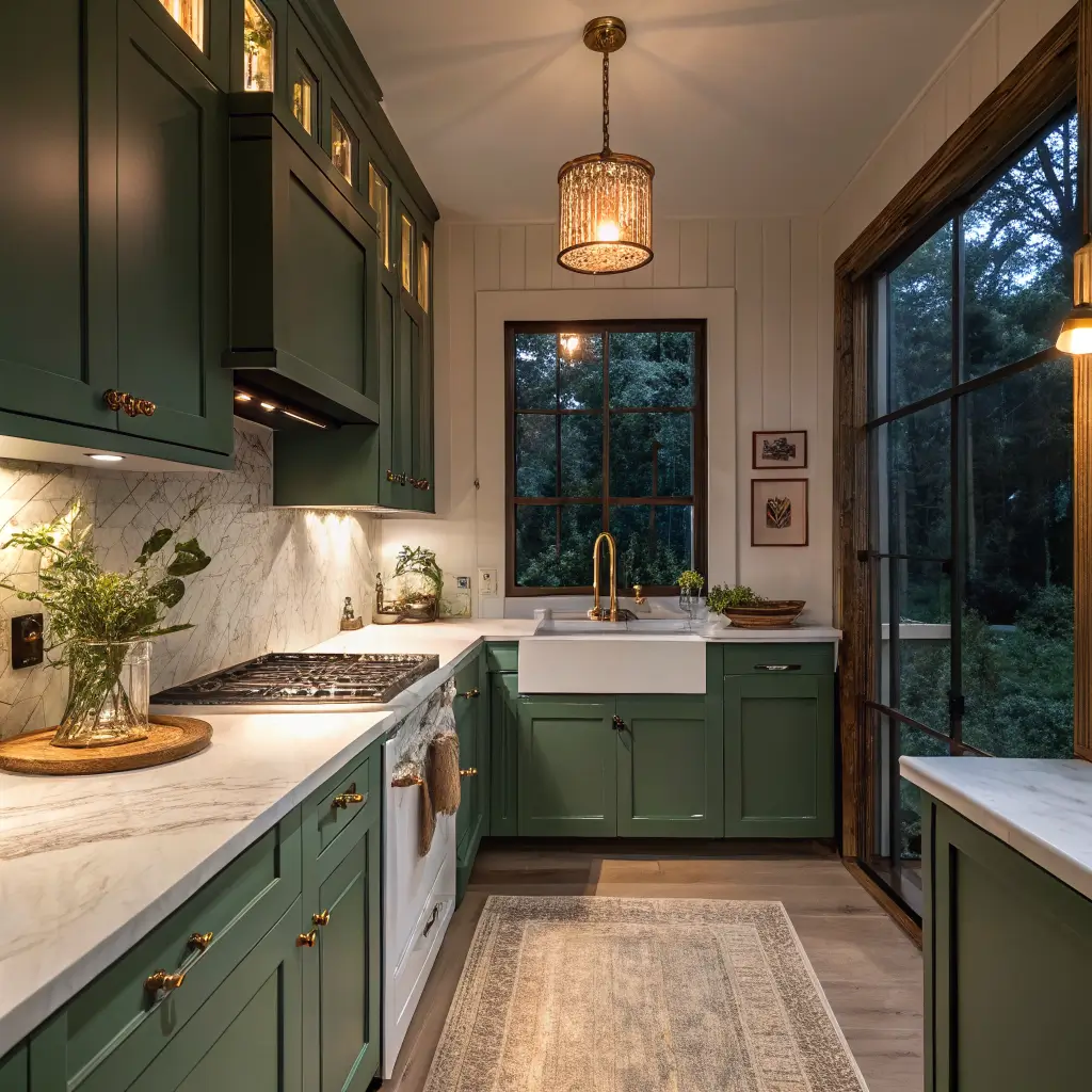
I’ll save you the trend list: greens win. Olive, sage, and forest green are the most forgiving colorful cabinet choice because they read as a neutral once they’re in. I painted my lower cabinets in a muddy sage two years ago and I still like them, which is the highest praise I give paint.
After green, in order of how often I see them aging well:
– Watery blues, teal, and deep navy — best on islands and lower cabinets
– Earthy terracotta, clay, warm taupe — gorgeous with brass and oak
– Buttery yellow and ochre — sunny without going Crayola
– Red, coral, pink, orange — better as accents (stools, art, a single appliance) than full cabinetry
The trick with any of these: look for paints with a gray or muddy undertone. Pure, clean pigments look great in the can and cartoonish on a wall. Farrow & Ball’s “Treron,” Benjamin Moore’s “Hunter Green,” Sherwin-Williams “Rosemary” — these all have that grayed-down quality that keeps them from screaming.
For the materials around your color, the safe bets are warm wood (butcherblock, oak shelves), veined marble or quartz, and brass or unlacquered brass hardware. Brass against green is the combo I’d marry.
What It’ll Cost You
Real numbers, no fantasy budgets:
Weekend refresh ($200–$800)
– 2–4 gallons of cabinet/wall paint at $50–$90/gallon
– Supplies (primer, foam rollers, tack cloth, frog tape): $80–$150
– A washable runner: $60–$250
– Hardware swap: $2–$8 per pull, and you’ll need 15–30 of them
Mid-range ($800–$4,000)
– Pro cabinet painting runs $2,000–$4,000 for an average kitchen, and honestly? Worth it if you have more than 15 doors. I painted mine myself and lost a full week of my life I’m never getting back.
– Peel-and-stick backsplash: $2–$6 per sq ft, so $60–$240 for a standard run
– A pair of bar stools: $160–$500
Full redesign ($5,000–$20,000+)
– New painted cabinet fronts: $3,000–$8,000+
– Custom tile backsplash: $10–$40/sq ft plus install
– Colorful range or fridge: a Smeg fridge alone is $2,500+
The Hero, the Backup, and the Extras
Think of your kitchen as having three color jobs to fill.
The hero is one big colored surface. Pick one:
– Painted lower cabinets or island
– A patterned tile backsplash
– A colorful range or fridge
– A color-drenched pantry or breakfast nook
Pick one. Not two. If you do colored cabinets and a wild backsplash and a red range, the room has no place to rest.
The backup is medium-impact color that supports the hero:
– Bar stools in a saturated shade
– Pendant lights with colored glass shades
– Roman shades or café curtains in a stripe or botanical print
– A washable runner along the sink run
The extras are the swappable stuff:
– Small appliances (toaster, kettle, stand mixer)
– Dish towels, potholders, seat cushions
– Art and prints
– Canisters, fruit bowls, utensil crocks
The extras are where most people start, which is backwards. Buy the hero first, then let everything else fall in behind it.
How to Put It Together Without Losing Your Mind
1. Lock the palette before you buy a single thing
One main color, one neutral, one or two accents. Write it on a Post-it and stick it on the fridge. Mine reads: sage / warm white / brass / a little terracotta. Everything I buy has to answer to that note.
2. Use the 60/30/10 split
– 60% neutral — walls, ceiling, main counter run
– 30% main color — cabinets or island
– 10% accent — stools, art, textiles
It’s an old interior rule and it works because your eye needs a place to rest.
3. Test paint in your actual light, at three different times of day
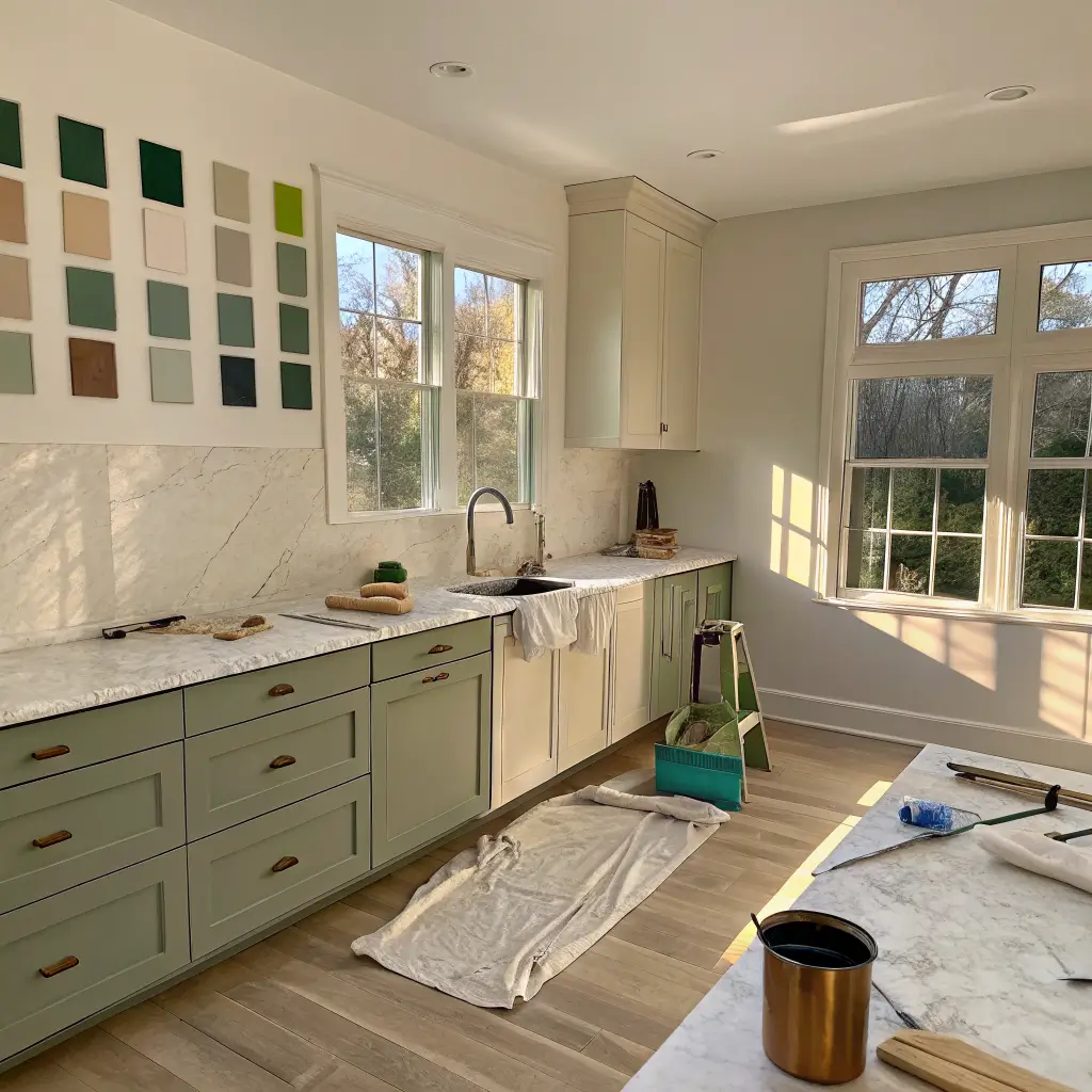
I cannot say this loudly enough. The sage I picked looked olive at the store, gray-green at 10am, and almost teal at sunset in my north-facing kitchen. Buy sample pots, paint a 2×2 foot square on at least two walls, and live with it for three days. Cheaper than repainting cabinets.
4. Keep the uppers light if the lowers are bold
If you’re going dark green on lower cabinets, leave the uppers white, glass-front, or open shelving. Otherwise the room closes in on you. The exception: tiny kitchens, where color-drenching one cocooning shade everywhere can actually feel intentional and bigger, not smaller. Counterintuitive, but true.
5. Repeat your accent color at least three times
One coral thing looks like a mistake. Three coral things look like a decision. A coral print, a coral seat cushion, and a coral utensil crock — done.
6. Pick a max of two metal finishes
Brass and matte black. Or brass and brushed nickel. Pick two and stop. I had brass pulls, chrome faucet, black pendant, and silver appliance handles in my old kitchen and it looked like four different people had decorated in shifts.
7. Edit at the end
Take 10–20% of the stuff back off the counters. The kitchen needs to actually function — coffee gets made there every morning.
The Mistakes I Watch People Make
Coloring everything. When the cabinets, walls, backsplash, and floor are all loud, there’s no hero. The room has nothing to look at because everything is shouting.
Cheap finishes with bold color. Bright paint on builder-grade laminate looks like exactly what it is. If your cabinet boxes are tired, put the color somewhere else — a freestanding hutch, an island, the walls — and save up for proper doors later.
Ignoring undertones. A green with yellow undertones next to a counter with pink veining will fight you forever. Always hold paint samples up to your permanent surfaces (floor, counter, backsplash) before you commit. Whatever doesn’t move stays — the paint has to work around it.
Trend-chasing on permanent surfaces. Don’t tile a backsplash in a color you saw on TikTok last month. Nature-inspired tones — greens, blues, clay, warm earth — age better than ultra-saturated primaries on anything you’d hate to redo.
Buying colored small appliances one at a time. This is how you end up with a mint kettle, a red mixer, and a cream toaster all on one counter. Either commit to one color family or keep them all stainless and let the cabinets do the color work.
Small Kitchens, Rentals, and Other Tricky Cases
Small kitchen? Counterintuitively, dark color often works. The room is already small — going moody (deep navy, forest green) can make it feel intentional rather than apologetic. Keep counters and uppers light to break it up.
Renting? Your toolkit:
– Peel-and-stick tile for the backsplash (the good ones from Smart Tiles or Quincy Shelf look surprisingly real)
– Removable wallpaper on the fridge side or island back
– A washable runner
– Hardware swap (keep the originals in a labeled bag for move-out)
– Colored small appliances and open-shelf styling
– A freestanding painted piece — a bar cart, a butcher block on legs, a hutch
I lived in a rental with beige laminate cabinets for three years and made it feel like mine with peel-and-stick zellige, brass cabinet pulls, and a deep green runner. Took a weekend. Came off cleanly when I moved.
Keeping It Fresh Without Starting Over
Once the bones are right, the kitchen should evolve through textiles and small swaps, not paint.
Seasonal rotations I actually do:
– Spring/summer: lighter rug, citrusy dish towels, herbs in terracotta pots on the windowsill
– Fall: a rust-toned runner, wooden boards leaning on the backsplash, a bowl of pears
– Winter: deeper textiles, candles, brass everything polished
Budget evolutions when I’m bored:
– Repaint just the island in a new color (a weekend, one quart of paint)
– New pendant shades over the bar
– Swap the hardware — different pulls completely change a cabinet’s mood
– New art above the coffee station
The point of a colorful kitchen isn’t that it’s loud. It’s that it feels like a real person lives there and makes real food in it. Pick your hero, support it properly, and stop adding stuff. That’s the whole game.
A colorful kitchen works best when it reflects how you actually cook and live, not just what looked good in a magazine spread. My sage cabinets have seen burned garlic, birthday cakes, and a lot of mediocre weeknight pasta — and they still feel like home because the color was chosen for the room, not the trend cycle. Pick one hue that makes you want to be in the space, build around it with materials that can handle real life, and let the rest stay simple.
Conclusion
The colorful kitchen that felt right to me had cabinets painted a deep teal, brass hardware, and open shelves with white ironstone that looked like it had been there forever. The owner had added a single yellow stool at the island, a bowl of lemons on the counter, and a rug in a geometric pattern that picked up both colors. The room felt like a kitchen in a house by the sea, even though we were in Minnesota. That is what color does — it takes you somewhere else.