What This Style Is, and Who Should Bother
Most people asking about a modern colorful kitchen are stuck in the same spot I was three years ago: the all-white kitchen feels like a dentist’s office, but every Pinterest board full of pink cabinets and rainbow tile looks like it’ll embarrass you by 2027. There’s a middle path. I’ve lived in it since I repainted my own base cabinets a deep olive green in 2022, and I’ve helped two friends do versions of the same thing since.
Here’s how to actually pull it off.
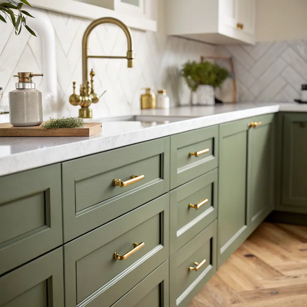
A modern colorful kitchen is a contemporary kitchen — flat-front or simple Shaker cabinets, minimal hardware, clean sightlines — where saturated color is used in one or two controlled places instead of everywhere. Think a forest-green island with white quartz on top, or navy lowers under a pale oak shelf. The bones stay calm. The color does the talking.
It pulls from Scandi-modern, mid-century, and minimalist playbooks: handleless drawers, open shelving, a strong silhouette on the pendant lights, and a palette that earns its place.
This style is for you if:
– All-white kitchens read sterile to you, but maximalist English-cottage color feels like too much
– You want something trend-aware but not disposable
– You have a 1990s or 2000s kitchen with a fine layout but tired finishes (color is the cheapest transformation tool you’ve got)
– You’re working with an open-plan space and need the kitchen zone to feel distinct without a wall
It works in small galleys and 8×10 kitchens as long as you keep color to one zone — usually the lowers or a single feature wall. In a 12×16 or open-plan space, you can go bigger: a fully color-drenched island, or a full run of colored cabinetry.
Time, Money, and What You Can Realistically Tackle
Three levels of project
Light refresh (1–3 weekends): Paint the walls, swap hardware, bring in colorful textiles, add a few small decor pieces. Beginner-friendly.
Mid-level refresh (2–4 weekends DIY, or 3–5 days with pros): Paint the cabinets, change pendants, install peel-and-stick backsplash, swap in new bar stools.
Full remodel (4–8 weeks): New cabinetry, counters, lighting, possibly relocated electrical for new pendants.
Real numbers
For paint only:
– Quality cabinet/wall paint runs $60–$90 a gallon (I used Benjamin Moore Advance for my cabinets — worth every penny over the cheaper stuff, which scuffs in months)
– Supplies (primer, rollers, sanding blocks): $50–$120
For a mid-range upgrade, expect $1,000–$5,000 to get a visible transformation without changing the layout. Rough piece costs:
– Modern colorful bar stools: $100–$350 each, most good mid-range options sit at $150–$250
– Colorful pendants: $90–$300 each
– Smeg-style small appliances (kettle, toaster, mixer): $130–$500 per piece
– Peel-and-stick backsplash: $4–$10 per sq ft
For a full kitchen with custom painted cabinetry, a 10×12 typically lands between $25,000 and $75,000 depending on where you live. Semi-custom painted cabinets run $300–$750 per linear foot; truly custom with soft-close everything and brass hardware climbs to $800–$1,500+. Quartz or porcelain counters: $60–$120 per sq ft installed.
Skill level, honestly
– Beginner: accent wall, stools, textiles, small appliances, peel-and-stick tile
– Intermediate: painting cabinets properly (this is the one that separates the patient from the impatient), changing hardware, swapping pendants, floating shelves
– Hire it out: refacing cabinets, moving electrical, stone counters, custom millwork
The Color Choices That Actually Hold Up
I’ve watched bright coral and millennial pink kitchens age badly in five years. The colors that don’t do that almost all share one trait: they have a gray or muted undertone instead of a pure, oversaturated hue.
The ones I’d recommend, and have either used or seen up close:
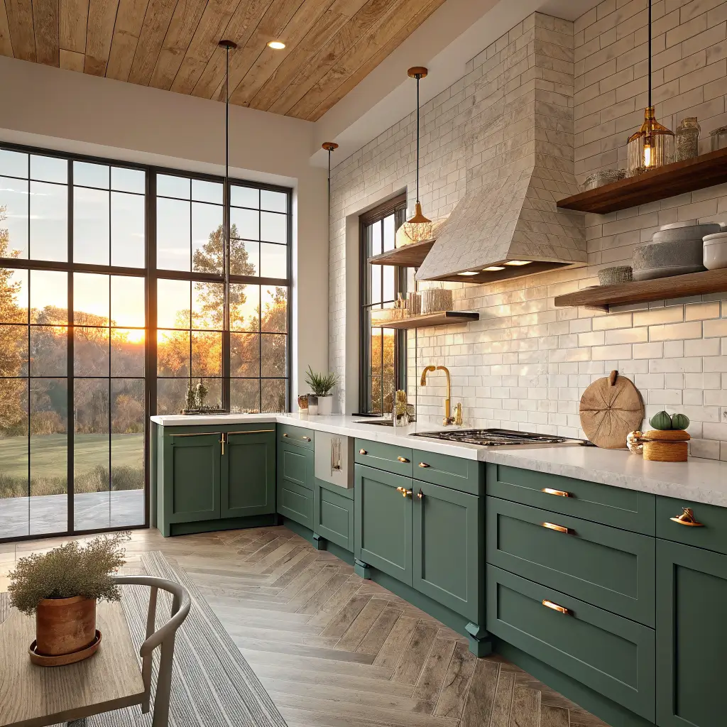
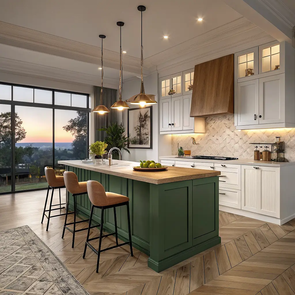
– Deep greens — olive, forest, moss. Farrow & Ball Studio Green and Benjamin Moore Essex Green are the references. Mine is closer to Studio Green and it still looks intentional two and a half years in.
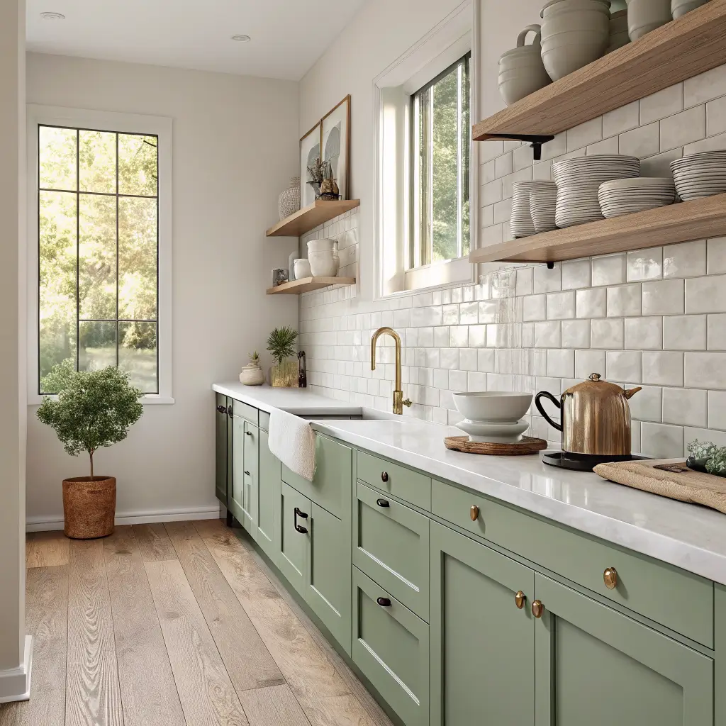
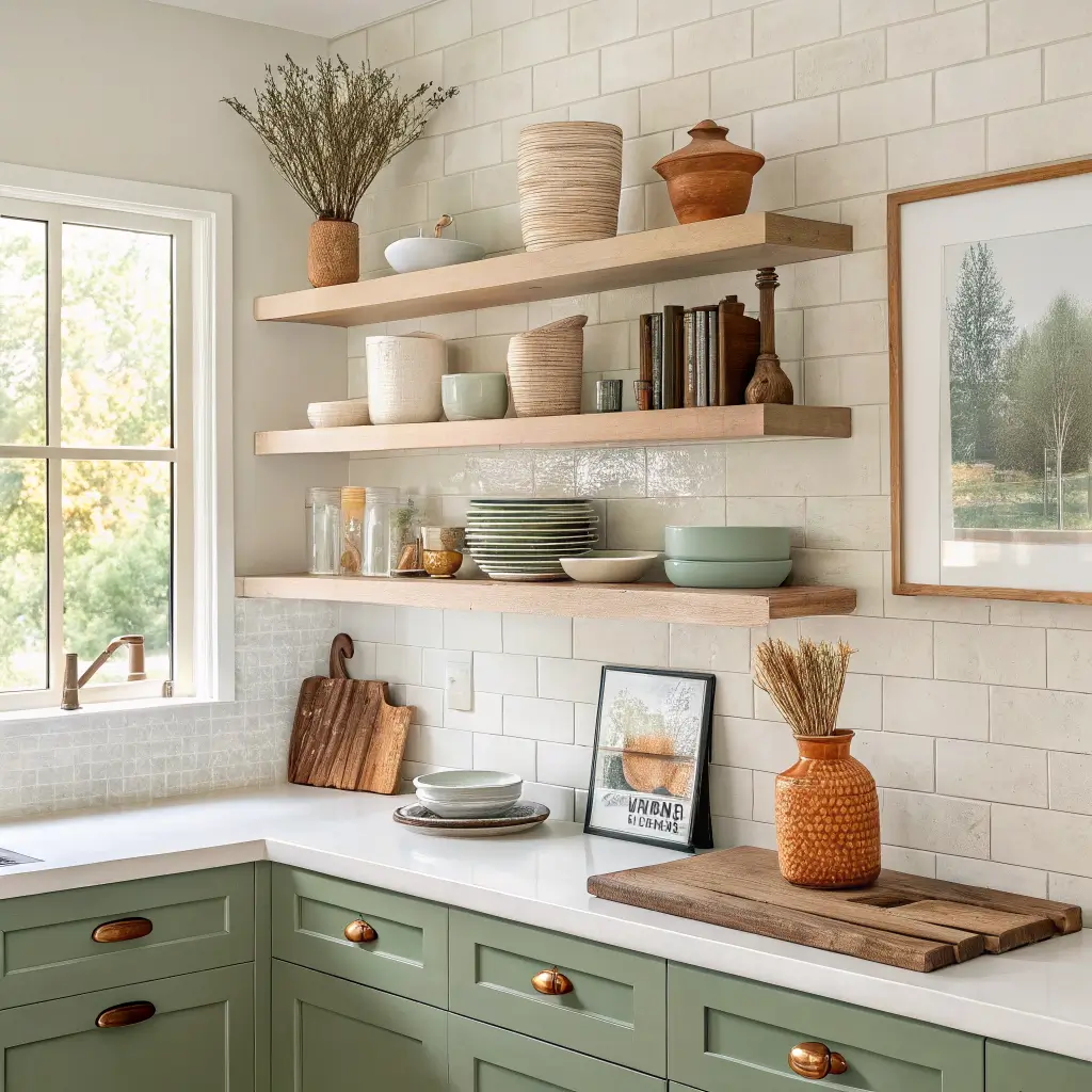
– Sage and mint — softer, easier in a small kitchen, very forgiving with brass
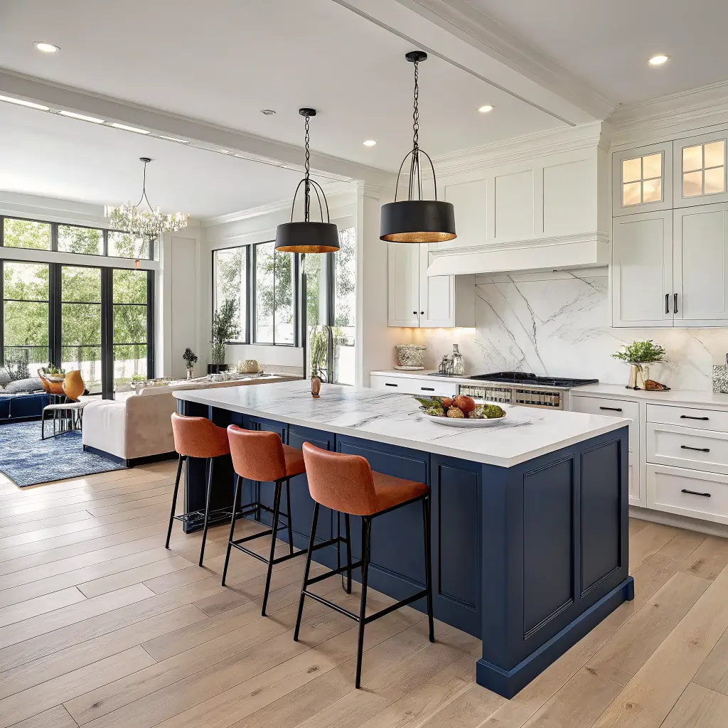
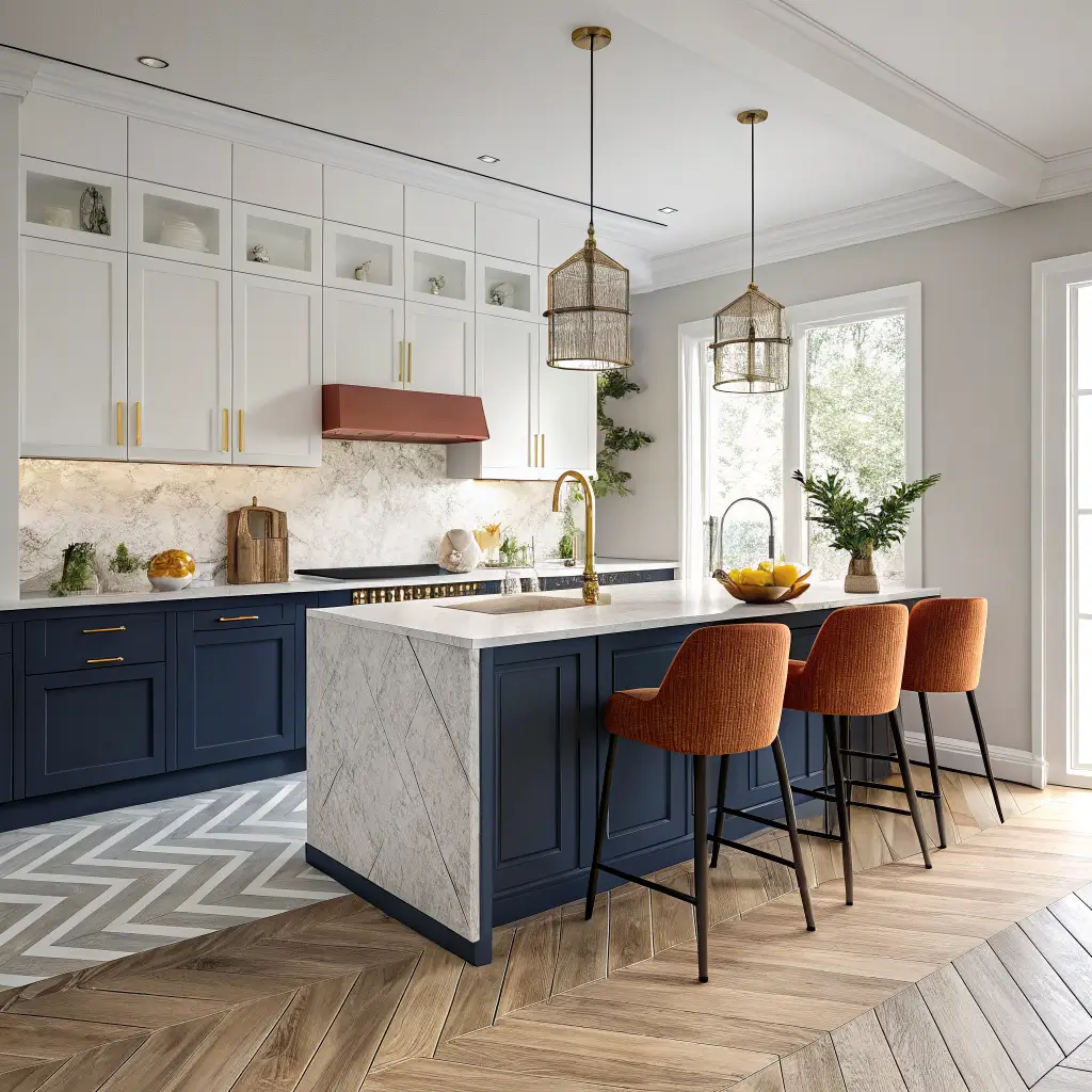
– Watery blues and navy — Hague Blue or Hale Navy on lowers under a white stone counter is genuinely hard to mess up
– Warm yellow and buttery cream — uplifting without going neon; skip anything that looks like a school bus
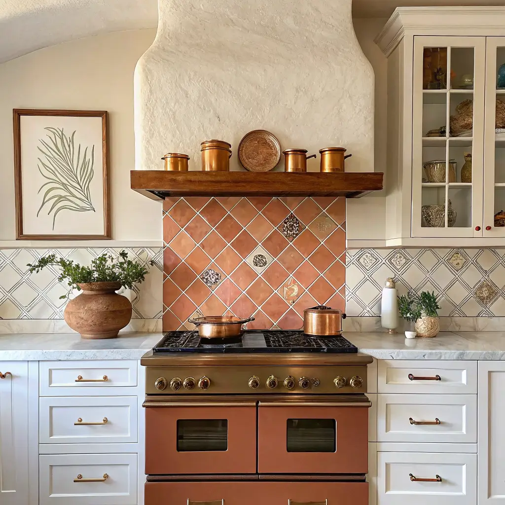
– Terracotta and clay tones — they need light wood and white marble nearby to feel grounded rather than 1970s
– Controlled brights — teal, coral, saturated orange, but only in small zones: an island, a backsplash, the stools
– Blush pink — works on cabinets if you pair it with marble and brass and treat it like a neutral
The throughline: nature-based color + quality natural materials = stays good.
Materials that pair with bold color
– Cabinets: painted MDF or hardwood (oak, teak) in flat fronts or simple Shaker
– Counters: veined marble, white or light quartz, porcelain slabs; butcher block for warmth on an island
– Backsplash: glazed ceramic, zellige-look tile, terrazzo, or a graphic geometric pattern
– Hardware: brushed brass, matte black, or stainless — pick pieces with weight to them
– Floors: natural oak, herringbone wood, or large-format porcelain in warm neutrals
The 60–30–10 Rule (And Why It’s the One Rule I Won’t Break)
If you remember nothing else: 60% neutral, 30% main color, 10% accent.
That means walls, counters, ceiling, and most of the floor stay calm. The cabinets or island carry the main color. Accessories, stools, and small art carry the accent.
When my friend Lauren did her kitchen, she wanted both navy lowers and a green island and a patterned terrazzo backsplash. We mocked it up. It looked like a kid’s birthday party. She ended up with navy lowers, a white counter, and brought the green in through bar stools and a runner. It reads sophisticated now and she can swap the green for rust in the fall if she wants.
Pick one hero. Not three.
The Hero Pieces That Carry the Look
Colored base cabinets or island
The single highest-impact move. Keep uppers neutral, or replace them with open shelving for a lighter top half. If you only do one thing, do this.
A statement backsplash
Three patterns that read modern instead of busy:
– Colorful subway tile laid in a stacked or vertical pattern (not the standard offset — that reads traditional)
– A single bold geometric or terrazzo
– Glazed zellige-look tiles in teal, deep green, or blue, where the slight variation between tiles is the whole point
Modern pendants
Powder-coated enamel pendants in matte teal, mustard, or deep green over an island or peninsula. $90–$300 each. Two or three matching, hung at about 30–36 inches above the counter, depending on bulb visibility.
Supporting cast
– Bar stools with slim metal legs and low backs, in rust, mustard, or blue
– Open shelving in white oak or painted to match the cabinets
– A flatweave runner picking up the cabinet or backsplash tone
– Colorful small appliances — this is how I cheat color into rentals; a Smeg kettle does a lot of work
– Graphic art on otherwise neutral walls, gallery-style
The Execution Order That Saves You From Repainting Twice
I learned this the hard way. I painted my cabinets first, then realized the wall color I’d planned fought the green. Repainted the walls. Then the stools I’d ordered clashed with the new wall color. Returned them.
Do it in this order:
1. Lock in the neutrals first. Walls in warm white, cream, or very light greige. Counter and floor choices set. Get those right before you touch a color decision.
2. Add the main color block. Paint the base cabinets or island in your chosen tone. Or, if cabinets stay neutral, this is when the colorful backsplash or feature wall goes in.
3. Bring in the secondary color. One softer support color through textiles, stools, or a small portion of cabinetry (a pantry door, an appliance garage). Two accents max.
4. Layer lighting and metals. Pendants, under-cabinet strips, hardware, faucet. Pick one or two metal finishes — brass and black play well; three metals start to look unplanned.
5. Style the open surfaces. Open shelves at roughly 70–80% function (plates, glassware, bowls) and 20–30% styled (a plant, a ceramic, art leaned against the back). Countertops stay mostly clear — group a few colorful pieces (kettle, fruit bowl, canisters) in clusters of two or three.
Prep Work Nobody Wants to Do (But Everyone Should)
Before you open a paint can:
– Clear and declutter. Every small appliance off the counter. Toss the expired stuff. Get rid of the window valance from 2004.
– Test paint samples on giant poster board and move them around the kitchen across a full day. Morning light, midday, dinner, lamps on. A green that looks like Studio Green at the store can look like split-pea soup under your warm LEDs.
– For cabinet painting: degrease with TSP or a TSP substitute, sand lightly with 220 grit, prime with a bonding primer (Stix or BIN). Remove every door, label every hinge location with painter’s tape. Tape your floors and counters with rosin paper. Don’t skip the primer. I tried once. I sanded it all back down and started over.
Mistakes I See Constantly
Too many colors at once. Cap it at two or three. One hero, one or two supports.
Ignoring undertones. Tested in two lights. Picked the muted version, not the most saturated one in the swatch family.
No place for the eye to rest. Keep ceilings white. Keep at least one significant wall calm. Bold color needs negative space — meaning empty, quiet area around it — to feel deliberate.
Cheap finishes on high-impact spots. Glossy plastic-looking cabinet fronts and bright laminate counters age in dog years. If the surface is going to be 30% of what you see, spend on it.
Not planning for resale. Put the boldest color where it’s easy to change — paint, an island, decor. Keep the main cabinet layout and counters classic. A future buyer can repaint a green island in a weekend; nobody wants to redo a custom orange backsplash.
Keeping It Fresh Without Starting Over
Once the bones are right, evolving the kitchen is mostly about textiles and small swaps.
Seasonal shifts that take 20 minutes:
– Spring: pastel ceramics, herbs in colorful pots, a linen runner in mint or blush
– Summer: a bowl of lemons, striped towels, brighter glassware on the shelves
– Fall: rust, ochre, burgundy in textiles; wooden boards out, brass on display
– Winter: jewel-tone linens, candles, warm wood cutting boards leaned against the backsplash
Budget-friendly evolutions:
– Paint only the island as a test before committing to the whole kitchen in a new color
– Swap hardware and the faucet — under $500–$800 for most kitchens and feels like a new room
– Replace the runner and two or three shelf accessories to rebalance the palette
Cross-style mashups that actually work:
– Modern + Boho: clean cabinets, a woven pendant, a Turkish-style runner, collected stoneware
– Modern + Coastal: pale wood or white flat fronts, a sea-glass green island, natural fiber stools
– Modern + Industrial: deep green or charcoal cabinets, concrete-look counters, black metal stools, warm wood shelves to keep it from going cold
A Quick Answer to the Questions Everyone Asks
Upper or lower cabinets for the bold color? Lower. Always lower in a modern kitchen, unless your uppers are floating open shelves in wood. Color on top makes the room feel shorter and heavier.
Will it hurt resale? Not if the boldest color is paint or an island. Painted cabinets are a weekend’s work for the next owner. Custom-fabricated orange quartz is not.
What backsplash works with green or navy? White or cream zellige with visible variation, warm marble with subtle veining, or a small-format handmade ceramic in an off-white. Skip anything gray-toned — it’ll fight the cabinet undertone.
The kitchen I painted in 2022 still makes me happy when I walk in every morning. That’s the only test that matters. Pick a color you’d be glad to see at 7 a.m. before coffee, build everything else quietly around it, and you’ll land somewhere good.
A modern colorful kitchen is not about being trendy, it is about creating a space where you want to spend Sunday morning making pancakes. My navy cabinets have a chip near the dishwasher from a rogue cast iron pan, and that small scar reminds me that this kitchen gets used, not just photographed. Pick a color that makes you reach for the coffee maker with a little more enthusiasm, and the rest will follow.
Conclusion
The modern colorful kitchen that convinced me this look works had cabinets in a deep teal, brass hardware, and open shelves with white ironstone that looked like it had been there forever. The owner had added a single yellow stool at the island, a bowl of lemons on the counter, and a rug in a geometric pattern that picked up both colors. The room felt like a kitchen in a house by the sea, even though we were in Minnesota. That is what color does — it takes you somewhere else.