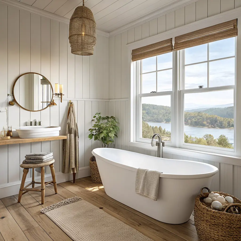
What Neutral Coastal Actually Is (and Who It’s For)
Think Hamptons rental, not surf shack. The bones are soft whites, warm sand tones, light oak, and natural fibers. Blue shows up, but it’s the color of weathered sea glass — never a Crayola crayon.
It works for you if:
– You want calm, light-filled rooms and hate visual clutter
– You like the feeling of the coast but not literal seashells everywhere
– You’ve got kids, dogs, or a partner who spills coffee — slipcovers and washable rugs were made for this
– You prefer the look of a small boutique hotel over a themed Airbnb
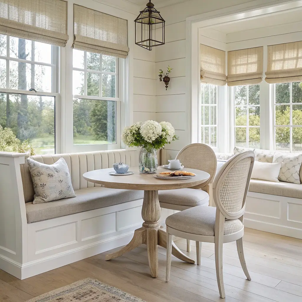
I’ve used this style in a 10×12 guest bedroom and across a 15×22 open-plan living/dining. It scales. The one room it struggles in is a north-facing space with bad light — without sun, the palette can drift gray and sad. Address the lighting before you commit.
The Pieces That Do the Heavy Lifting
You can buy a hundred accessories and the room will still feel off if the big stuff is wrong. Get the anchors right first.
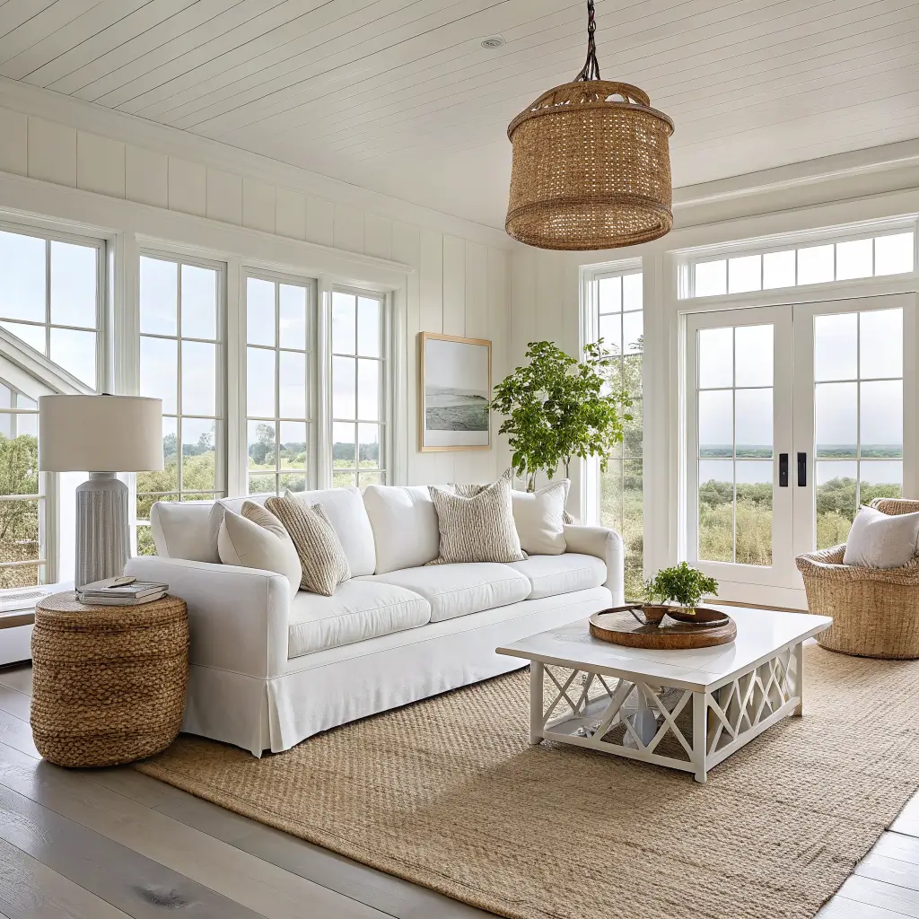
Slipcovered Sofa in a Warm White or Stone
This is the centerpiece. Performance linen blend, slipcovered, bench cushion or two-cushion. Skid the three-cushion option — the seams sag and look tired within a year.
– Budget: $600–$1,200 (big-box, often online-only)
– Mid-range: $1,800–$3,500 (Pottery Barn, Serena & Lily-adjacent)
– High-end/custom: $3,500–$8,000+
I had a pure linen slipcover for about eight months before red wine ended that experiment. Performance fabric is the move if anything edible happens in the room. Look for “stone,” “natural,” “flax,” or “warm white” — pure bright whites go blue in afternoon light and look cold.
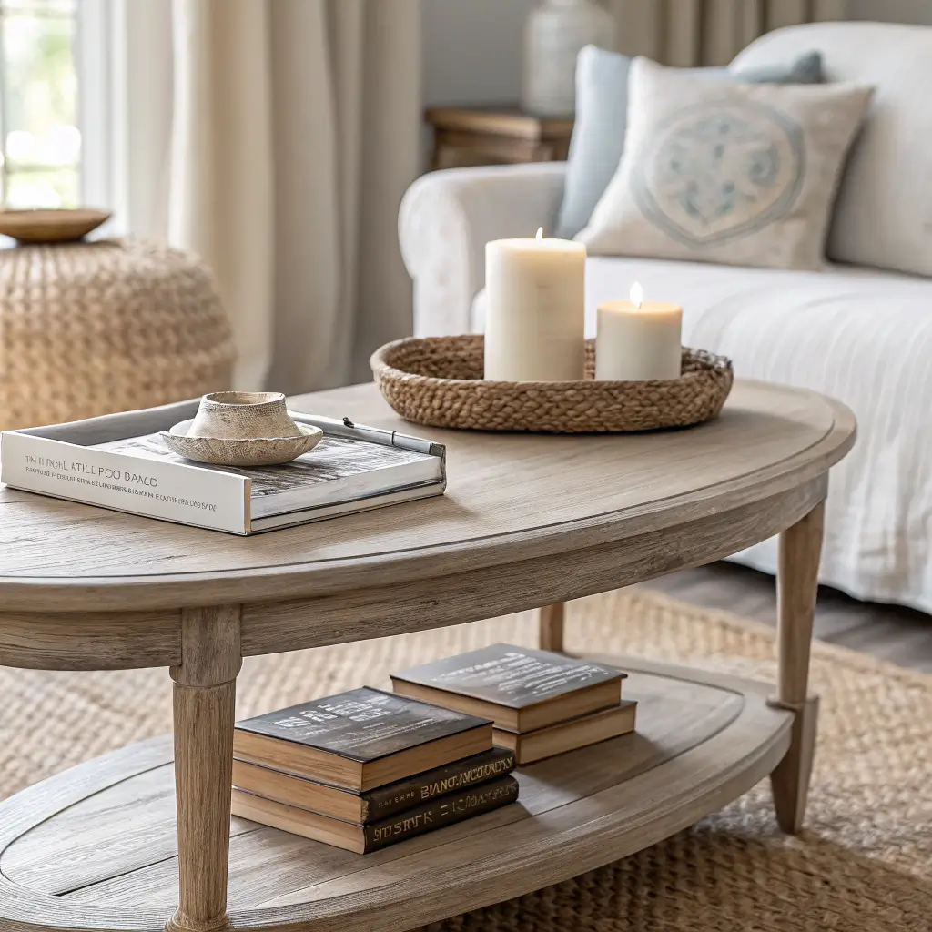
Light Wood Coffee Table
White oak, ash, or a bleached/driftwood finish. A 48–60″ length works for most living rooms; round or oval if your space is tight on traffic flow. Avoid anything with heavy turned legs or thick black hardware — it fights the whole vibe.
Budget around $250–$900. I have a $380 oak oval from a direct-to-consumer brand that gets mistaken for a $1,500 piece because the proportions are right.
Jute or Seagrass Rug
Non-negotiable. An 8×10 for medium rooms, 9×12 for open-plan, and the front legs of every seating piece should land on it. If you can stretch budget anywhere, a wool-jute blend ($500–$1,200) feels noticeably better underfoot than pure jute, which can be scratchy.
Pure jute: $180–$450. Worth it if you’re testing the look and don’t want to commit big money.
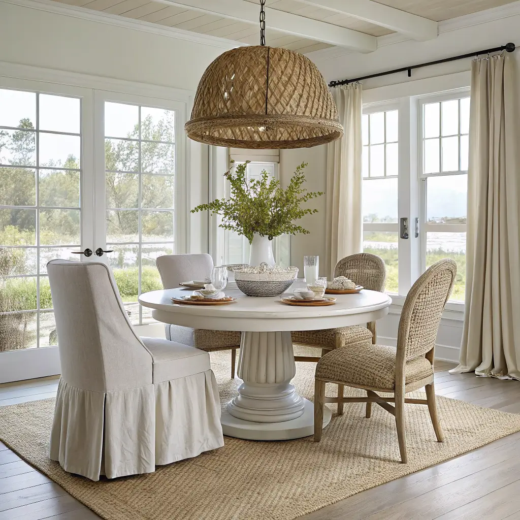
One Statement Woven Pendant
Basket-weave, seagrass drum, or rattan lantern. Over a dining table or centered in a living room. $120–$350 covers most good options; designer pieces run $350–$900. This single fixture does more work than five accessories combined because it casts the whole room in texture.
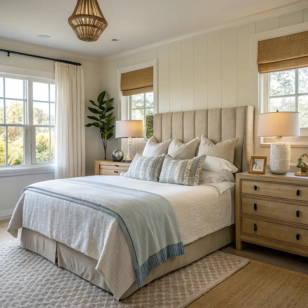
Bedroom Anchors
For bedrooms, an upholstered headboard in natural linen ($250–$800) and either braided rattan or light oak nightstands ($180–$450 each). Skip the matching set — one rattan, one oak feels collected; two of the same looks like a showroom.
How I Actually Put a Room Together
Order matters. I’ve rearranged my living room three times, and the version that finally worked started from the floor up.
Step 1: Rug, then sofa. Lay the rug first. Position the sofa so the front legs sit on it. Place coffee table with 18–20″ clearance to the sofa — closer feels cramped, further feels like you need to lunge for your drink.
Step 2: Windows. Hang linen or cotton curtains high and wide — rod 4–6 inches above the window frame, extending 8–10 inches past each side. Panels should kiss the floor, not hover above it. This single trick makes rooms look taller and lets light in.
Step 3: Lighting. Overhead first, then table lamps with linen, paper, or rattan shades. I keep one lamp with a brushed brass base for warmth — the room felt sterile without it.
Step 4: Textiles. On a standard sofa: two 22″ neutral linen pillows at the back corners, then one or two smaller patterned pillows (a thin stripe, a small block print) in front. A lightweight throw draped — not folded — over one arm.
Step 5: Surfaces. Coffee table gets three things: an organic object (driftwood, a piece of coral, a ceramic bowl), a short stack of books in coastal-toned spines, and a tray with a candle. That’s it. Negative space — meaning the empty parts — is doing real work here.
Step 6: Art, last. One large piece above the sofa or bed, hung so the center sits at roughly 57–60 inches off the floor. A muted seascape, an abstract in sandy tones, or a single oversized photograph. Skip the gallery wall of beach signs.
The Color Formula That Keeps It From Going Wrong
The ratio I stick to: 70–80% neutrals, 20–30% muted blue or sea-green, with darker accents used like punctuation.
Wall colors I’ve actually used or specced:
– Whites: Benjamin Moore Chantilly Lace (clean, slight warmth), White Heron (cooler, holds up in sunny rooms), Sherwin-Williams Snowbound
– Soft greiges: BM Pale Oak, Moonshine — both lean warm without going yellow
– Blue accents (sparingly): BM Beach Glass, Palladian Blue, Boothbay Gray; SW Sea Salt, Krypton
Use eggshell finish on walls, satin on trim. Flat shows every kid handprint, semi-gloss looks too plasticky for this style.
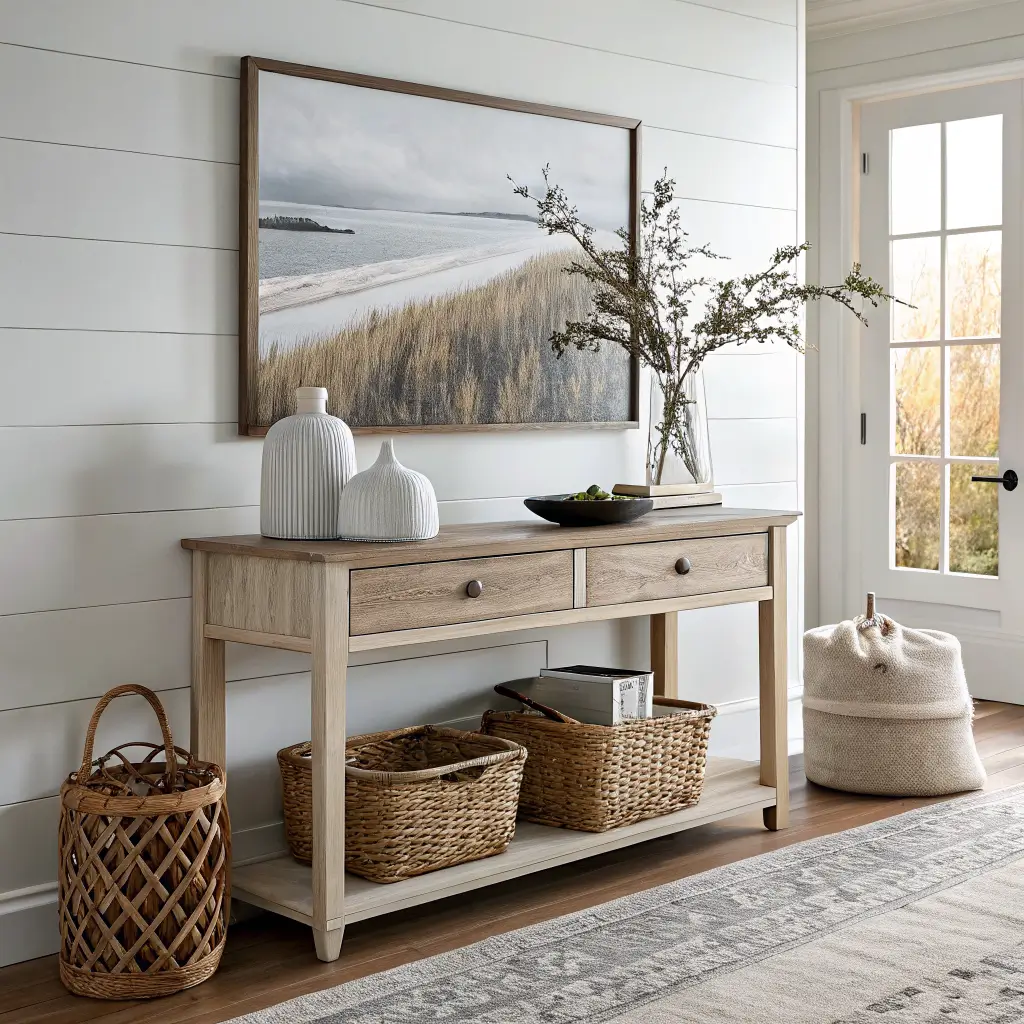
Wood tones: pick one primary (I use white oak) and at most one secondary (a touch of darker walnut on a single piece for grounding). Five different wood tones in a room is what’s making it feel “off” even when you can’t name why.
Where to Spend, Where to Save
Spend on: the sofa, the rug, and lighting. These set the tone and you’ll touch them every day.
Save on: pillow covers, art, decorative objects, baskets. Etsy, HomeGoods, and estate sales are where I find most of mine. My favorite piece of “art” is a $14 thrifted oil painting of a foggy beach that I reframed in a $40 oak frame. Looks like it cost $400.
Don’t bother with: matching furniture sets, anything labeled “coastal collection,” resin starfish, signs with words on them.
The Mistakes I See (and Made)
Theme-park coastal. Anchors, ropes, “Gone to the Beach” signs, jars of shells. One subtle nod per room. If you love shells, frame three in a clean white shadowbox and stop there.
Bright artificial blue. Royal blue and turquoise read pool float, not coastline. Stick to grayed, muted blues. If you’re squinting at a paint chip wondering if it’s too vivid, it is.
Dark, heavy holdovers. A dark leather recliner will fight everything else. If you can’t replace it, throwing a heavy linen slipcover on it ($60–$120 custom on Etsy) buys you time.
Shiplap everywhere. One accent wall, maximum. Vertical paneling behind a bed reads elegant; shiplap on all four living room walls reads sitcom.
Overstyled surfaces. Max three items per surface. I keep a “donate or store” basket near the front door — when something new comes in, something old goes out.
Seasonal Swaps That Keep It Interesting
The base stays. The accents rotate.
– Spring/Summer: Hydrangea or eucalyptus stems, lighter pillow covers, a glass vase with a single branch
– Fall: Dried fan palms, caramel-toned pillows, a heavier woven throw layered over the lighter one
– Winter: Chunky ivory knit throws, more candles, a small brass tray for warmth
A single $80 swap of pillow covers and stems makes the room feel intentional for the season without buying anything you’ll store six months later.
A Few Cross-Style Notes
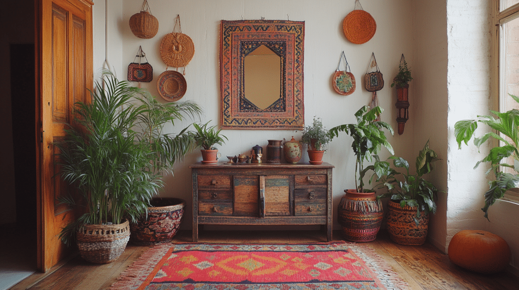
If pure neutral feels too quiet for you, boho-coastal holds up well — keep the seagrass rug and oak furniture, but layer in more patterned textiles, a Moroccan-style accent pillow, and warmer terracotta tones in the accessories. Same bones, more personality.
If you’re going the other direction toward something more refined, swap the rattan pendant for an alabaster fixture, add a single piece of travertine, and replace the jute rug with a wool-jute blend. Same palette, dressed up.
The thing nobody tells you about this style: it looks easy because it is simple, but simple is hard to get right. Buy fewer things. Buy bigger things. Leave space around them. That’s most of it.
Conclusion
The neutral coastal decor that feels right is a room where everything is white, sand, or driftwood gray, and the only color is the ocean through the window. The owner has a linen sofa, a jute rug, and a single ceramic bowl on the coffee table. She says she stopped buying things for the room five years ago because the light changes every hour and that is decoration enough. That is the point of neutral — it gets out of the way so you can see what is actually there.