How to Decorate with Color Without It Looking Like a Toy Store: A Real Guide to Colorful Home Decor
Why colorful rooms go wrong (and how to fix it)
You want colorful home decor, but every time you try, it ends up looking either cluttered, juvenile, or like three different rooms crashed into each other. I’ve been there. My first attempt at a “colorful” living room had a coral sofa, a yellow rug, turquoise curtains, and a purple accent chair I bought drunk on a Wayfair sale at midnight. It looked like a Skittles factory exploded. I sold the chair for $80 on Facebook Marketplace and started over.
What I’ve learned in the five years since: color works when it’s planned, repeated, and grounded. Not when you grab everything that makes you happy at HomeGoods and hope it talks to itself.
Here’s how I’d actually do it.
What This Style Is, and Who Should Try It
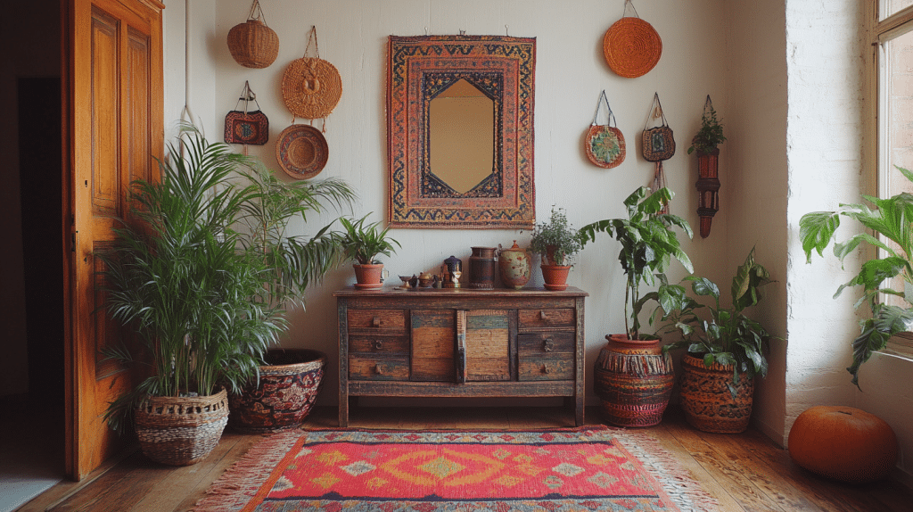
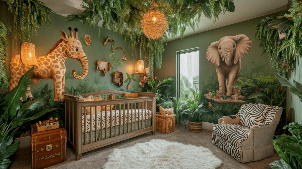
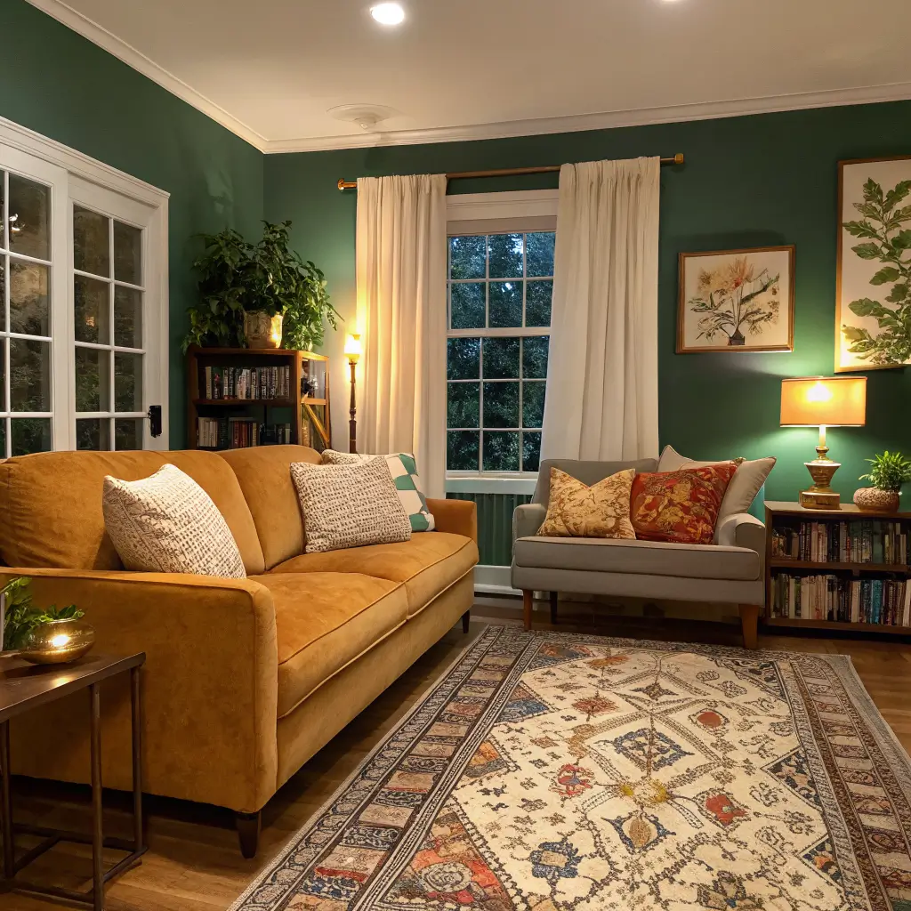
This is the colorful, slightly maximalist, boho-eclectic look that’s everywhere on Pinterest right now — jewel tones, painted furniture, mixed patterns, gallery walls, a little ’70s, a little Mexican folk art, a little Y2K if you’re brave. Some people are calling it “dopamine decor,” which is marketing speak, but the idea holds: rooms that make you happy to walk into.
It’s for you if:
– You’ve tried minimalism and felt like you were living in a dental office
– You collect things from travel, thrift stores, or your grandmother’s attic
– You rent and want personality without losing your deposit
– Beige makes you depressed
It works in studios and family homes alike. The rules just shift with scale.
What It Costs (Honest Numbers)
Just accents, working with what you have: $100–$300. Throw pillow covers run $10–$25 on Amazon or at places like Jungalow and Society6. Small art prints from Etsy: $15–$40 each. A handful of ceramic vases or trinket dishes: $10–$30 a pop.
A full room refresh: $600–$1,500. This is where I’d put a 5×7 or 6×9 patterned rug ($120–$400), an accent chair in velvet or bouclé ($200–$600), and a gallon or two of good paint ($40–$120 with primer). A colorful table lamp adds another $40–$150.
Full makeover with furniture and art: $2,000–$5,000+. A velvet or linen sofa in a real color (not “greige”) runs $800–$2,500. Original art is $200–$1,200 per piece if you want something that isn’t on the wall of every other apartment in your city. Patterned tile for a kitchen or bath backsplash: $8–$25 per square foot.
The Time It Actually Takes
A pillow-art-plant refresh of one room: 2–4 hours if you’ve already shopped. Painting an accent wall plus rearranging furniture: a weekend, two if you’re slow or precise about edges. Tile work, reupholstering, or murals: hire someone or block out real time.
Pick Your Palette Before You Buy Anything
This is the step everyone skips and then regrets at the checkout. Lock in 2–3 main colors and 1–2 neutrals before you spend a dollar.
The palettes I’ve actually seen work in real homes:
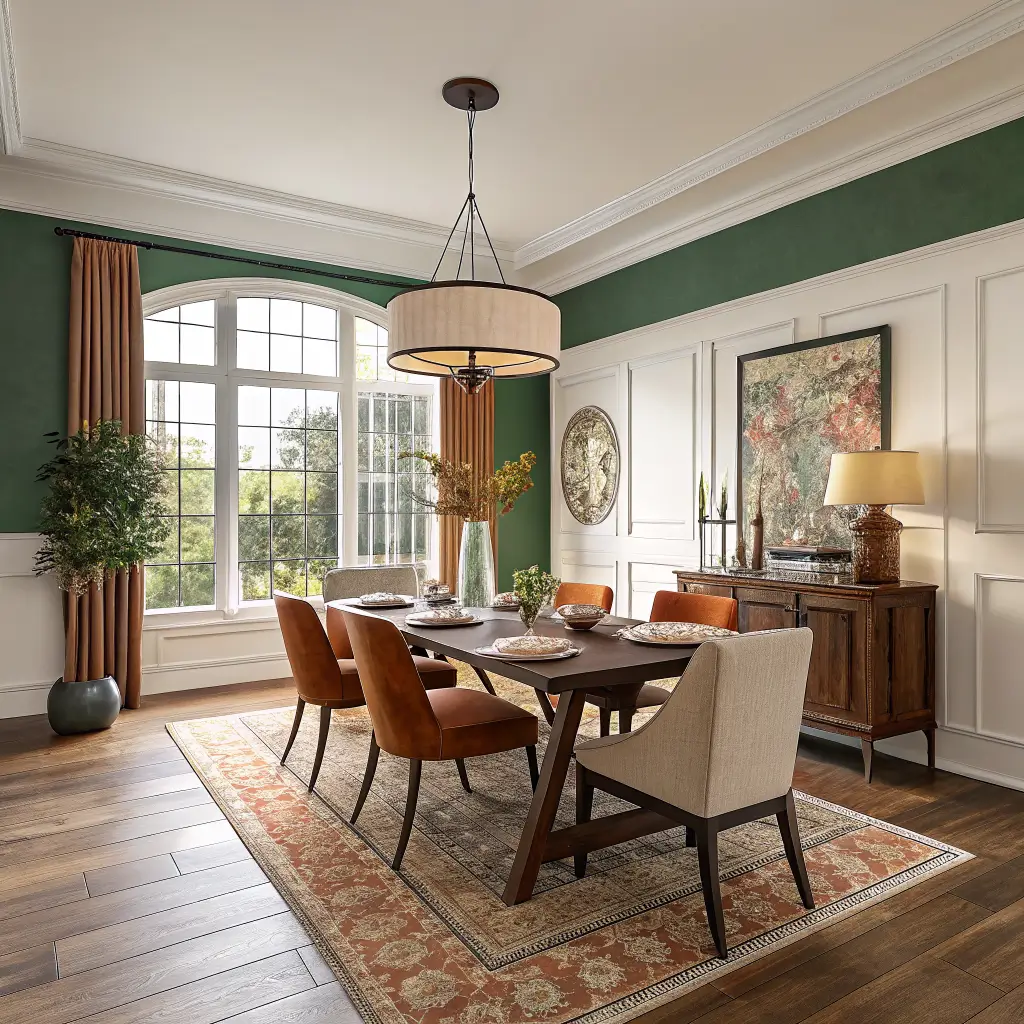
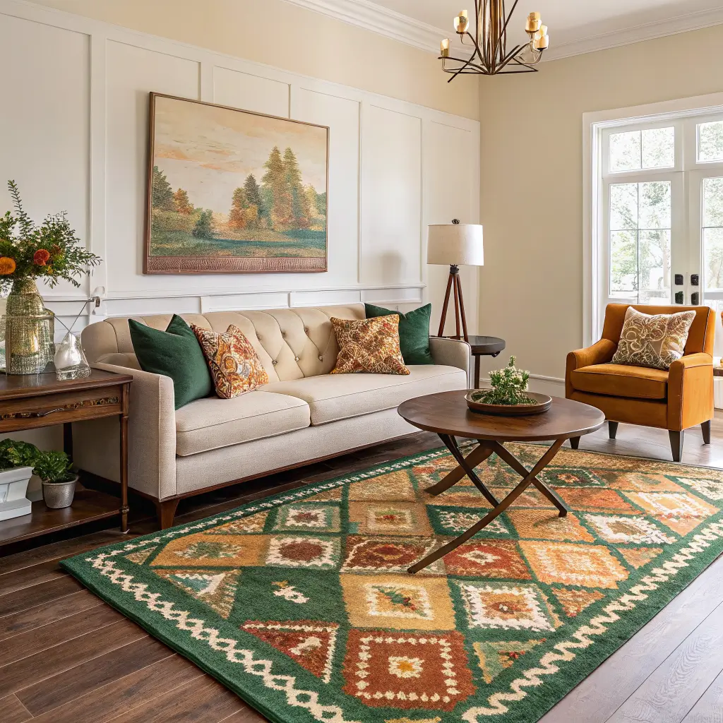
– Warm jewel: emerald, burnt orange, mustard, with cream and warm oak
– Sunset bright: coral, hot pink, terracotta, soft buttery yellow
– Cool moody: sapphire, teal, plum, with bone white and black accents
– Soft retro: sage, dusty pink, ochre, walnut wood
– Mexican-folk inspired: cobalt, fuchsia, marigold, leafy green
Pick one. Stop trying to use them all.
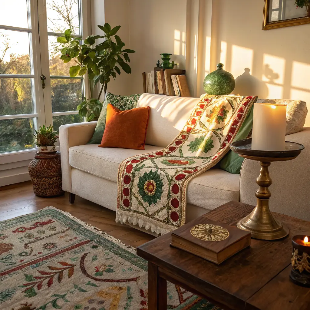
The trick I use: find one textile — a rug, a quilt, a piece of art — that you genuinely love, and pull every other color in the room from it. My current living room palette came from a vintage Suzani throw I found at a flea market in Pasadena for $45. Everything else followed.
The 60-30-10 Rule (the One Rule Worth Knowing)
60% base color (usually a warm white, soft cream, or muted neutral on walls and big furniture), 30% main color (your hero — a sofa, rug, or painted wall), 10% accent (the pop — pillows, art, a lamp).
If that math feels rigid, here’s the looser version I actually use: whatever your accent color is, repeat it at least three times in the room. A teal velvet pillow, a teal vase on the shelf, a streak of teal in the artwork above the sofa. Repetition is what makes a colorful room read as intentional instead of accidental.
Hero Pieces: Where to Spend
You need one or two anchor pieces per room. Not five. One or two.
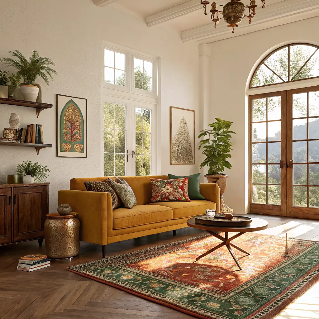
– A colorful sofa or accent chair. Mustard, emerald, rust, and teal are the colors I see aging well — they read more “vintage” than “trend” when they inevitably feel less new. I have a mustard velvet loveseat from Article (the Sven in Yarrow Gold) that I bought four years ago and still love.
– A patterned area rug. This is the single best investment for a colorful room. A bold rug ties everything else together and forgives a lot of mismatched furniture. Look at Lulu and Georgia, Revival Rugs, and Ruggable if you have pets.
– A painted wall or ceiling. A gallon of Benjamin Moore in a saturated color (Hunter Green 2041-10, Salamander, or Caliente AF-290) costs $70 and changes a room more than $2,000 of furniture.
– Patterned tile, if you’re committing to a kitchen or bath.
Pick one of those as your room’s loudest voice. The rest support it.
Where to Save
– Pillow covers, not pillows. Buy good 20″ and 22″ down inserts once ($15–$30 each), then swap covers seasonally for $12–$20.
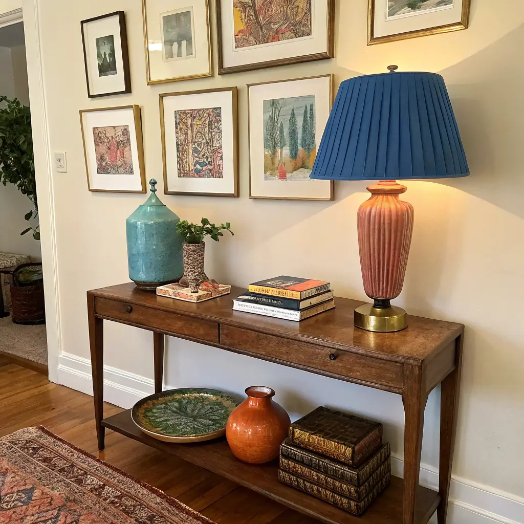
– Art. Etsy, Society6, Juniper Print Shop, and vintage poster sites have great prints for $20–$40. Mix in one or two originals or thrift finds for soul.
– Lamps. Thrift store ceramic lamps with ugly shades are gold. I spray-painted a $6 brass lamp from Goodwill cobalt blue and put a pleated pink shade on it. People ask where it’s from.
– Frames. Get cheap frames from Target or IKEA and spray-paint them in colors from your palette. A unified frame color makes a thrifted gallery wall look curated.
How to Actually Put It Together
Order matters. I’ve redone this enough times to know.
1. Rug first. It sets the palette and grounds the room. Get the biggest one you can afford — front legs of all major furniture should sit on it, minimum.
2. Big furniture next. Sofa, bed, dining table. If these are colorful, they’re your hero. If they’re neutral, your rug and walls do the heavy lifting.
3. Paint. Easier to paint around bare furniture than to drag a sofa into the middle of the room. Use matte or eggshell finish for walls in saturated colors — flat shows every smudge, glossy looks cheap on big surfaces. Save high-gloss for doors and trim.
4. Curtains and big textiles. Hang curtains as high and wide as possible — rod 4 inches below the ceiling, panels extending past the window frame. Short curtains shrink a room faster than anything else.
5. Art and shelves. Hang main artwork with the center at 57–60 inches from the floor. For a gallery wall, lay it all out on the floor first, photograph it, then hang.
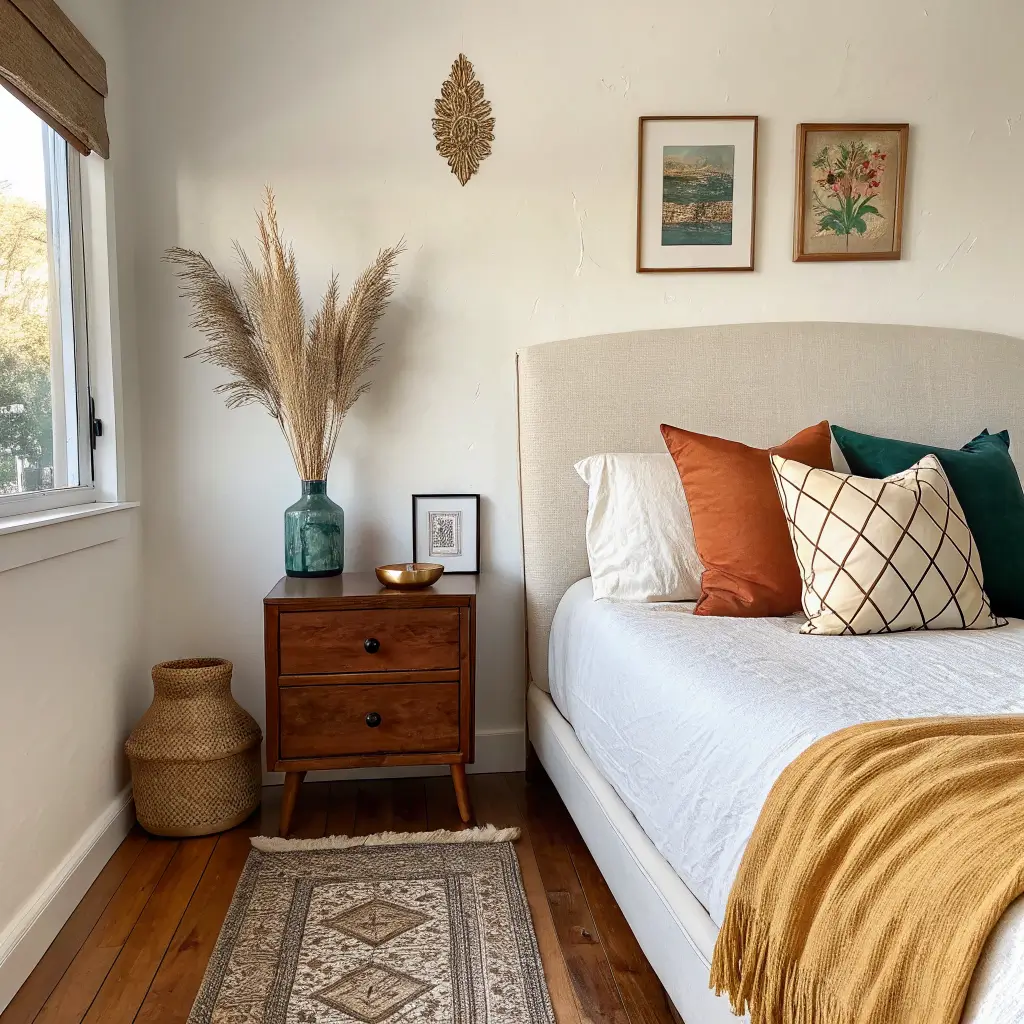
6. Pillows and throws. Mix three to five on a sofa: one solid, one big pattern, one small pattern, one with texture (boucle, embroidery, tassels). Vary sizes — 22″, 20″, 18″, and a lumbar.
7. Small stuff. Books, vases, candles, trays. Style in odd numbers. Three things at varying heights beats four things at the same height every time.
8. Lights on, step back, remove two things. This is the step no one wants to do. The room will look better.
The Mistakes I Made So You Don’t Have To
Buying small colorful tchotchkes before committing to a big color move. A few bright trinkets on a beige shelf in a beige room just look like clutter. You need the room to be colorful first; the small stuff supports it.
Choosing paint colors in the store. Get the sample. Paint a 2×2 square on the actual wall. Look at it morning, noon, and night. A color I swore was a soft terracotta turned pink at 6 p.m. and I had to repaint two walls.
Skipping neutrals. Even a maximalist room needs visual breathing room. Cream walls, a wood coffee table, a jute rug under the patterned one — these are what let your colors actually pop instead of fighting each other.
Forgetting the ceiling. A pale pink, sage, or even just warm white ceiling makes saturated walls feel finished. Builder-grade flat white above a Caliente red wall looks unintentional.
Too many patterns at the same scale. Mix a large floral with a small geometric with a medium stripe. Three big florals in the same room read as chaos.
Renter-Friendly Moves
Almost all of this works in a rental. The specifics:
– Peel-and-stick wallpaper on one accent wall, inside a bookcase, or on stair risers. Chasing Paper and Tempaper are the brands I’ve used. Removes cleanly if you go slow.
– Removable wall hooks (the Command 3M ones rated for 5+ lbs) hold gallery walls for years.
– Floor lamps with colored shades instead of hard-wiring sconces.
– Layered rugs. Cover ugly beige rental carpet with a big jute rug, then a colorful one on top.
– Tension rods for curtains if you can’t drill into trim.
Easy Seasonal Swaps
I don’t redecorate seasonally. I swap small things.
– Spring: Pastel pillow covers, fresh tulips or hydrangeas, a citrus-colored throw.
– Summer: Lighter textiles, a bowl of lemons or peaches on the table (sounds dumb, works).
– Fall: Mustard, rust, and burgundy pillow covers, a chunky knit throw, dried wheat or pampas.
– Winter: Velvet cushions in jewel tones, a layered quilt, warm bulbs (2700K, not 4000K), colorful twinkle lights through January.
The frames, rug, sofa, and lamps stay. Only the soft stuff changes.
Cross-Style Variations
Not every colorful room needs to be full-tilt boho. A few directions:
– Modern minimal + one color: Clean-lined furniture, white walls, but a single cobalt blue repeated in a chair, a rug, and one big abstract painting. Disciplined, still alive.
– Boho coastal: Sandy neutrals, rattan, with turquoise and coral. Patterned quilt with shell or wave motifs instead of folk florals.
– Retro-eclectic: Checkerboard rug, mushroom lamp, avocado green or burnt orange velvet chair, vintage glassware in the kitchen. This is having a real moment right now and I think it sticks.
The One Thing I’d Tell Past Me
Commit. The reason most “colorful” rooms feel off is that the person decorating them got scared halfway through and pulled back to safety. A sage green wall with a beige sofa and beige pillows isn’t a colorful room — it’s a beige room with a wall. Pick your palette, buy the rug, paint the wall, and trust it.
Then live in it for a month before adding anything else. Most of the time, you’ll find you already have enough.
Colorful home decor works when it reflects the actual people living in the space, not a magazine version of what a home should look like. Our hallway has a gallery wall of my daughter is finger paintings mixed with a print from a local artist, and the combination is chaotic and perfect because it is us. Start with one color that makes you smile, add one piece with a story, and build from there.
Conclusion
The colorful home decor that worked for my friend was not a rainbow in every room. It was a house where the living room had a single mustard sofa, the kitchen had teal cabinets, and the bedroom had a quilt in a pattern of rust and cream. The colors did not match from room to room, but they each felt like the person who lived there had chosen them on purpose. She said her house felt like a story with different chapters, and I understood what she meant the moment I walked through the door.