The Cozy Colorful Bedroom: How to Get Color, Comfort, and Calm in the Same Room
A cozy colorful bedroom is what I kept searching for after years of beige rooms that photographed well and felt like nothing. I wanted color. I also wanted to sleep. Those two things sound like they fight each other, and if you’ve ever painted a wall a shade you loved on Pinterest and then couldn’t relax in the room, you know exactly what I mean.
It took me three repaints, one regrettable orange velvet headboard, and a rug that was two sizes too small before I figured out the formula. Here’s what actually works.
The Look, and Who It’s For
Think soft maximalist with the volume turned down. Layered, personal, a little eclectic — but anchored by a controlled palette and warm light so it still reads as a bedroom, not a lounge.
This style fits you if:
– You like color but get overwhelmed by rooms that look like a paint sample exploded.
– You rent and can’t do major renovations, but you can swap textiles and lighting.
– You want personality without sacrificing rest.
– Your room is small to medium — this approach actually rewards smaller spaces because texture and color do the heavy lifting instead of big furniture.
It works in primary bedrooms, guest rooms, studios, and teen rooms. I’ve used a version of it in a 10×11 rental with one window and it made the room feel twice the size, mostly because I finally got the lighting right.
Time and Budget Reality Check
Quick refresh (one weekend): $250–$800 if you’re swapping bedding, pillows, a rug, and lamps. This is where most people should start.
Full layered version (1–3 weeks): $1,500–$5,000+ if you’re painting, adding an upholstered headboard, sourcing vintage nightstands, and doing custom curtains.
Skill level: beginner for decor-only; intermediate if you’re painting or installing plug-in sconces.
The Color Formula That Keeps It From Looking Chaotic
The single biggest mistake I made early on was treating “colorful” as “every color.” A colorful bedroom needs more discipline than a neutral one, not less.
My rule: one dominant color, one secondary, one accent. That’s it.
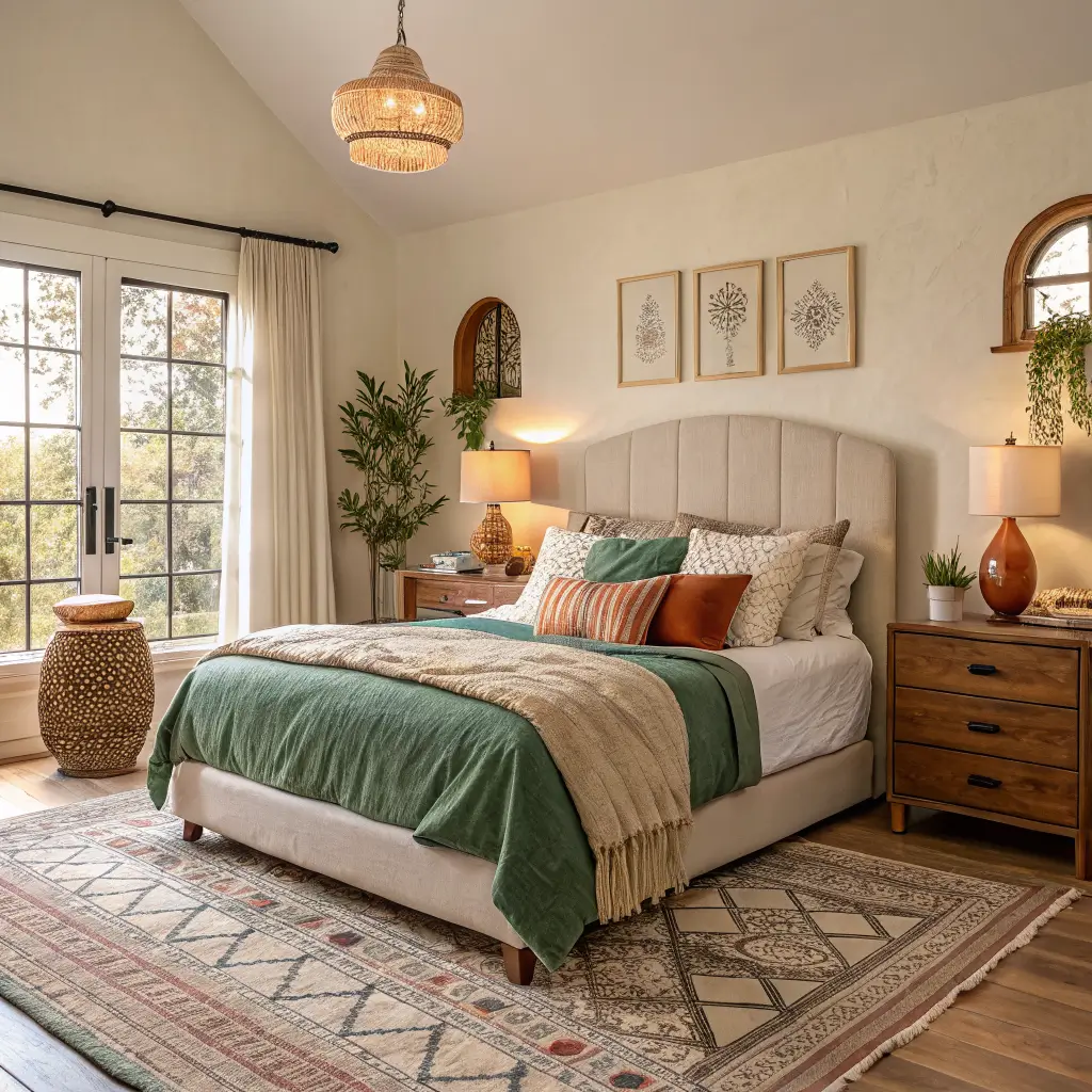
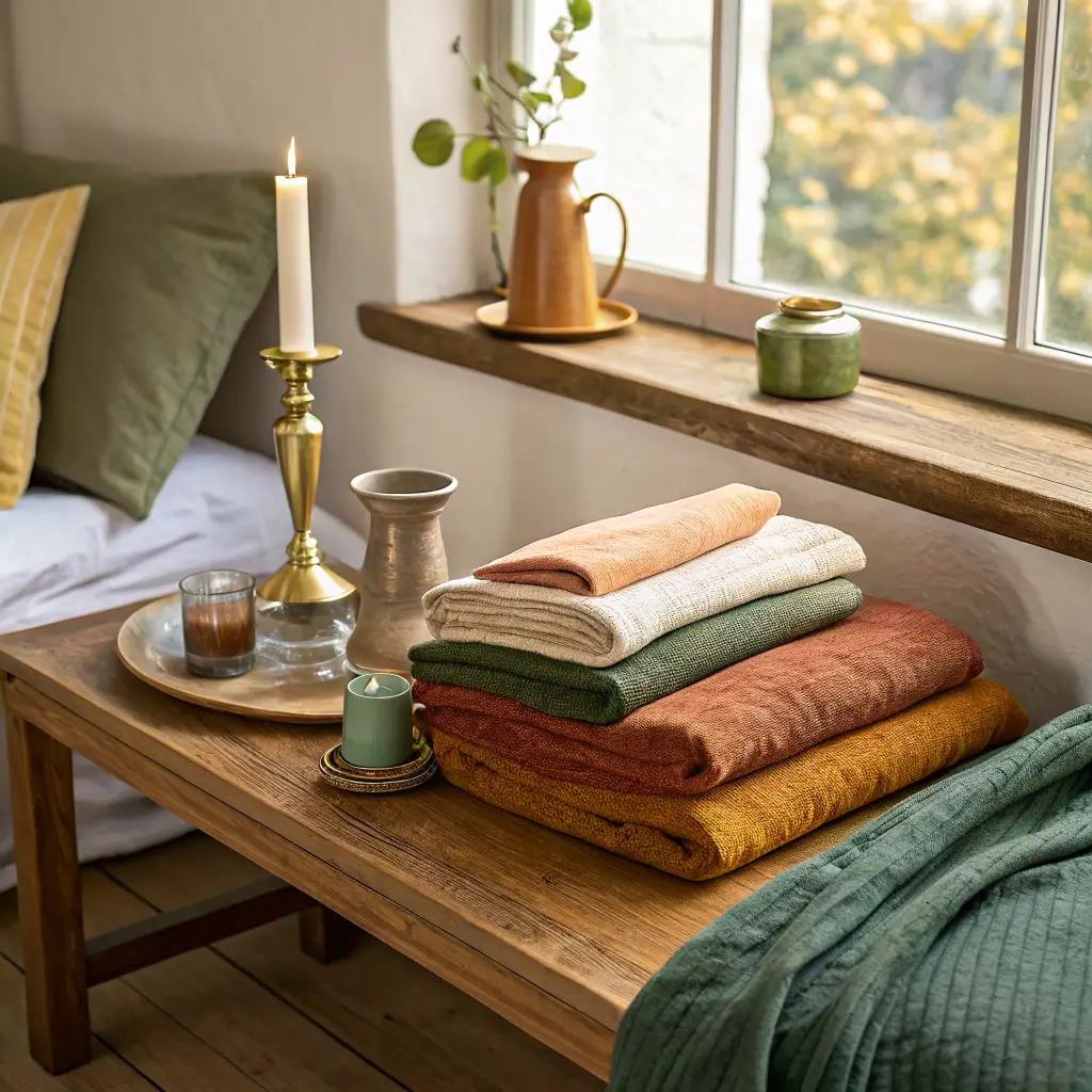
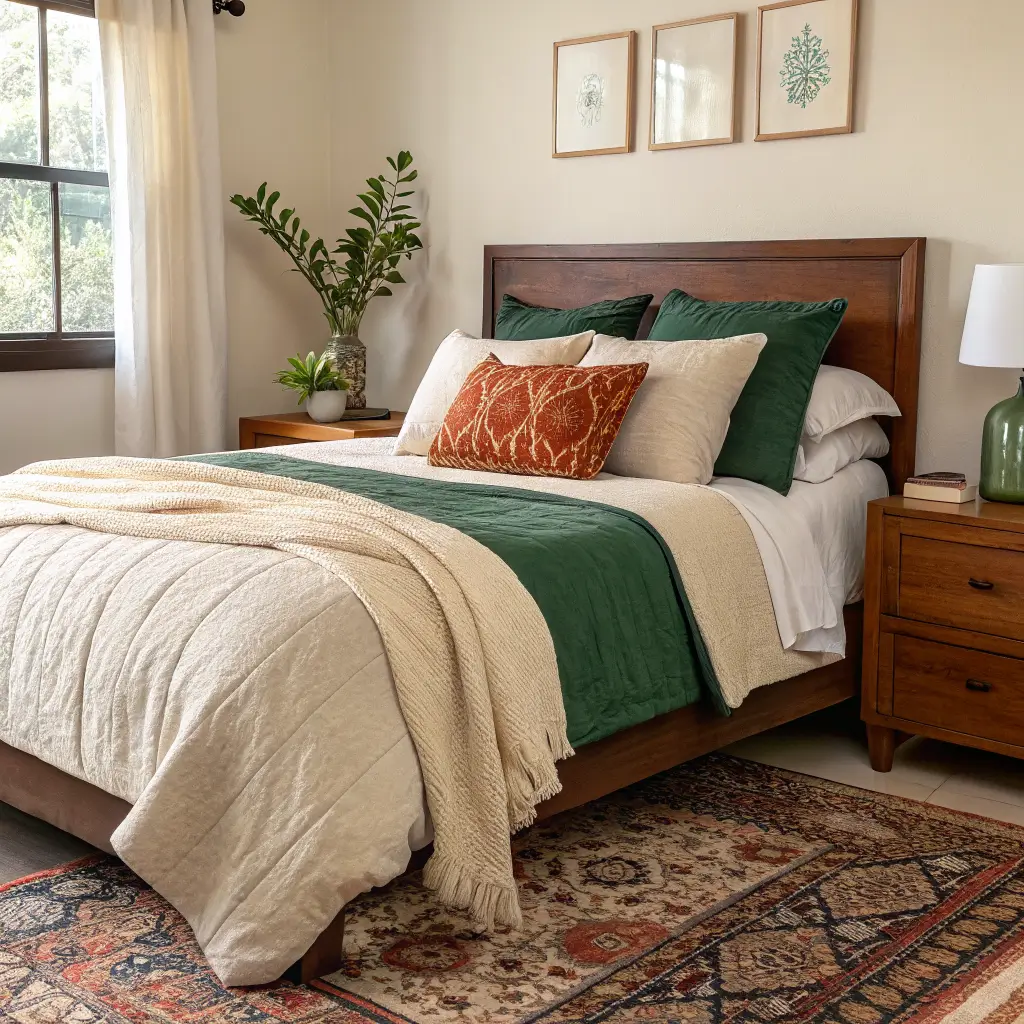
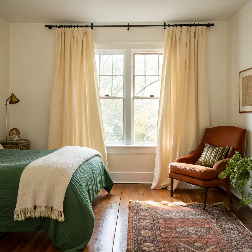
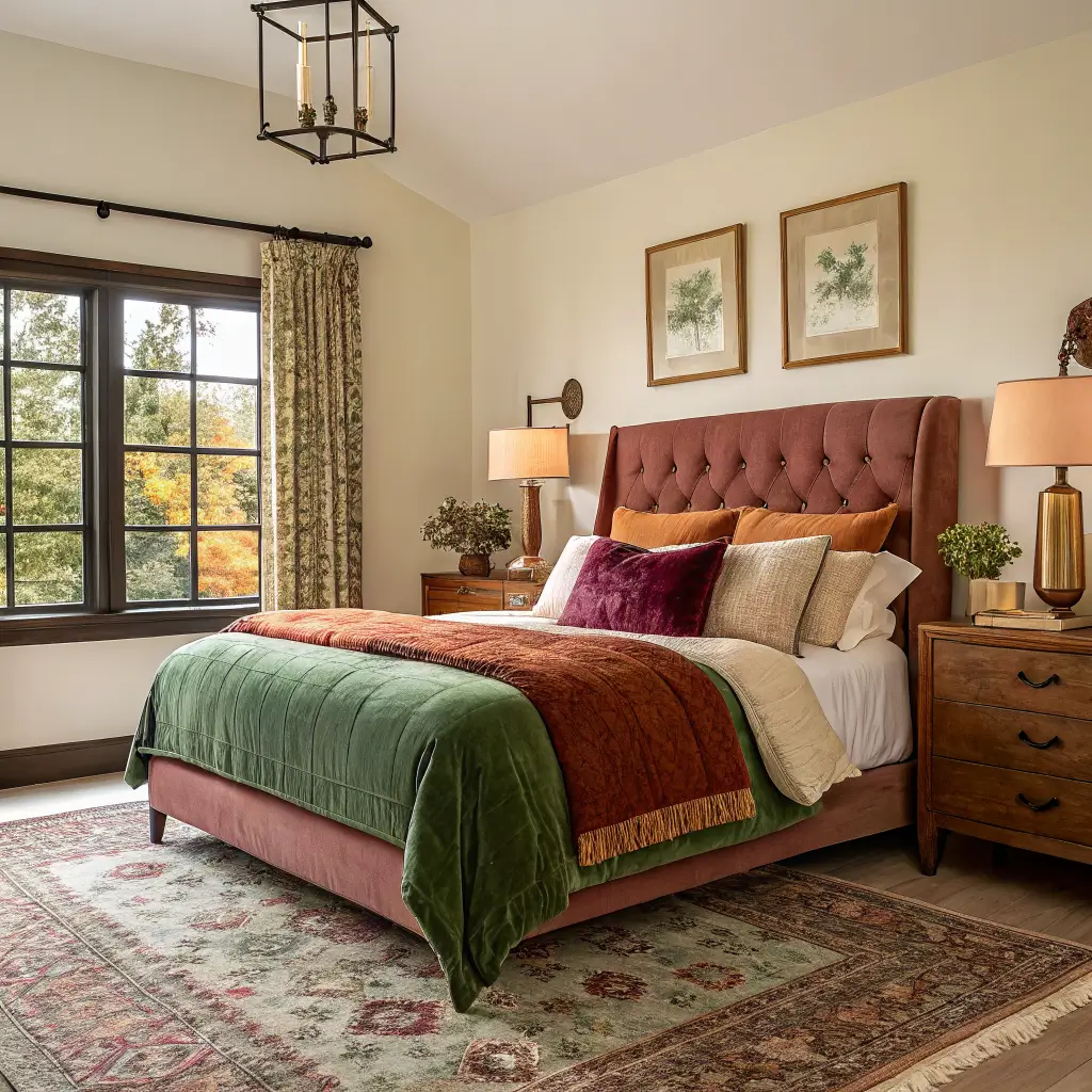
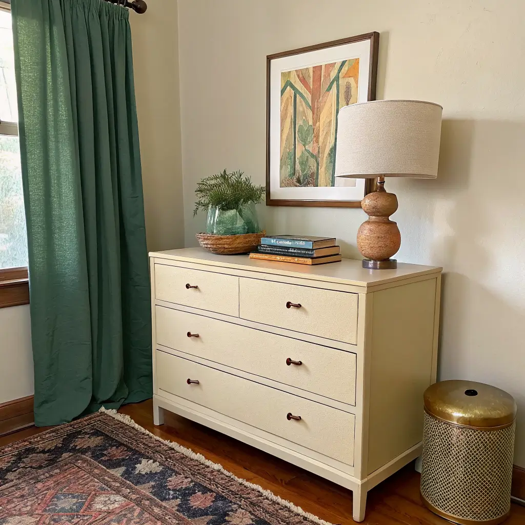
For mine, that’s hunter green (dominant, on the bedding and curtains), warm cream (secondary, on walls and the rug), and a rust-y terracotta (accent, in pillows and one piece of art). Three colors, repeated everywhere, in different materials and scales.
Colors I keep coming back to for cozy rooms:
– Powder blue and navy — quiet, restful, plays well with brass and wood.
– Hunter green and yellow-green — yellow-green is having a moment and looks great with jewel tones.
– Taupe and warm cream — the unsung grounding colors that keep brighter shades from feeling juvenile.
– Rust, ochre, plum, butter yellow — warm accents that add energy without screaming.
The trick: balance one cool tone with one warm tone. All-cool feels chilly. All-warm feels stuffy. A blue room needs a rust pillow. A green room needs a brass lamp.
The Pieces That Actually Make It Work
Bedding (where most of the color lives)
This is the biggest visual surface in the room, so it’s where I spend the most. Layer it like this:
– Sheets: cotton percale if you run hot, sateen if you like a smoother feel, washed linen if you can deal with wrinkles (I can, barely).
– Duvet or quilt: your dominant color goes here.
– Throw at the foot of the bed: in a contrasting texture — wool, boucle, or a chunky knit.
– 2–5 pillows: mix solids with one pattern. For a queen bed, I do two Euro shams in the back, two standard pillows in front, and one lumbar in a pattern. That’s it. More than five and it looks like a hotel.
Headboard
An upholstered headboard in bouclé, velvet, or a sturdy performance fabric is the single piece that changed my room the most. It softens the whole wall. If you’re renting and can’t drill, get one with legs that the mattress weight holds down.
I tried a tufted velvet one in burnt orange first. It was too much — the headboard was competing with the bedding for attention. I swapped it for a simple bouclé in oatmeal and suddenly the colorful bedding could breathe.
The Rug (don’t go too small)
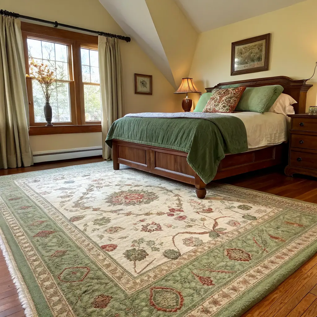
Get the right size or skip it. This is the rule I wish someone had yelled at me earlier.
– Queen bed: minimum 8′ x 10′, with the rug extending at least 18–24 inches past the sides and foot of the bed.
– Full bed in a small room: 5′ x 8′ placed sideways under the lower two-thirds of the bed.
– Anything smaller than 5×8 under a queen looks like a bathmat.
A patterned rug can pull all your colors together. A solid rug gives the room a break. I prefer pattern in a small room because it disguises the fact that the rug isn’t enormous.
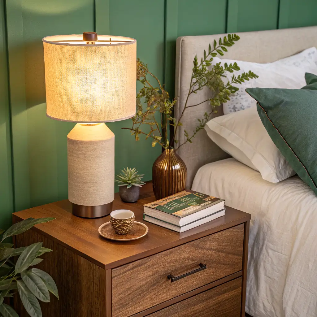
Lighting (the thing most people get wrong)
If you only do one thing from this article, do this: kill the overhead light and use 2700K warm bulbs everywhere.
Cozy colorful rooms fall apart under cool white light. The colors go flat, the textures look cheap, and the whole thing reads like a dorm.
What I use:
– Two bedside table lamps with linen shades and 2700K bulbs on dimmers.
– A plug-in sconce above the bed (the kind with a cord cover — Hudson Valley and Cedar & Moss both make rental-friendly versions for $80–$200).
– A small floor lamp in the corner with a warm bulb for ambient fill.
– The ceiling light gets used maybe twice a month.

Curtains
Lined drapery in linen or velvet, hung 6–8 inches above the window frame and wide enough to puddle slightly or kiss the floor. Bunched-up short curtains will undo all your other good decisions.
How to Actually Put It Together
The order matters. I’ve done this wrong enough times to know.
1. Pick your anchor first. Either paint, rug, or bedding — whichever is the biggest commitment. Everything else gets chosen to relate to it.
2. Measure. Bed wall width, ceiling height, floor area for the rug, window dimensions for curtains. Write it down. Don’t shop without it.
3. Layer the bed in this order: sheets, duvet or quilt, throw, pillows. Step back after each layer.
4. Add lamps and bulbs. Turn them on before you keep styling. The room looks different under warm light, and you want to make later decisions in that light.
5. Style the nightstands sparsely. A lamp, a book, one small object. That’s enough.
6. Hang art last. I made the mistake of buying art first and then trying to match the room to it. Backwards. Let the room tell you what art it needs.
Common Mistakes I’ve Made So You Don’t Have To
– Too many colors, no repetition. If a color appears only once in the room, it looks like an accident. Repeat every color at least twice.
– All bright, no grounding. Color needs neutrals to breathe. Wood tones, cream, taupe, or a soft white wall will save a colorful room.
– Cool light bulbs. I cannot stress this enough. 2700K, always.
– Flat color with no texture. A green duvet and green pillows in the same cotton finish looks unfinished. Mix velvet with linen with boucle with wool.
– Undersized everything. Small rug, short curtains, tiny art. The room reads like it doesn’t fit you.
– Treating one wall as an afterthought. The bed wall is your focal point. Paint, art, wallpaper, or a real headboard — pick one.
Easy Swaps and Seasonal Updates
You don’t need to redo the room twice a year. You need two sets of pillow covers and a different throw.
Fall/winter: swap to deeper tones — rust, plum, hunter green — in heavier fabrics like wool, velvet, mohair. Add a chunky knit throw. If you have rod-pocket curtains, switch to velvet ones for a couple of months.
Spring/summer: lighter cotton or linen pillow covers in fresher tones — butter yellow, sage, washed blue. A waffle-weave throw instead of the wool one. Stems of something green on the nightstand.
Budget-only refresh ($100–$200): new pillow covers, new lampshades, a new throw. That’s genuinely enough to make the room feel different.
If you want to lean into another style
– Boho: add fringe, more natural fibers, a vintage runner layered over the main rug.
– Coastal: swap your dominant color to powder blue, lighten the wood tones, more linen.
– Vintage-inspired: a patterned quilt instead of a duvet, a wood-frame headboard, scalloped lampshades.
– Modern eclectic: keep the palette tight, but add one sculptural lamp and one bold piece of art.
A Note on Quiet Luxury (Without Spending Like It)
The reason designer cozy bedrooms look the way they do isn’t usually the furniture — it’s the bedding weight, the curtain length, the bulb temperature, and the fact that nothing is the wrong size. You can hit most of that with a $400 bedding swap, $30 worth of bulbs, and curtains hung at the right height.
My current bedroom cost under $1,200 to pull together, and the most expensive thing in it is a thrifted dresser I paid $180 for and repainted in a warm cream. The orange velvet headboard is in my sister’s guest room now, where it actually works. Sometimes the mistakes find their right home eventually.
A cozy colorful bedroom is where you end the day, not where you stage a photo shoot. My bedroom has a forest green accent wall, flannel sheets that have been washed so many times they are impossibly soft, and a reading lamp that casts the exact right warmth at 10 p.m. Pick colors that feel like a deep breath, add textures you want to touch, and the room will do what a bedroom is supposed to do, help you sleep.
Conclusion
The cozy colorful bedroom that felt right to me had walls painted a warm white, a duvet in a pattern of coral and mustard, and a single armchair in teal velvet that had been reupholstered twice. The owner had added a string of lights above the headboard, not for reading, but because she liked the way they looked when she woke up at three in the morning and could not get back to sleep. The room was not decorated. It was inhabited. And that is what makes a bedroom cozy — the evidence that someone actually sleeps there.