The Look, and Who It’s Actually For
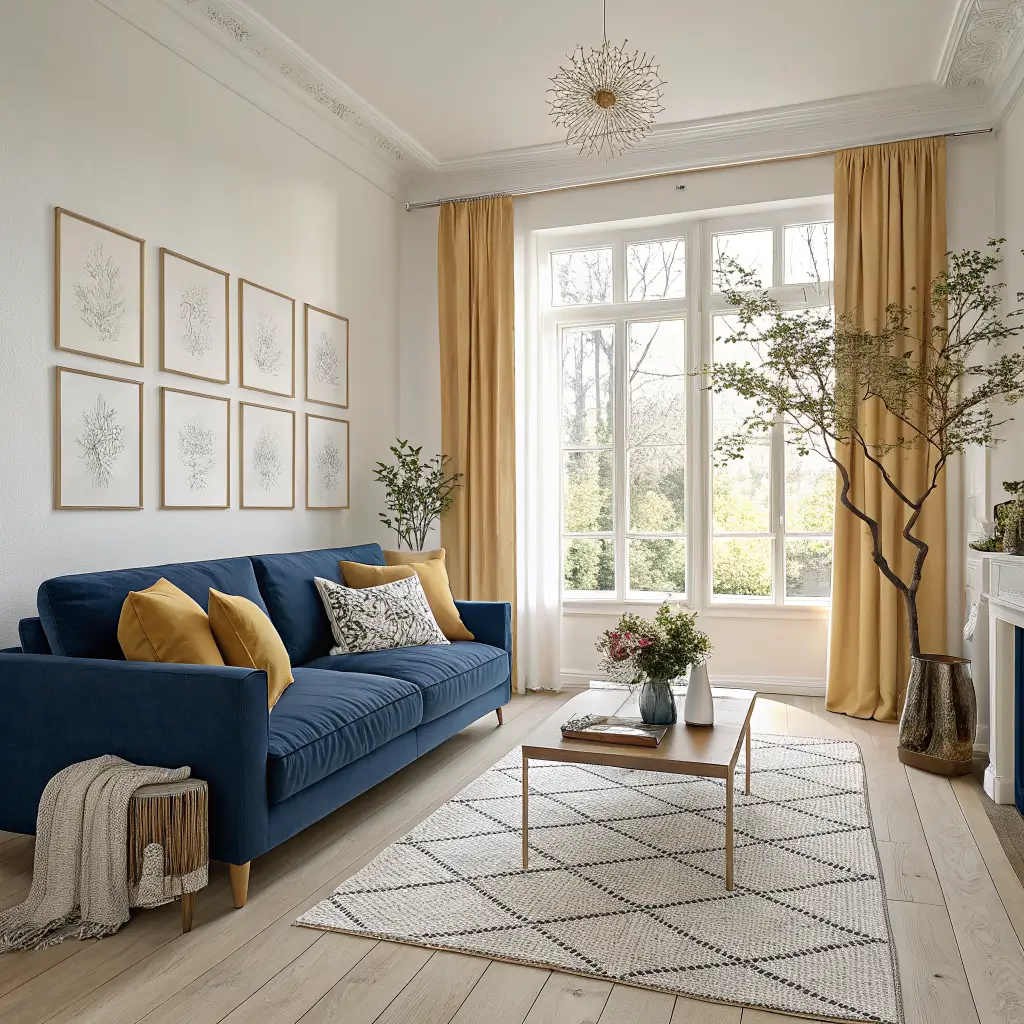
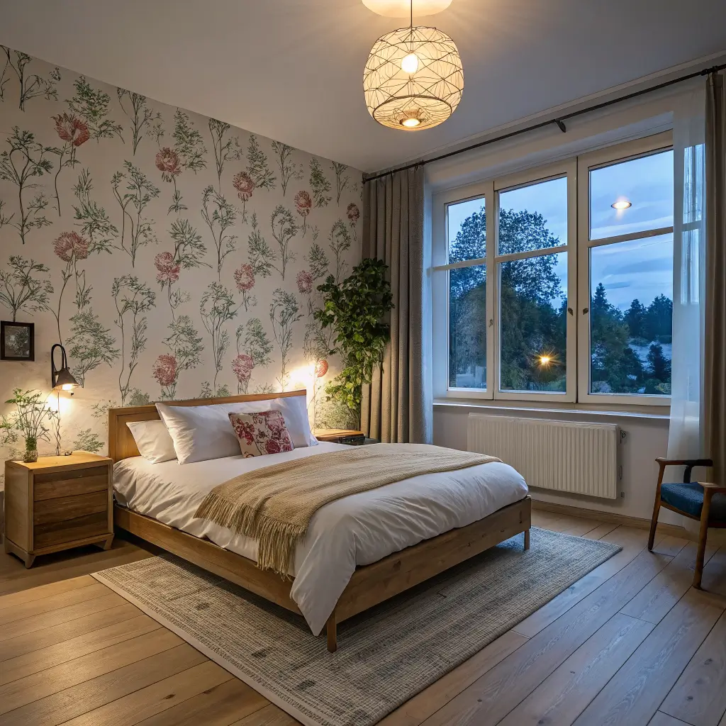
Think of this as Scandi minimalism with the volume turned up two notches. Clean lines, blonde wood, light-filled rooms, integrated storage — all of that stays. What changes is the palette: instead of white-on-white-on-oat, you get cobalt sofas, duck-egg walls, mustard cushions, a Josef Frank-style botanical print behind the bed.
It suits you if:
– You like art and pattern but hate clutter
– You rent and can’t gut-renovate, but you can repaint and swap textiles
– You’ve tried gallery-wall maximalism and found it stressful to look at
– You want a room that works year-round but can shift with the seasons
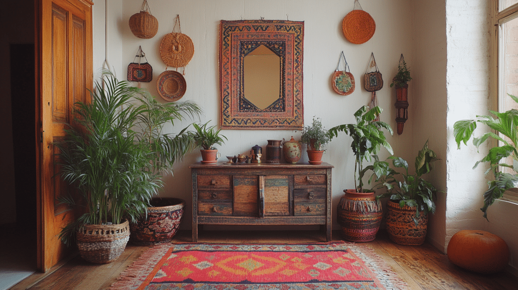
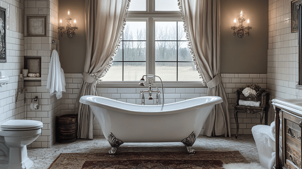
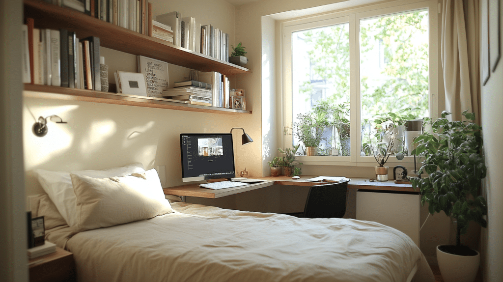
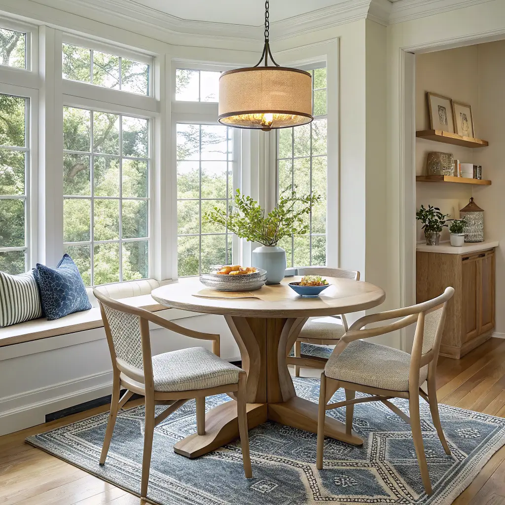
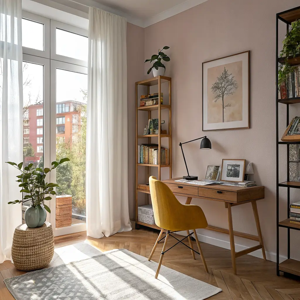
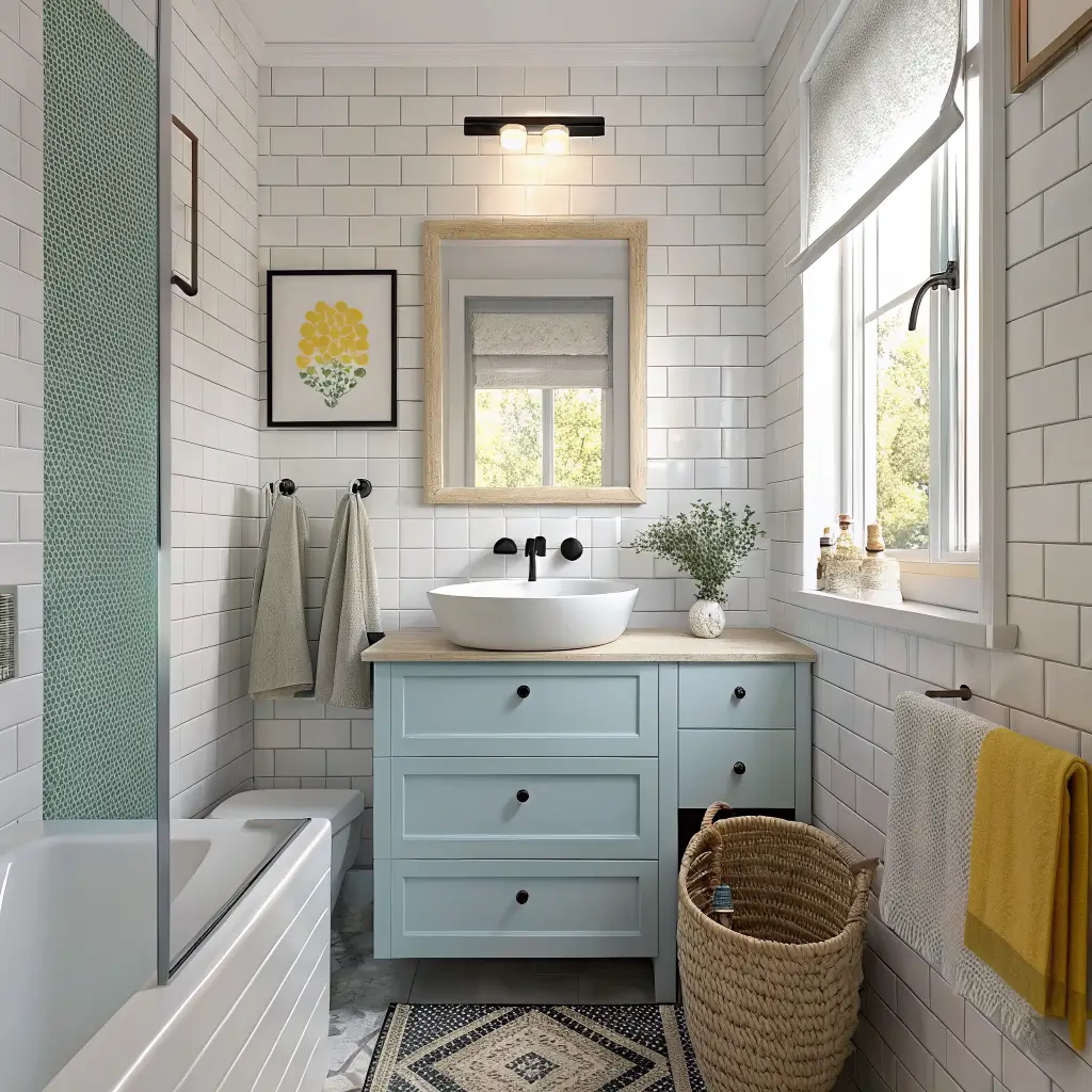
It works in living rooms, bedrooms, dining nooks, home offices, small bathrooms, and entryways. Especially good in small to medium rooms because the restraint built into Scandi design keeps tight spaces from feeling crammed.
Time to put it together: 1–3 days for a styling refresh; 1–3 weeks if you’re painting walls, hanging wallpaper, or waiting on a rug.
Realistic budget: $200–$800 for a textile-and-art level refresh. $1,000–$4,000+ if you’re adding a rug, curtains, a lamp, and an accent chair. Decent Scandi-style graphic rugs in a 5×8 sit around $300–$700; a designer accent chair will eat most of your budget on its own.
The Pieces That Actually Make It Work
If I had to rank what matters most, in order:
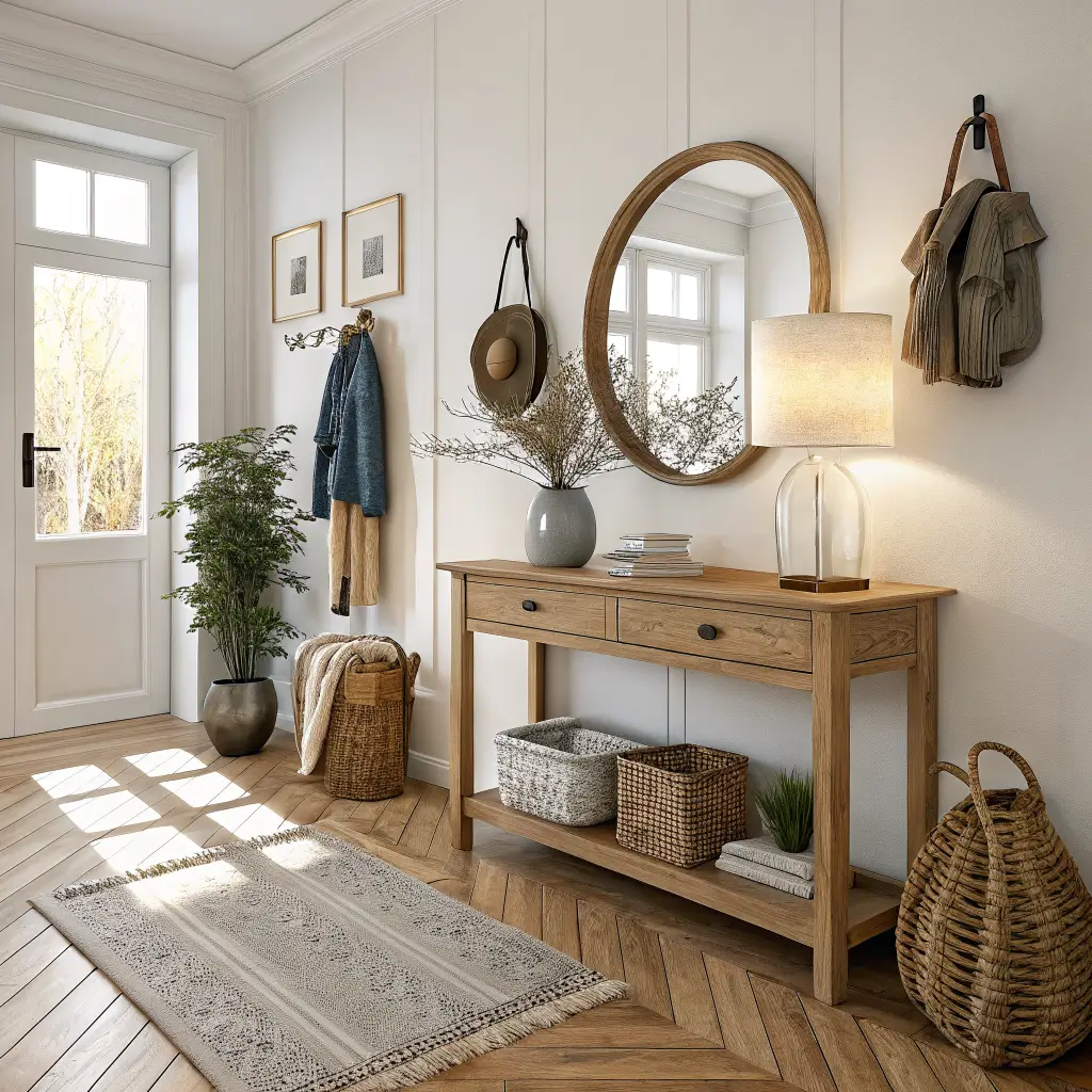
1. A colorful patterned rug. This is the anchor. Go graphic — color blocking, abstract shapes, or a strong geometric. A plain jute won’t do the work here.
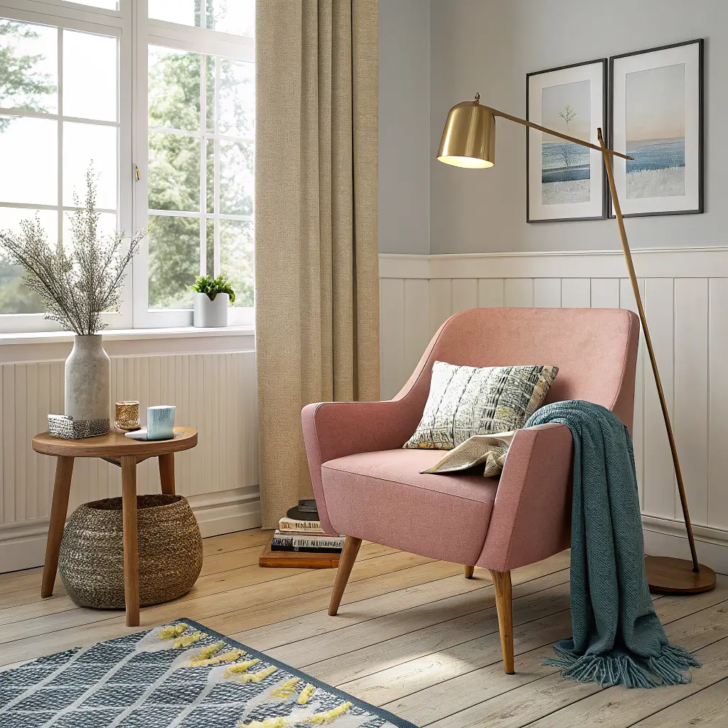
2. One bold upholstered piece. A cobalt sofa, mustard accent chair, rust loveseat, or dusty pink reading chair. One. Not three.
3. Light wood furniture. Oak, birch, ash, or pine for the coffee table, sideboard, and dining chairs. This is what keeps the room reading as Scandi instead of just “colorful.”
4. A feature wall or wallpaper moment. Optional but high-impact. A Josef Frank-inspired botanical wallpaper on one wall, or a painted accent (I did the back of my open shelving in a soft celadon and it changed the whole room).
5. Layered textiles. Linen curtains, a wool throw, cotton cushions in stripes or checks. Mix two patterns max per seating area.
6. Sculptural lighting. Paper lantern pendants, linen drum shades, frosted glass globes. Clean shapes, warm bulbs (2700K, nothing cooler).
7. A few mirrors and framed prints. Abstract or botanical. Skip the inspirational quote stuff.
8. Closed storage. Cabinets with doors, not open cubbies overflowing with magazines.
The Color Palette: Pick Three, Maybe Four
This is where most people go off the rails. They see a colorful Scandi room on Pinterest, count six colors, and think “great, I’ll do six colors.” Those rooms only look effortless because every color is repeating in at least two places.
Stick to three or four colors total, including your neutrals.
A formula that works:
– One warm neutral base: warm white, oat, or pale beige on walls
– One blonde wood tone: oak or birch, repeated across furniture
– One dominant accent: cobalt, forest green, burnt orange, mustard, or dusty pink
– One supporting accent: a quieter companion — pale yellow with cobalt, celadon with rust, duck-egg with charcoal
My own combination ended up being warm white walls, oak floors and furniture, cobalt as the dominant (sofa and one print), and pale yellow as the supporting note (a lamp base, two cushions, and the spines of a small stack of books I keep on the coffee table because I’m vain).
How to Build It, Step by Step
I’ve rearranged my living room maybe four times getting this right. The order matters.
Start with the floor. Lay the rug first. Everything else gets chosen against it. I bought my sofa before the rug the first time and spent six months trying to make a teal rug not fight my mustard cushions. Don’t do this.
Add the wood base next. Coffee table, sideboard, dining chairs. Keep tones in the same family — don’t mix orange-red cherry with cool grey oak.
Then bring in your one big color statement. Sofa, accent chair, painted cabinet, or wallpaper panel. Just one.
Echo that color in two or three smaller places. A vase, a book spine, a framed print, a candle. This repetition is what makes the room read as intentional rather than random.
Layer texture. Linen curtains, a chunky wool throw, a ceramic vase, a rattan basket. The texture is what saves you from a flat-looking room when you’re working with a restrained palette.
Finish with lights and one or two plants. A tall plant in an empty corner — a 5-foot ficus or a leggy olive tree — fixes most “something feels off” problems. Lamps in at least two heights per room, never just the overhead.
Where to Spend, Where to Save
Spend on:
– The rug. It’s doing the most work and cheap rugs look cheap fast.
– Lighting. A good paper pendant ($150–$400) reads as designed; a $30 one reads as dorm room.
– The accent chair or sofa, if it’s your hero piece.
Save on:
– Cushion covers. IKEA, H&M Home, and secondhand do this fine.
– Art. Print-on-demand sites, estate sales, your own framed photographs.
– Vases and ceramics. Thrift stores are full of them. The 1970s stoneware vase on my mantel cost $4 and gets more compliments than anything else in the room.
– Curtains. Plain linen panels from IKEA work great if you hem them properly and hang the rod close to the ceiling.
The Mistakes I See (and Made)
Too many colors. Five accent colors isn’t colorful Scandi — it’s a confused room. Three to four total, repeating.
Skipping the neutral base. If your walls are pink and your sofa is green and your rug is patterned and your wood is dark walnut, you’ve left Scandinavia entirely. The calm foundation is what makes the color feel joyful instead of frantic.
Putting color only in tiny things. A few colorful cushions on a beige sofa in a beige room isn’t a colorful Scandi interior. You need color in at least one substantial piece — a rug, a chair, a curtain, or a wall.
Overloading shelves. Negative space is part of the style. If your shelves look like a gift shop, edit. I follow a loose rule: each shelf gets about one-third empty space.
Forgetting texture. Color without texture goes flat under photos and in real life. Linen, wool, ceramic, raw wood, woven rattan — at least four different textures in a room.
Cool-toned lightbulbs. This kills the whole mood. Use 2700K bulbs, warm white, every fixture. Daylight bulbs make even the prettiest room look like a dentist’s office.
Seasonal Swaps That Actually Look Different
The base stays. The textiles change.
Spring/summer:
– Lightweight linen and cotton throws
– Tulips, ranunculus, or branches of flowering quince
– Lighter accent cushions — pale yellow, soft pink, celadon
– Sheer curtains pulled fully open
Fall/winter:
– Sheepskin draped over a chair
– Chunky wool or mohair throws
– Deeper accents — forest green, rust, charcoal
– More candles, lower lamp light
– Heavier curtain panels in duck-egg or charcoal
Budget-Friendly Updates When You’re Bored
– Repaint the back of your open shelving in a saturated color. Half a sample pot, two hours, totally different room.
– Swap cushion covers seasonally. Keep the inserts.
– Change one lampshade. A linen drum in a new color shifts a whole corner.
– Paint a single interior door. I painted my hallway closet door in a soft yellow and it became the best thing in the apartment.
– Reframe existing prints in oak or natural wood frames if you have black ones. Instantly more Scandi.
Crossover Ideas If You Want to Bend the Style
Scandi-Boho: Add more rattan, a Berber-style rug, macramé in restraint. Keep the neutral base strict so it doesn’t slide into full bohemian.
Scandi-Coastal: Lean into pale blues, sandy beiges, lots of linen. Skip the rope-and-shell clichés and let texture carry the coastal feeling.
The rule across both: minimal base, then add one direction’s color and texture story. Don’t try to do all three.
The reason colorful Scandinavian works as a long-term style — not just a phase — is that the bones are calm enough to live with for years, and the color is concentrated enough that you can swap it without redoing the whole room. That’s the part I wish someone had told me before I bought the teal rug.
A colorful Scandinavian interior works because the calm base lets the color breathe instead of competing for attention. My living room is mostly white oak and soft gray, but the mustard throw on the sofa and the terracotta vase on the shelf are what my eye goes to every single morning. Start with the quiet, add the color sparingly, and the room will feel both peaceful and alive.
Conclusion
The colorful scandinavian interior that worked for my friend had white walls, pale wood floors, and a single bright orange sofa that looked like it had been dropped there by accident. But the sofa was the reason the room worked — it gave your eye somewhere to land in all that calm. She had added a blue throw, a green plant, and a yellow ceramic bowl, and the room felt like a Scandinavian summer — long days, bright moments, and the quiet in between.