What You’re Actually Signing Up For
A colorful living room is what most people actually want when they say they’re “tired of beige,” but the leap from all-neutral to full color is where things go sideways. I’ve done it twice in my own apartment — once badly, once well — and the difference came down to restraint, not bravery.
Here’s how I’d plan it now, including what to spend on, what to fake, and the mistakes that cost me a weekend and a non-returnable rug.
A “colorful” room doesn’t mean every surface shouts. The version that works in 2025 is curated color — a strong palette of three to five hues, repeated deliberately, with enough breathing room that your eye isn’t doing wind sprints.
Time-wise:
– Color refresh (pillows, art, rug, throws): one weekend, shopping included.
– Mid-range restyle (paint plus a furniture swap or two): two to four weekends, mostly waiting on deliveries.
– Full overhaul (wallpaper, custom upholstery, repainted trim): a month or more.
Rough budgets I’ve actually seen hold up:
– Refresh: $250–$800. Pillow covers run $15–$40, framed prints $25–$80, a 5×8 polypropylene rug $120–$250.
– Mid-range: $1,500–$3,500. Colorful three-seat sofa $600–$1,500, an 8×10 wool rug $300–$800, accent chair $200–$600, two to three gallons of decent interior paint $80–$180.
– High end: $6,000–$15,000+. Velvet designer sofa $2,500–$6,000, hand-knotted rug $1,500–$6,000, designer wallpaper feature wall $500–$2,000 installed.
This style works in everything from a 120-square-foot studio nook to a 450-square-foot open-plan room. The strategy shifts: small rooms need one bold hero and a tighter palette; bigger rooms can handle color-blocked walls and multiple accent zones.
Who This Look Is For
Renters who want impact without losing a deposit. Families whose white sofa already has a juice incident on it. Anyone who films or photographs at home and is sick of the same gray backdrop. And honestly, anyone who walked into a beige builder-grade living room and felt nothing.
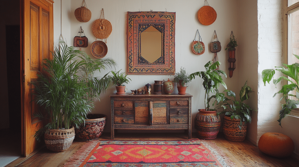
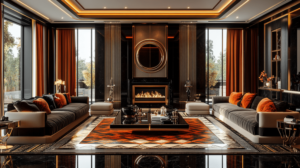
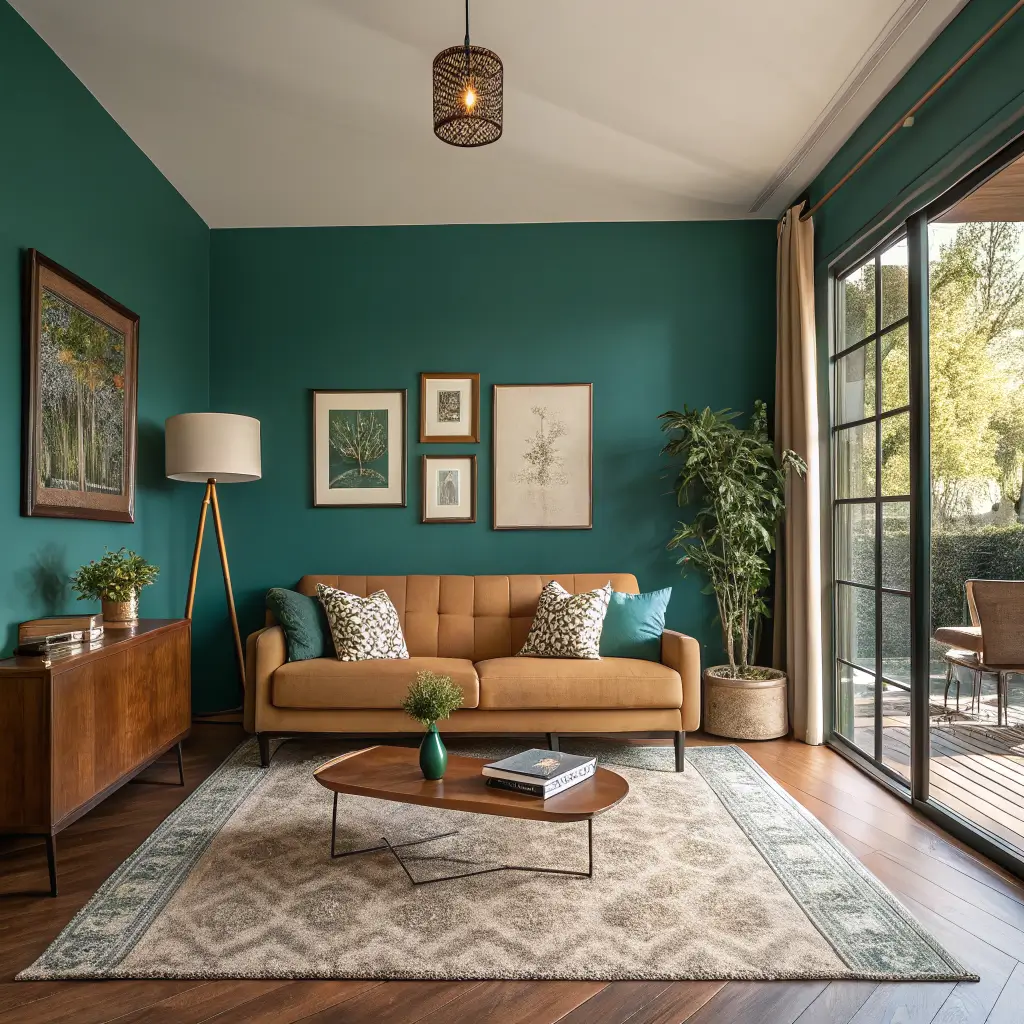
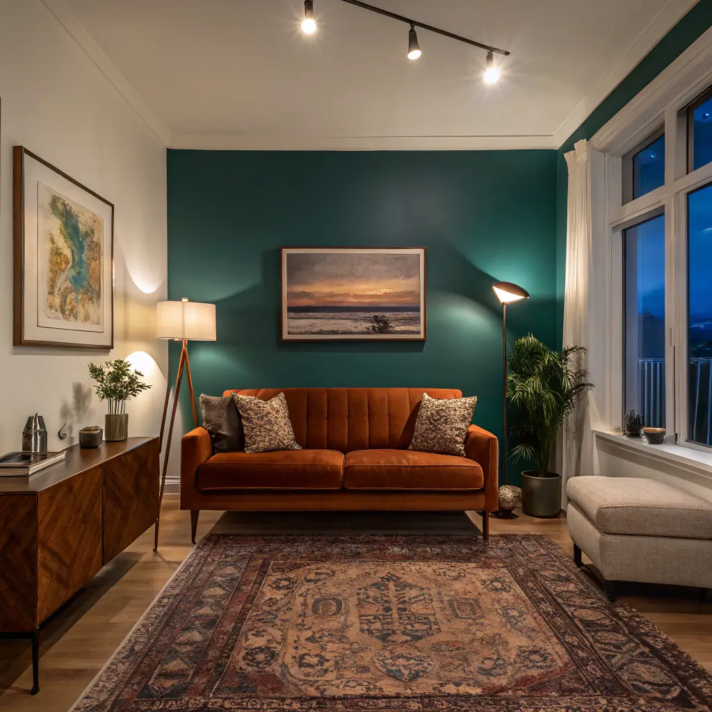
It leans eclectic, modern boho, mid-century, or maximalist depending on how you shape it. The unifying idea is what designers have been calling “colorful but curated” — saturated palettes with real negative space (the empty wall and floor areas that let the color breathe).
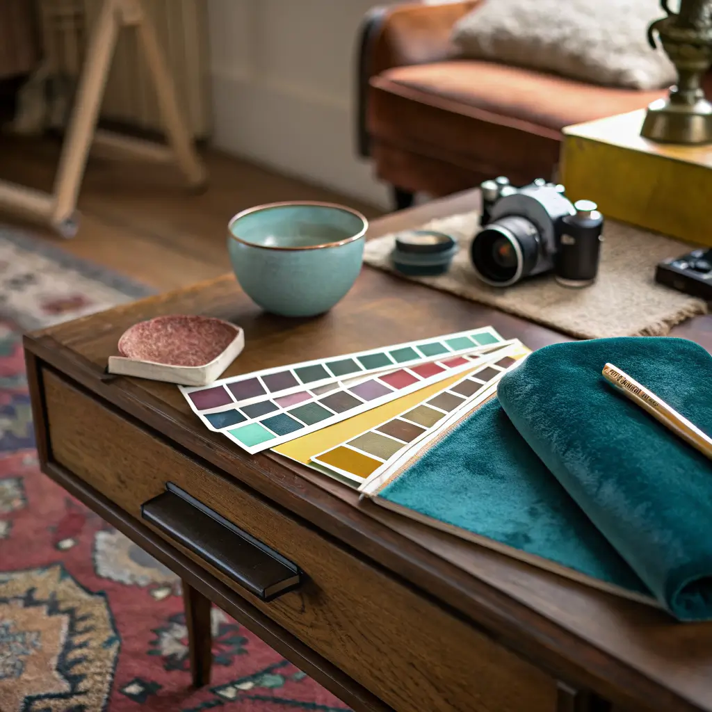
The Palette: Pick a Direction First
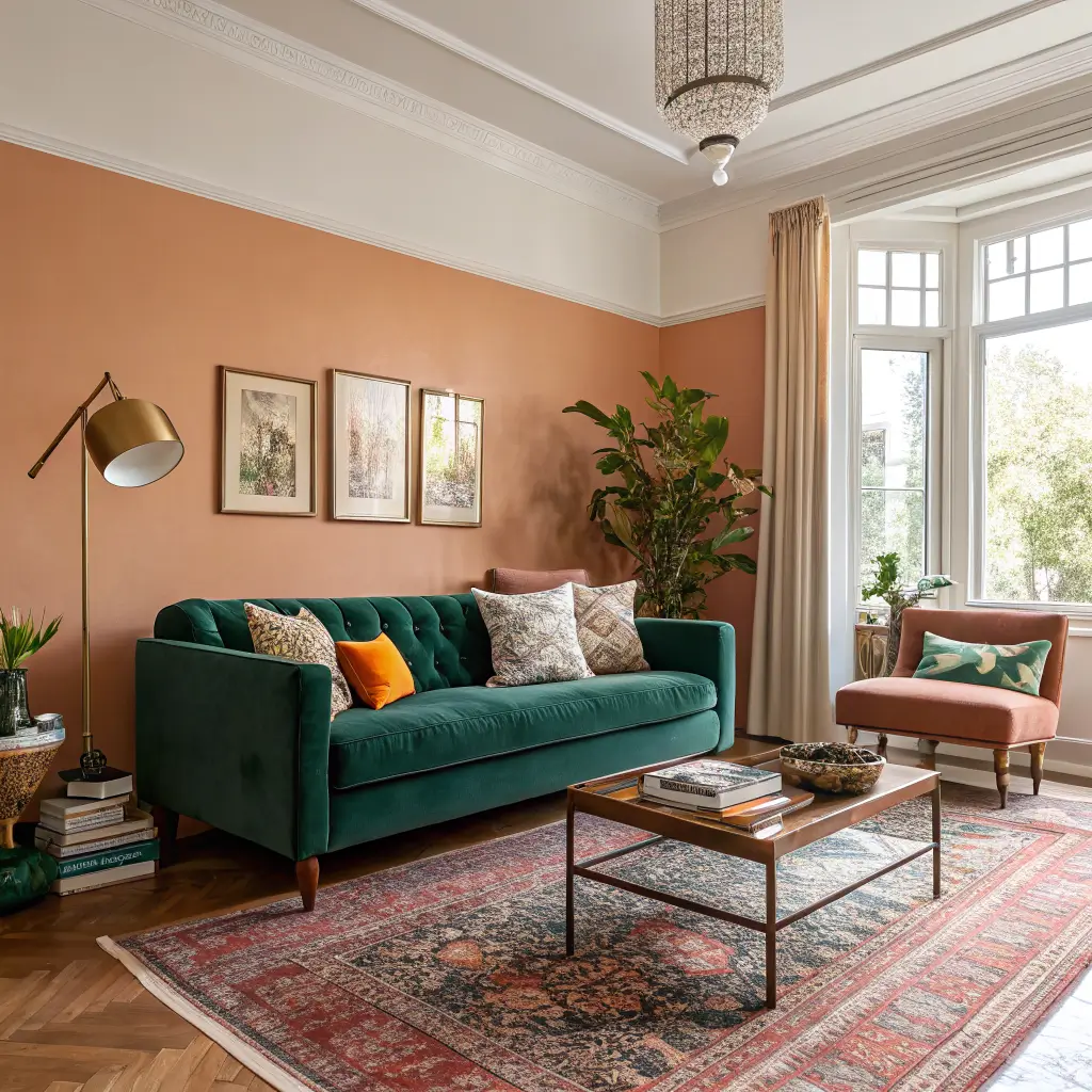
This is where I went wrong the first time. I bought a teal velvet sofa, a mustard chair, a pink rug, and a green wallpaper sample — all things I loved individually — and the room looked like a paint store exploded.
Pick a temperature lane before you buy anything else:
– Warm-centered: terracotta, turmeric, marigold, coral, tomato red, dusty rose.
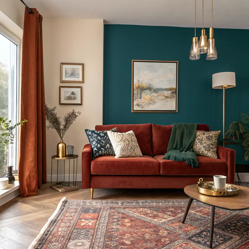
– Cool-centered: emerald, deep teal, sapphire, sage, amethyst, denim blue.
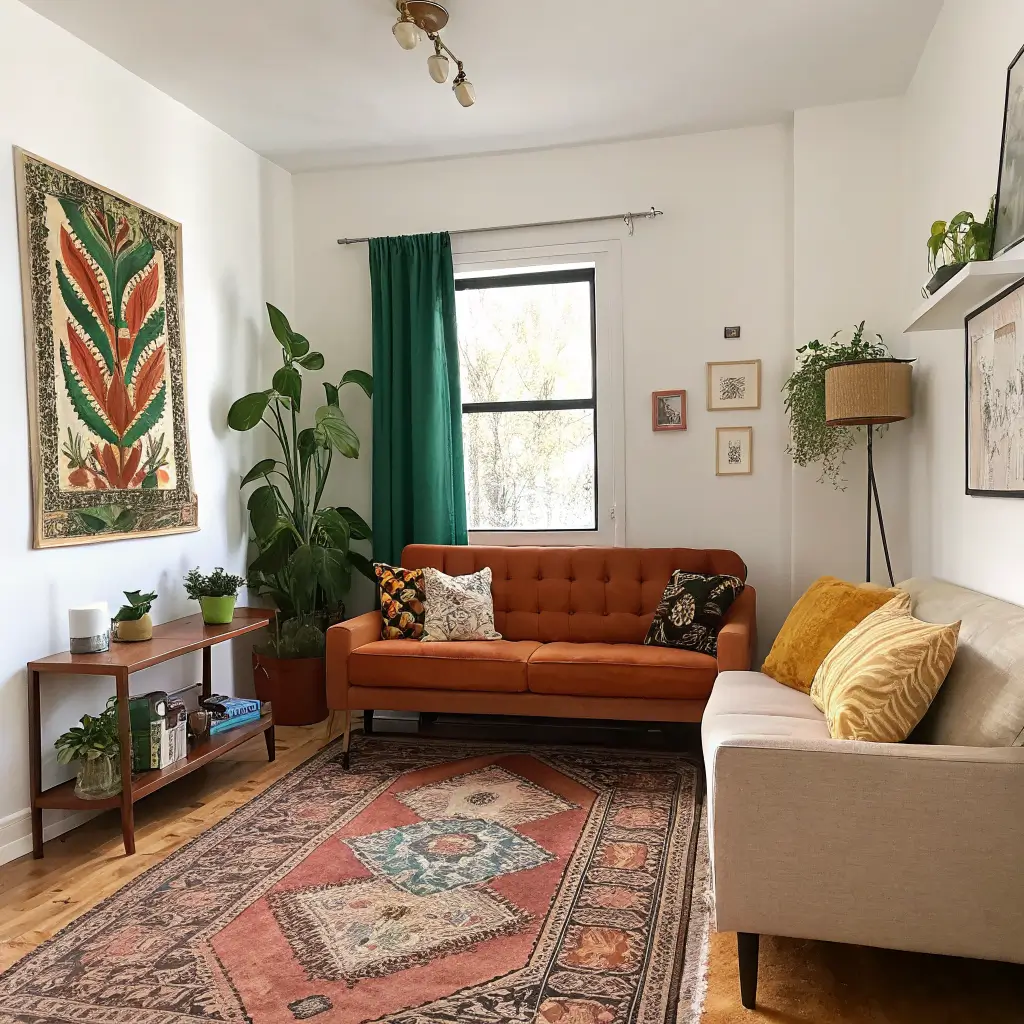
– Jewel-tone mix: emerald + ruby + sapphire on rich neutrals (works year-round and photographs well).
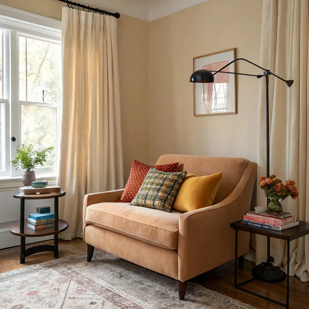
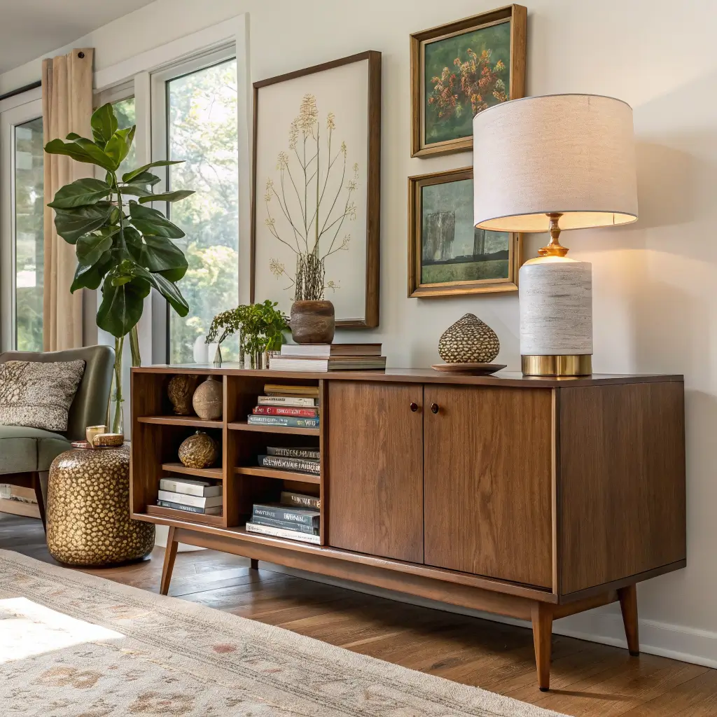
Then pick one anchor neutral — cream, camel, charcoal, or black — that runs through the hard pieces (media console, coffee table, lamp bases). That neutral is what lets the colors stop fighting.
My rule of thumb: three to five colors, max. Each one has to appear at least three times in the room — pillow, vase, book spine, art. If a color only shows up once, it reads as a mistake.
The Pieces That Carry the Look
Hero pieces (pick one or two, not all four)
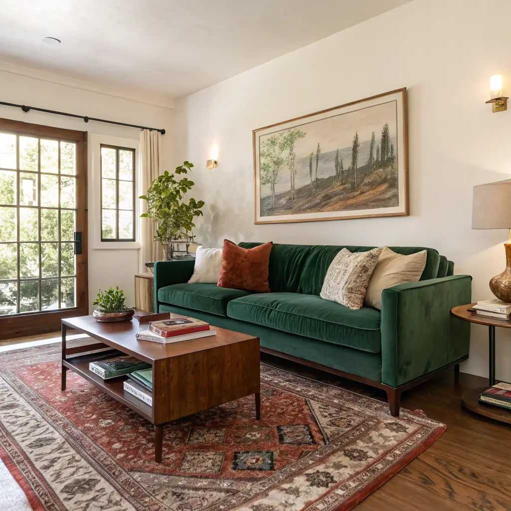
– A colorful sofa. Standard three-seaters run 80–90″ wide; apartment versions 70–78″. Emerald, cobalt, rust, berry pink, and mustard are the ones I see holding up over time.
– A bold rug. 5×8 for small rooms, 8×10 or 9×12 for anything larger. Vintage Persian-inspired, Moroccan, or abstract color-wash all work. Front legs of the sofa go on the rug — a too-small rug is the single most common scale mistake I see.
– A statement chair. Barrel, mid-century, or swivel in velvet or a pattern. $200–$800 mid-market.
– One oversized piece of art (24×36 or larger) or a 6–9 frame gallery wall.
You don’t need all of these. One hero plus a supporting cast beats four heroes elbowing each other.
The supporting layer
– Pillows: 20–22″ squares for sofas, a lumbar or two for shape. Mix solids, one geometric, one organic pattern. Three to five pillows total — more than that and it starts looking like a furniture showroom.
– Curtains: floor-length, hung 6 inches above the window frame and 6–12 inches wider on each side. This is the single cheapest move that makes a room look intentional.
– Coffee and side tables: wood or black metal to ground the color. If you want a pop, go lacquered or tinted glass.
– Lighting: at least three sources — overhead, a floor lamp, a table lamp. Bulbs in the 2700–3000K range. Cool white bulbs make jewel tones look muddy; I learned this after wondering why my emerald sofa looked gray for a month.
Accessories that earn their spot
– A large plant in the dead corner past the sofa (a 4–5 foot fiddle leaf, bird of paradise, or fake if your light is bad — no shame).
– Books grouped by spine color, not author.
– Two or three ceramic objects clustered on a tray. Clusters of odd numbers read as styled; pairs read as forgotten.
How to Put It Together
The 60-30-10 split
– 60% dominant color — usually walls or the rug.
– 30% secondary — sofa and main seating.
– 10% accent — pillows, art, smaller objects.
This is the framework. Break it on purpose, not by accident.
Pull your palette from one pattern
Easiest trick I use: find a rug, large art piece, or fabric that already contains three or more colors you love. Pull your wall paint, upholstery, and accent tones directly from it. The work has been done for you.
Mix pattern scales
One large-scale pattern (rug or curtains), one medium (pillows), one small (a throw or ottoman). Three patterns at three scales reads layered. Three patterns at the same scale reads like a mess.
Pick one focal wall
The wall behind the sofa, behind the TV, or around the fireplace. That’s where the boldest move goes — deepest paint color, wallpaper, or the gallery wall. The other walls support it.
Hang art at eye level
Center of the artwork at 57–60 inches from the floor. Over a sofa, the bottom of the frame should sit 6–10 inches above the cushions. Art hung too high is the dead giveaway of an amateur job.
Where to Spend, Where to Save
Spend on:
– The rug. A bad rug ruins a good room. Wool wears better and looks more expensive — even a $400 wool rug beats a $250 synthetic one in five years of foot traffic.
– The sofa. A colorful sofa you’ll keep for ten years is worth real money. A trendy one you’ll hate by spring is not.
– Lighting. Three good lamps will do more than a dozen cheap accessories.
Save on:
– Pillow covers (not inserts). Buy quality down or down-alternative inserts once, then swap covers seasonally for $15–$30 each.
– Art. Etsy prints, vintage posters, secondhand frames. The frame matters more than people think — a $20 print in a $60 frame looks like a $200 piece.
– Side tables and accessories. Thrift stores, Facebook Marketplace, estate sales. My favorite side table is a $12 brass thing I found at a church sale and sprayed with clear lacquer.
The Mistakes I Made (So You Don’t Have To)
Rainbow with no repetition. First attempt: every color appeared exactly once. Fix it by repeating each hue at least three times around the room.
Ignoring undertones. A cool blue sofa against warm yellow-beige walls looked like two rooms pretending to be one. Match temperatures, or commit to one deliberate high-contrast pairing and echo it in the art.
All pops, no anchor. A neutral base with a million little colorful things looks busy and accidental. You need at least one big colorful piece — rug or sofa — to make the small stuff read as a system.
Wrong bulbs. 4000K daylight bulbs murder warm palettes. Switch to 2700K and watch the room come back to life.
Too-small rug. If your rug looks like a postage stamp under the coffee table, it’s too small. Front legs of the sofa on the rug, minimum.
Overstuffing. Once the room is “done,” remove 10–20% of what’s on display. I do a final pass where I take three things off the coffee table and shelves. It always looks better.
Renter-Friendly Versions
You can get 80% of this look without touching a wall:
– Peel-and-stick wallpaper behind a bookshelf or on one wall — comes off cleanly if you do it right.
– Large-scale art or a fabric panel hung as the focal point instead of paint.
– A colorful rug as the dominant color — wall stays landlord-white, rug does the talking.
– Tension-rod curtains in a saturated solid that picks up the rug.
I lived two years in a rental where the only “permanent” color was a $180 peel-and-stick mural behind the sofa. Got my deposit back. Took 40 minutes to remove.
Easy Seasonal Updates
– Spring/summer: linen pillow covers in citrus and pastel, lighter throws, fresh stems.
– Fall/winter: velvet and wool covers in burgundy, forest, navy; heavier knit throws.
– Annually: swap one piece of art over the sofa. New color story, $40.
If you want to push further without repainting the whole room, paint just the interior doors, baseboards, or window trim in a contrast color. A black door in a sage room. A blush trim in a cream room. It looks like you hired someone.
Quick Answers to the Things People Ask Me
Will a colorful living room date quickly? Not if the bones are good. Jewel tones, terracotta, deep teal, and sage have been around for decades and aren’t going anywhere. Trend-chasing neon and a very specific shade of millennial pink — those date. Classic saturated colors don’t.
Sofa color or wall color — which should be louder? Pick one. If you go bold on the sofa, keep walls in a supportive warm white, greige, or soft tint. If you color-drench the walls, the sofa can be a mid-tone bridge (camel, oatmeal, sage). Both screaming at once is what made my first attempt look unhinged.
Best paint finish? Matte or eggshell for walls, satin or semi-gloss for trim and doors. Saturated colors in flat finishes read richer; trim in satin gives you the crisp line that holds the whole room together.
Can a small room handle this? Yes — but tighter palette, one hero piece, and more negative space. Counterintuitively, going darker on the walls in a small room often makes it feel bigger and more deliberate than a pale color trying to “open it up.”
Start with the palette, buy the rug first, and don’t trust anything under a 4000K bulb. The rest is just paying attention.
A colorful living room should feel like the center of your home, not a display case. Our sofa is a deep moss green that hides dog hair surprisingly well, the rug has a pattern busy enough to forgive spilled snacks, and the amber glass lamp was my grandmother is. Pick pieces that can handle real life, and the color will feel like a natural part of the story instead of a costume the room is wearing.
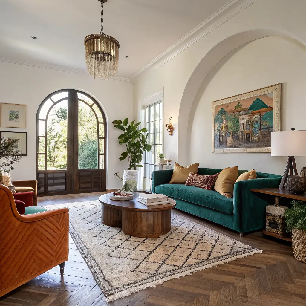
Conclusion
The colorful living room that convinced me this look works had a charcoal sofa, a single armchair in emerald velvet, and a rug in a geometric pattern of navy and coral. The walls were white, the art was black and white photography, and the only other color was a single brass lamp that caught the afternoon light. The room felt alive because the color was concentrated, not scattered, and every piece had been chosen to talk to the others.