Who This Look Is For
This works if you’ve got a mostly neutral house and you’re itching to do something brave somewhere. It also works if you entertain and want guests to walk out of the bathroom slightly stunned. And it’s ideal for renters — peel-and-stick wallpaper and a swapped mirror can carry the whole room without touching anything permanent.
The footprint we’re talking about is the standard powder room: 15–20 square feet, often 3’x5′ or 4’x5′. The smaller it is, the more dramatic you can be. That sounds backward, but it’s the truth — a tiny room can absorb a saturated color the way a big living room can’t.
What It’ll Cost You
Three honest tiers:
Budget refresh ($250–$800): paint ($40–$80), peel-and-stick wallpaper ($60–$200), a new mirror ($50–$150), and accessories ($100–$300). One weekend.
Mid-range makeover ($1,000–$3,000): designer wallpaper ($200–$800), a painted or new prefab vanity ($400–$1,000), a real faucet ($150–$400), and a pair of sconces ($150–$600). Two to five days, plus an electrician for an afternoon.
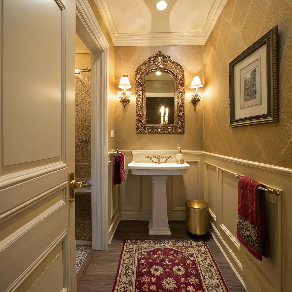
Jewel-box build ($3,000–$12,000+): stone vanity in something like Calacatta Viola or a green marble ($1,500–$6,000+), hand-painted or grasscloth wallcovering ($1,000–$4,000+ installed), and designer brassware.
The thing nobody tells you: the mid-range tier is the sweet spot. Paying $400 for wallpaper in a room this small still totals under $200 in actual paper. The luxury feel comes from the idea of paying for the good stuff in a space where you only need a few rolls.
The Style Directions That Actually Work
I’d pick one of these and commit, rather than mixing:
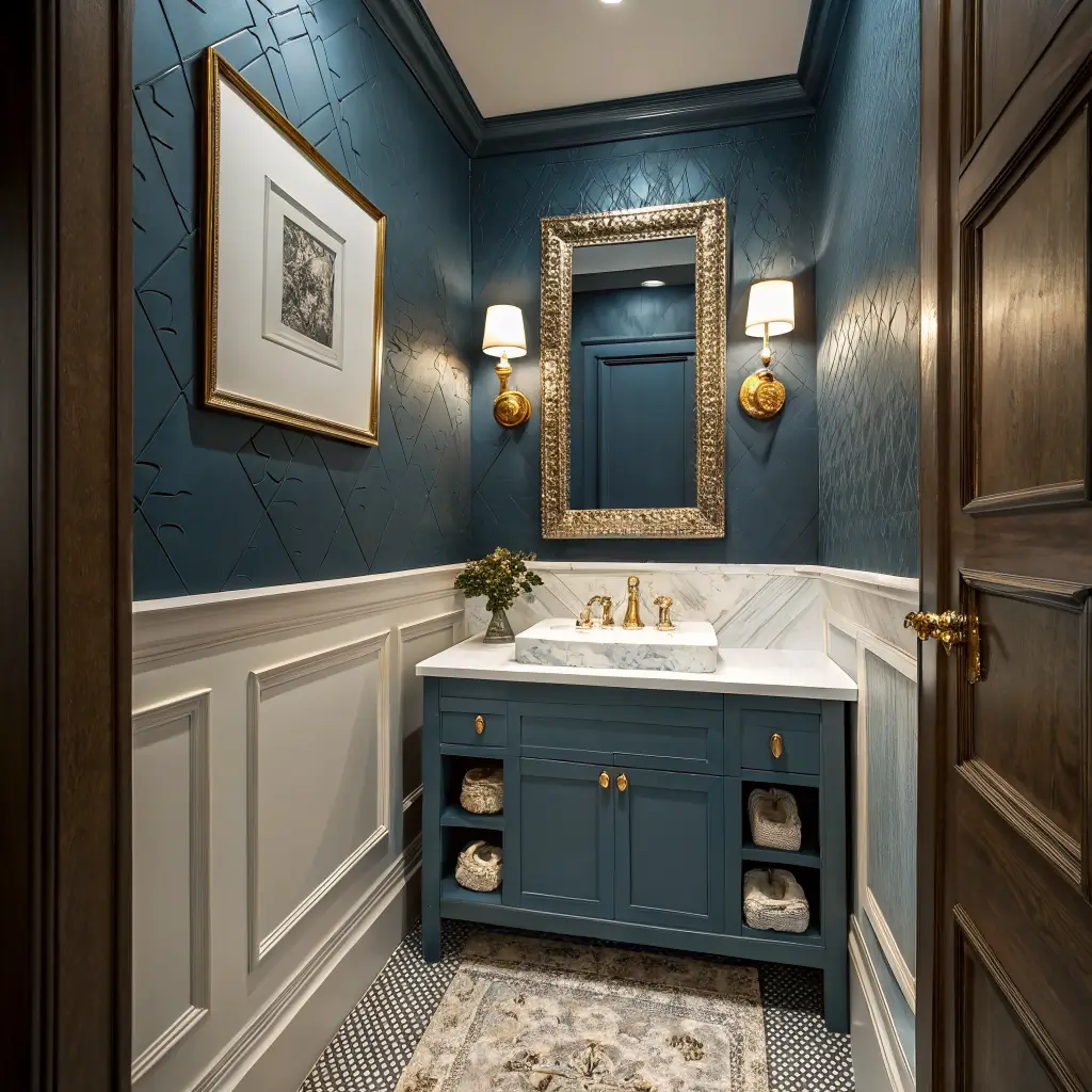
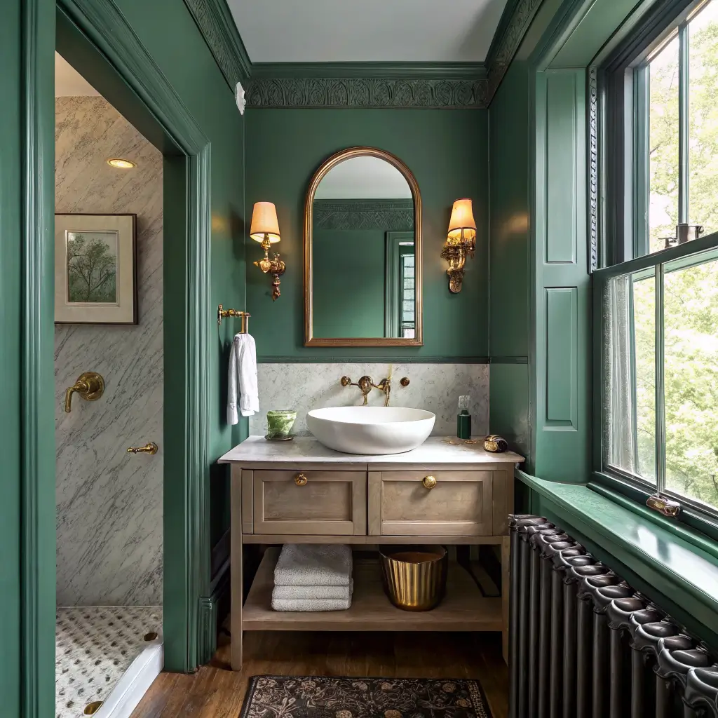
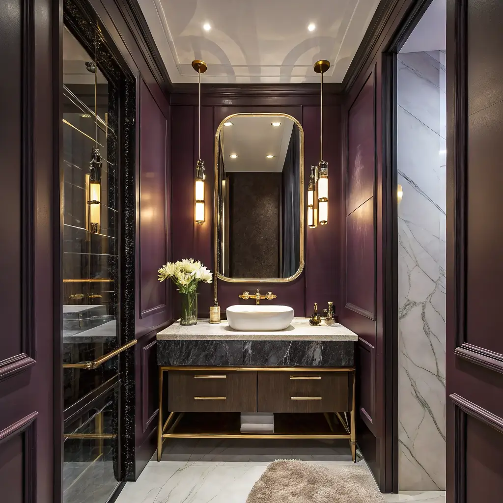
Color-drenched moody: walls, ceiling, trim, and door all in one deep hue. Think aubergine, inky teal, oxblood, forest. Minimal accessories. Sculptural sconces.
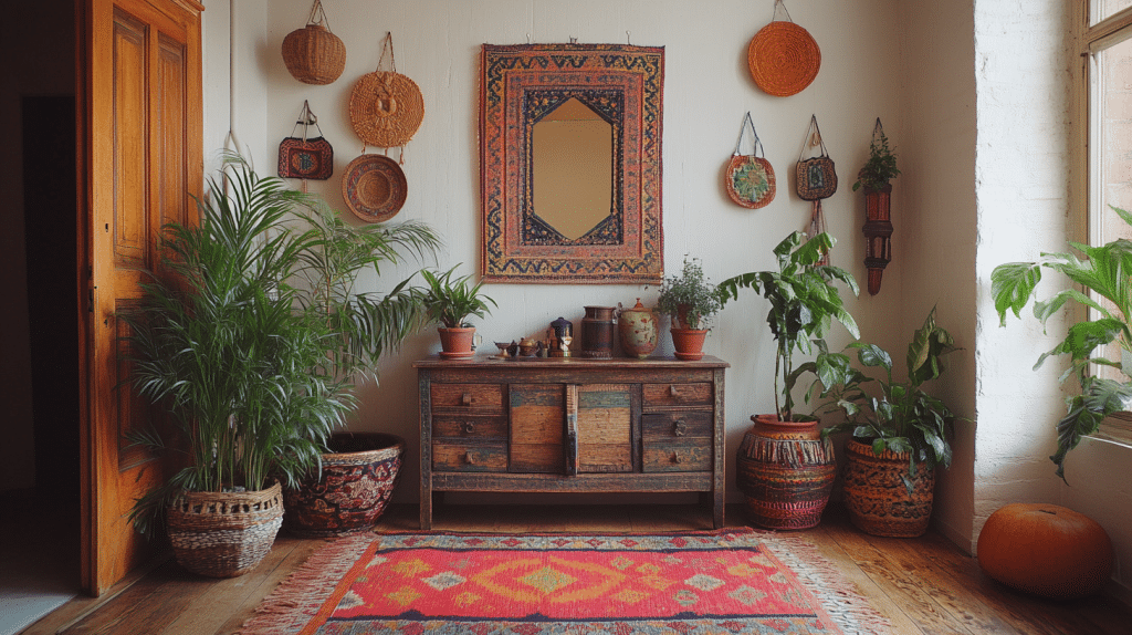
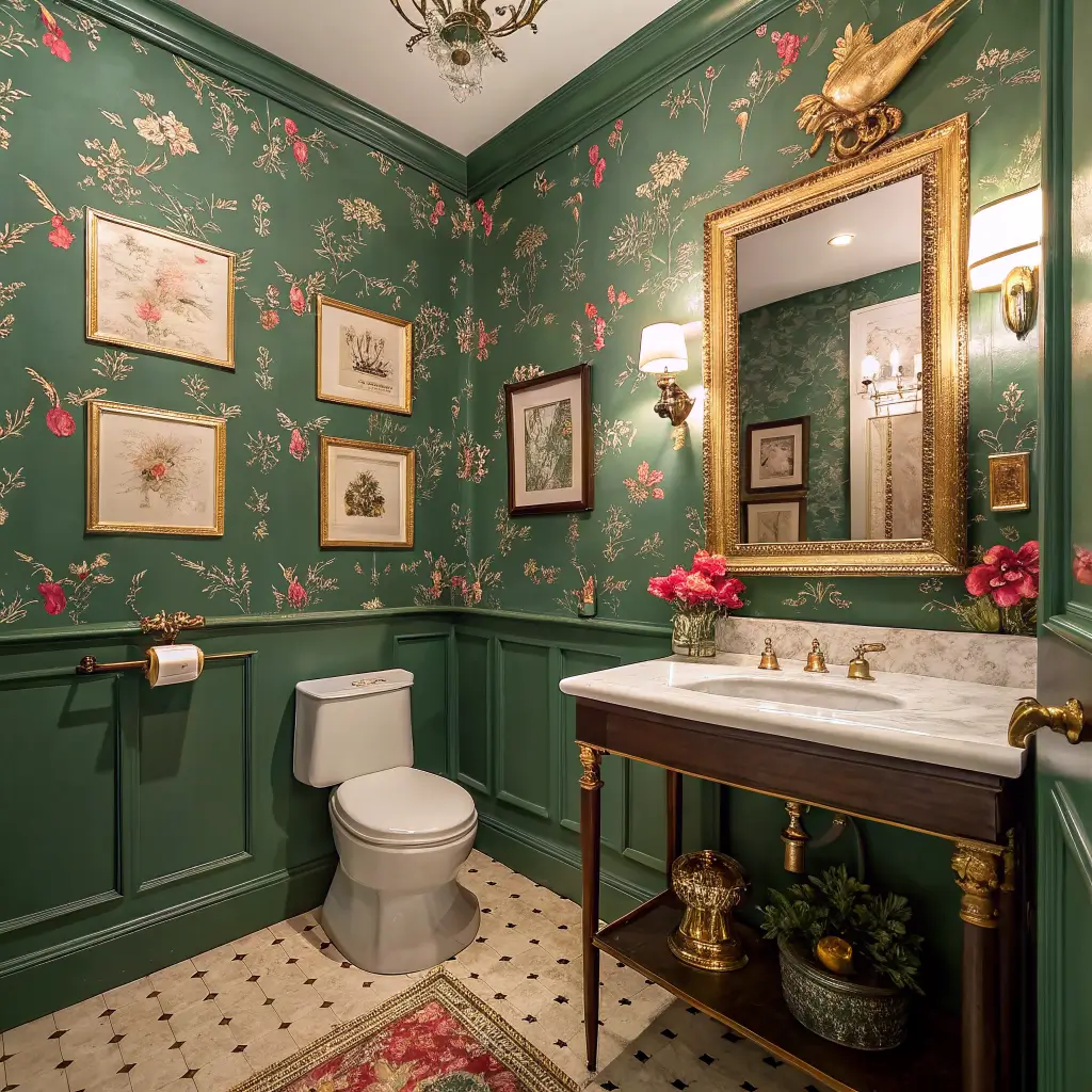
Maximalist eclectic: bold wallpaper, gallery wall, brass everything, patterned floor, a vintage rug.
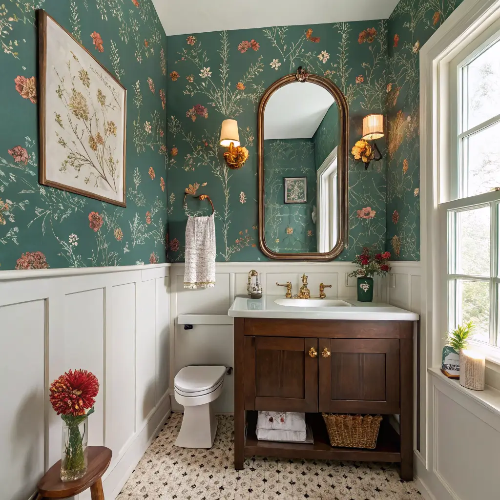
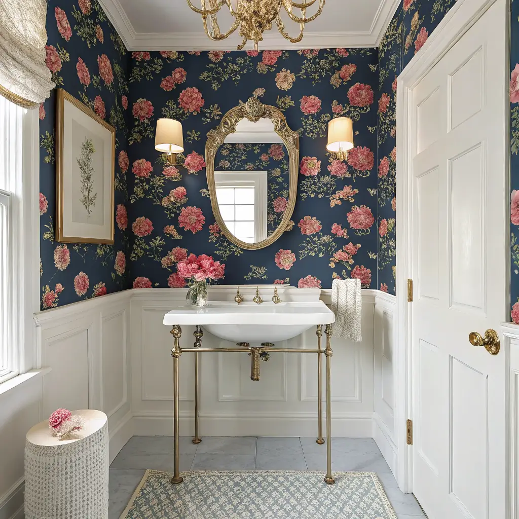
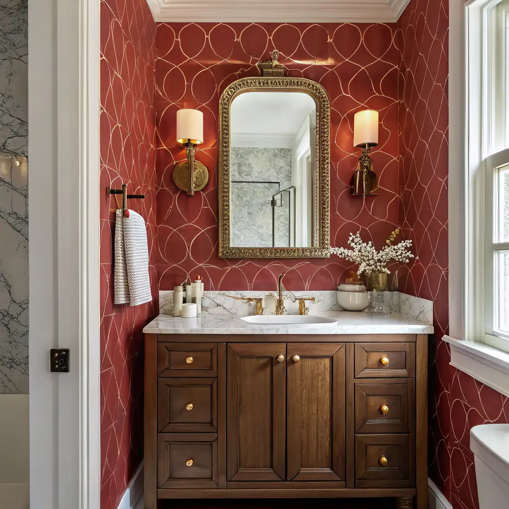
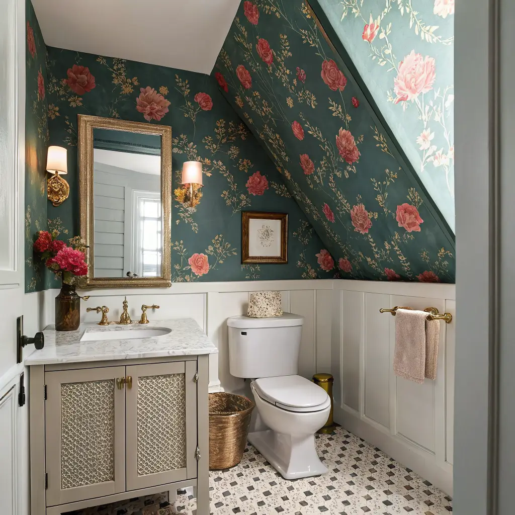
Playful traditional: chinoiserie or large-scale floral wallpaper, scalloped mirror, classic console sink, hand towel with a contrast trim.
Modern glam: high-gloss lacquered walls, a marble block sink, a single brass pendant, big arched mirror.
If you’re nervous, do color-drenched. It’s the most forgiving because there’s no pattern to scale, no mixing to balance — you just pick a color you love and paint everything.
Colors I’d Actually Use
The colors holding up best right now, and the ones I keep coming back to:
Deep jewel tones: emerald, sapphire, aubergine, inky teal
Warm saturated hues: terracotta, paprika, ochre, raspberry, muted coral
High-contrast pairings: navy + unlacquered brass, pink + red (yes, together), black + a botanical floral, blue + white in a bigger-than-expected scale
A few specific paints I’d recommend without hesitation: Farrow & Ball’s Preference Red, Hague Blue, and Studio Green; Benjamin Moore’s Caliente, Polo Blue, and Black Forest Green. Use eggshell or satin finish on walls — flat shows every smudge in a room where hands and splashes happen, and full gloss is gorgeous but punishes every drywall flaw.
The Pieces That Carry the Room
You need three hero items. Everything else is supporting cast.
1. The walls.
Either bold wallpaper or saturated paint on every surface. Pick one. Wallpaper if you want pattern; paint if you want envelopment.
2. The mirror.
Oversized, shapely, framed. Scalloped, arched, gilt, or colored. Skip the frameless rectangle from the builder — it’s the single thing dragging your powder room down right now. Budget $150–$400 for something good.
3. The lighting.
Two sconces flanking the mirror at 60–66 inches from the floor, or one above if you don’t have width. Brass or black, with ribbed or fluted glass shades. Use 2700K bulbs — anything cooler kills the warmth of the color you just spent money on.
The Supporting Cast
Faucet and hardware in one finish. Unlacquered brass ages beautifully but spots; polished nickel is the durable everyday choice; matte black reads modern.
Hand towels in a color pulled from the wallpaper — not matching, pulled. Linen ones with a contrast stripe are my default.
A small rug. A vintage Persian scrap, a kilim runner, or a striped cotton flatweave. Roughly 2’x3′.
One piece of art or a tight cluster of three small framed pieces over the toilet. Real frames, not poster frames.
Countertop styling: 3–5 items, no more. A ceramic soap dispenser, a small brass tray, a bud vase with eucalyptus or a single stem of something. Done.
Putting It Together
The order matters because each layer constrains the next.
1. Choose the wall treatment first. Everything else responds to this.
2. Pick the vanity color and material. If walls are loud, vanity should be solid and grounding — dark wood, stone, a deep solid paint. If walls are color-drenched solid, vanity can be the contrast moment.
3. Lock in your metal finish. One dominant, maybe one accent. Brass faucet, brass sconces, brass hardware — and a black mirror frame as the accent. That’s the formula.
4. Floor decision. If the wall is the show, keep the floor quiet: a small-scale tile, a checkerboard, or a single rug over existing flooring. If you’ve got beige tile you can’t replace, paint walls darker than you think — the contrast distracts from the floor.
5. Accessorize last. Always. Buy these in person if you can, against samples of the paint and wallpaper.
The Doorway Test
The most important rule I’ve learned: the view from the doorway is the whole game. Stand in the door. What you see directly across is your focal wall. That’s where the mirror, the vanity, the wallpaper feature, the lighting all need to land. The other walls are scenery.
In awkward under-stair powder rooms, put the toilet at the low ceiling end and pull the mirror and sconces toward the headroom. Wrap the wallpaper onto the sloped ceiling — it disguises the angle instead of fighting it.
Where to Spend, Where to Save
Spend on:
– The mirror. You see it more than anything else.
– Sconces. Cheap lighting reads cheap immediately.
– Faucet. The dollar-store look is unmistakable.
Save on:
– Wallpaper, if you go peel-and-stick from Spoonflower or Chasing Paper. They’re genuinely good now.
– Vanity. A prefab one painted in a custom color looks bespoke.
– Towels and rug. TJ Maxx and HomeGoods churn through good ones constantly.
The dumbest money I spent on my first attempt was a $280 “designer” tissue box cover. Get a $12 one. Nobody is grading you on tissue infrastructure.
Mistakes I’ve Made or Watched People Make
– Tiny ditsy wallpaper pattern. It reads fussy and old. Go medium-scale — the repeat should be at least 8–12 inches across.
– Three competing patterns. Wallpaper and patterned tile and a busy rug. Pick one hero pattern, one quiet supporting one, and let the rest be solid.
– One sad overhead light. A windowless room with one ceiling fixture looks like a gas station bathroom no matter what’s on the walls. Add sconces. Non-negotiable.
– Color that has nothing to do with the rest of the house. If your adjacent room is a warm cream, don’t go cool icy blue in the powder room. Go the same color family but deeper and more saturated. The powder room should feel like the bold cousin, not the stranger.
– Skipping the ceiling. A white ceiling above colored walls cuts the room in half visually. Paint it. Same color, or one shade deeper.
Easy Updates Without Redoing the Room
Seasonal swaps that take 20 minutes:
– Towels: deeper berry and forest tones for fall/winter; citrus, coral, sea-glass for spring/summer.
– Vase contents: branches in winter, tulips in spring, eucalyptus year-round as the default.
– Candle: switch the scent and the label color so it reads with the season.
If you want a bigger refresh without a redo, the two highest-impact swaps are the mirror and the lighting. Change those two and the room feels new even with the same walls.
A Few Real Questions Worth Answering
Can a tiny powder room handle dark color? Yes, and it’s actually better for dark color than a big room. Small + dark + warm light = enveloping. Small + dark + bad overhead light = cave. The lighting is the variable.
Wallpaper or paint? Paint if you want moody and immersive. Wallpaper if you want personality and pattern. Both hold up fine in a half bath since there’s no shower steam.
My beige tile and oak vanity aren’t going anywhere. Can I still do this? Paint the walls a deep saturated color that makes the beige read as a warm neutral rather than a dated one. Terracotta, deep olive, and warm clay tones all do this. Swap the mirror and lighting. The vanity stops being the story.
Will I get sick of it? If you picked the color because it was trending, yes. If you picked it because you’ve been drawn to it in restaurants, hotels, and other people’s homes for years — no. That’s the test. Not Pinterest. What color do you keep noticing in the wild.
Go bold. It’s 18 square feet. The downside is a weekend and a gallon of paint.
A colorful powder room is the one place in the house where you can take a real risk without waking up to it every morning. I painted mine a deep teal on a Saturday, hung a vintage mirror I found for $25, and now it is the room every guest mentions before they even sit down. Go bold in a small space, the payoff is always worth it.
Conclusion
The colorful powder room that convinced me bold works in small spaces had walls covered in wallpaper with a pattern of oversized flowers in pink, orange, and green. The sink was white, the mirror was round and unframed, and the only other color was a single brass faucet that looked like it had been there forever. Guests always commented on the wallpaper, and the owner said that was the point — the room was too small for furniture, so the walls had to do the talking.