The Look, and Who It’s For
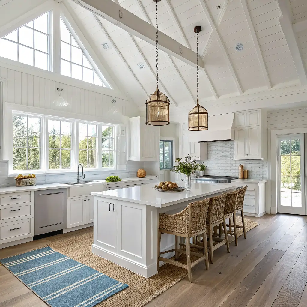
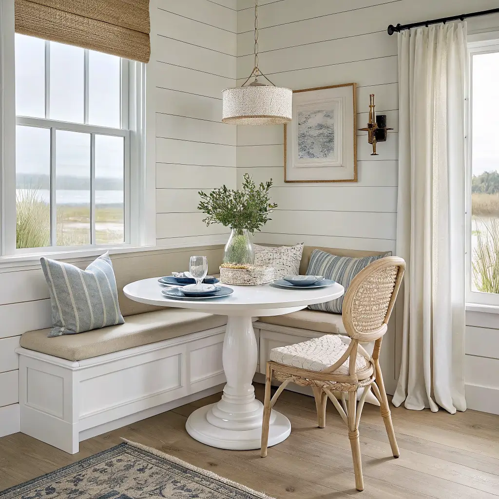
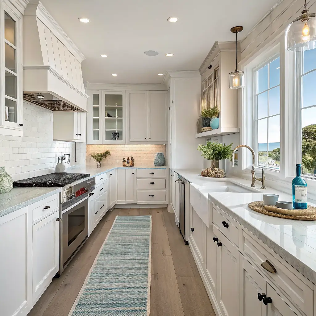
I’d call my kitchen modern coastal with a farmhouse lean. White oak stools, warm white cabinets, a rattan pendant over the island, and a flatweave runner with a thin blue stripe. The only literal “beach” things in the room are a small framed watercolor of a sailboat and a stoneware canister set with a barely-there shell embossed on the lid.
This style suits you if:
– You like light, airy kitchens and find dark cabinets oppressive
– You actually cook and need surfaces and dinnerware that can take a beating
– You want a beach feeling without committing to a beach theme
– You live near water — or you don’t, and you want the room to feel like you do
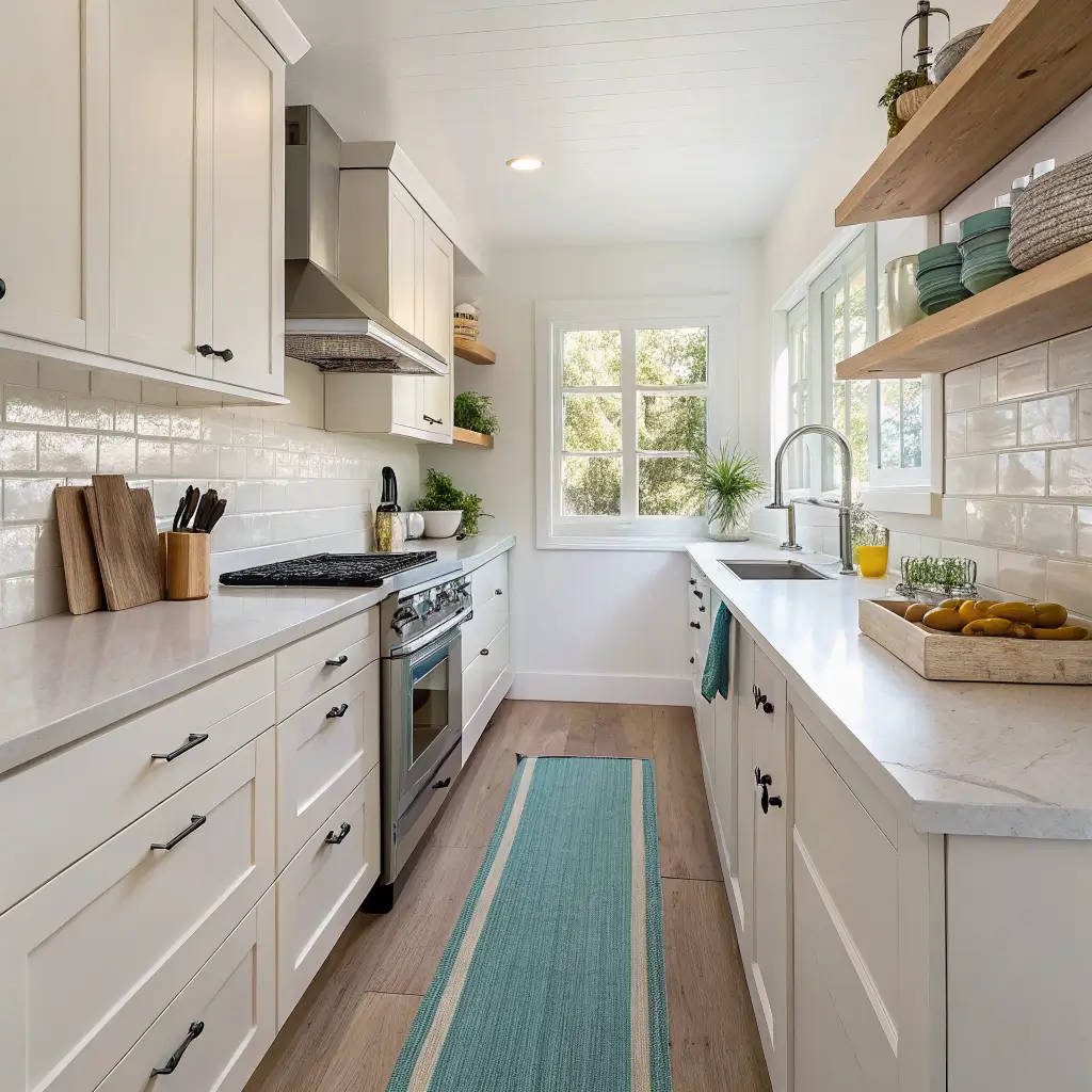
It works in small galley kitchens (lean on textiles, art, and hardware), open-concept layouts where pendant lighting and bar stools become the focal point, and eat-in kitchens where your dinnerware stays on display.
What It’ll Cost You
I’ve done this in three rounds over about two years, so I’ve got real numbers.
A simple refresh — textiles, a few accessories, one piece of art — runs $150–$400. That’s roughly two coastal tea towels ($12–$30 a set), a seagrass tray ($30–$80), a ceramic canister set ($40–$80), and a framed print ($40–$150).
A weekend mid-range makeover lands at $600–$1,500. Add bar stools at $120–$250 each, a runner ($20–$50), a rattan or rope pendant ($120–$350), and a few more wall pieces.
A bigger décor overhaul — multiple pendants, new stools, peel-and-stick backsplash, hardware, plus accessories — runs $1,500–$4,000 without touching the cabinet boxes or counters.
Time-wise: a textile-and-accessory refresh is 2–4 hours. A medium update (lighting swap, stools, hardware, rug, art) is one weekend. Adding paint and fixtures pushes it to two or three weekends.
The Color Palette (Be Specific or It’ll Look Muddy)
Here’s where most coastal kitchens go wrong. People grab “a blue” and “a white” without thinking about undertones, and the room ends up reading patchy.
My rule of thumb:
– 60–70% soft whites and light neutrals (walls, cabinets, counters)
– 20–30% blues — pale blue-gray, sea glass, muted teal
– 10–20% accent tones — light wood, brushed brass, occasionally navy
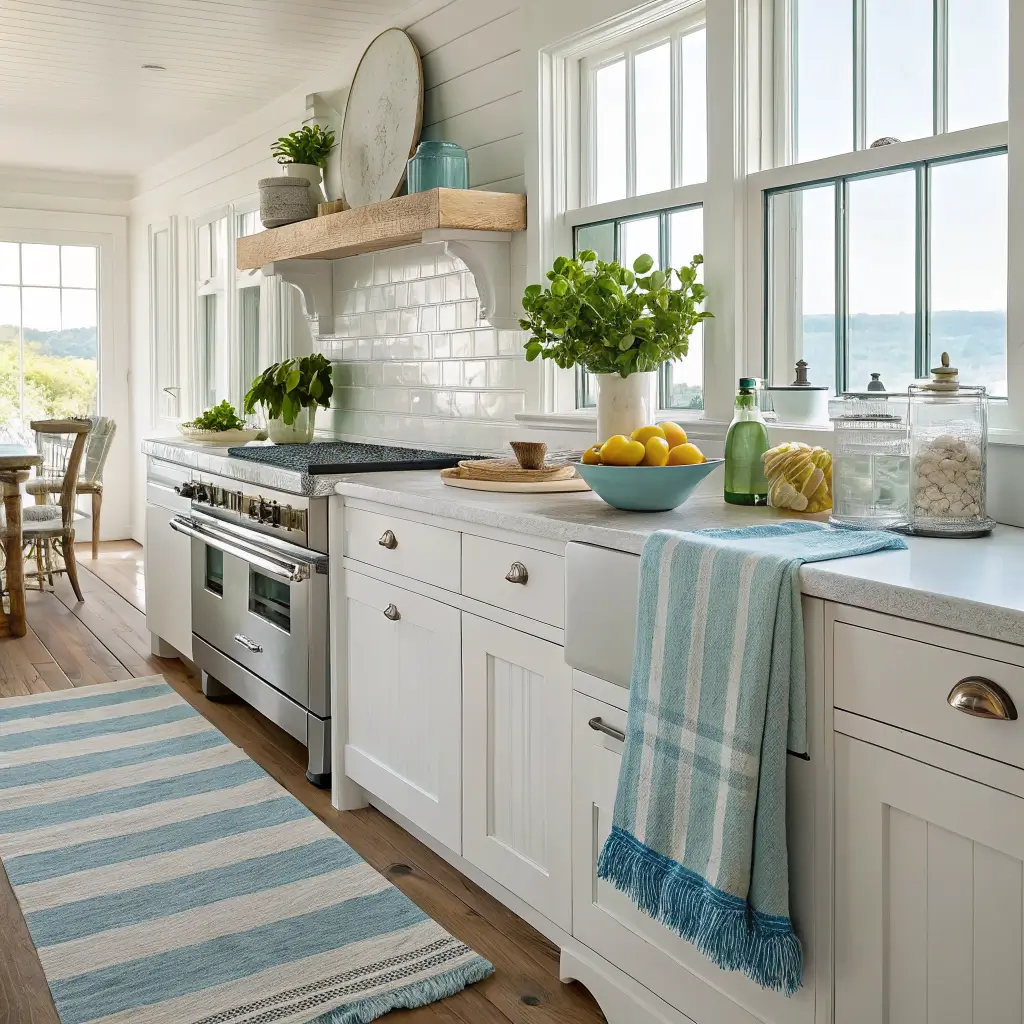
For whites, pick a warm white, not a cool stark white. I used Benjamin Moore White Dove on my cabinets after testing Simply White and Chantilly Lace — both leaned too cold against the oak floor. If you’ve already got cream-toned counters or floors, a yellow-white will fight a blue-gray-white, and the room will feel “off” without you knowing why.
For blues, go muted. Sea glass, dusty aqua, or a soft denim. Bright turquoise reads “kids’ bathroom” the second it’s on more than a small accessory.
One white family. One or two wood tones. Done.
The Materials That Make It Work
This is what separates modern coastal from theme-park coastal:
– Light woods — white oak, ash, bleached or driftwood finishes for stools, shelves, cutting boards
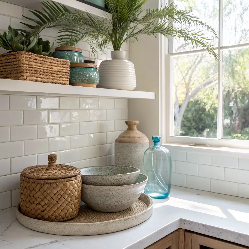
– Woven textures — rattan, cane, seagrass, jute on trays, pendants, baskets
– Ceramics and stoneware in white, sand, and blue glazes
– Glass — clear, or subtly tinted blue-green for vases and bottles
– Metals — brushed nickel, stainless, or soft brass; skip oil-rubbed bronze unless you want to fight the airy vibe the whole time
Mix smooth (quartz, glossy tile) with coarse (jute, rattan) so the room doesn’t read flat. A kitchen full of glossy white surfaces feels sterile; a kitchen full of woven texture feels like a tiki bar. You need both.
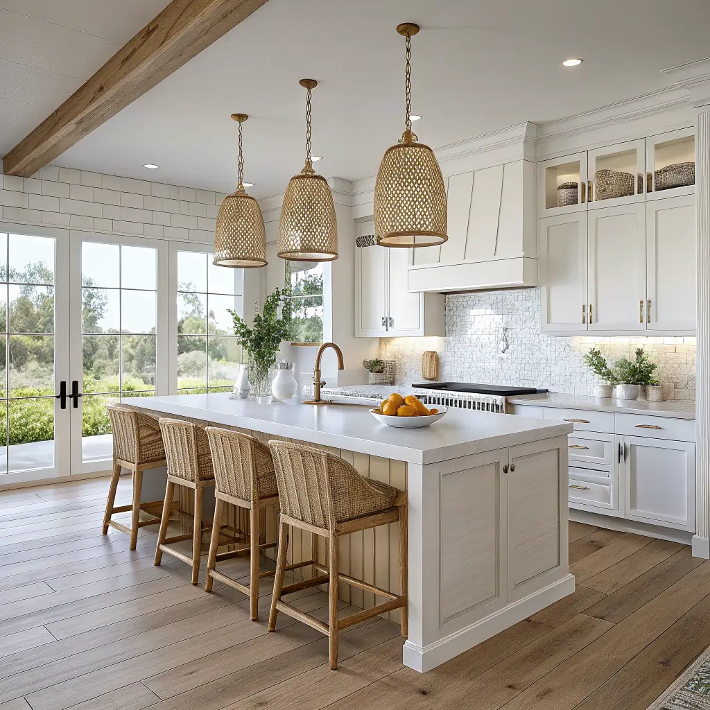
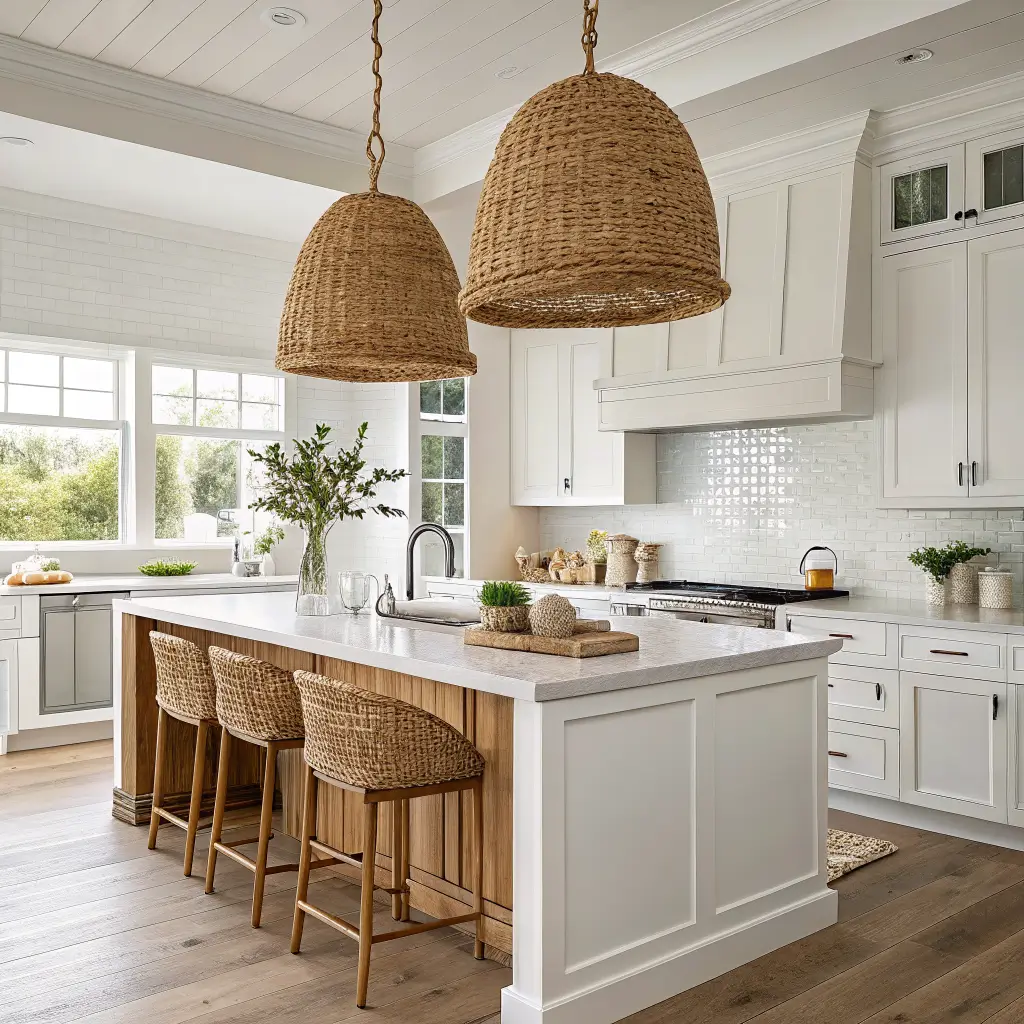
The Hero Pieces
Pick one focal point. Just one. Trying to make the pendants AND the backsplash AND the art wall AND the stools all “the moment” is how rooms get noisy.
My focal point is the island with two rattan pendants and white oak stools with woven seats. Everything else stays quieter.
Your options:
– Lighting — woven rattan or seagrass pendants, or clear glass with a slight blue tint. Two or three over an island, spaced about 24–30″ apart, hanging 30–36″ above the counter
– Bar stools — light wood or white frames, woven or linen-look seats. Space them 21–24″ apart center to center
– Backsplash — white subway as a safe base, or a pale blue ceramic or sea glass mosaic behind the range only
– A rug or runner — a flatweave or indoor-outdoor in blue stripes. Skip anything shaggy unless you want to mop it weekly
Functional Décor That Earns Its Spot
The trick to making coastal kitchen accessories not look like clutter is choosing pieces that do a job.
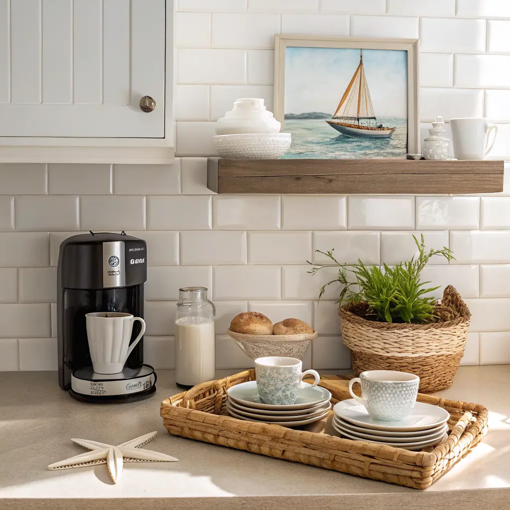
– Coastal canisters — ceramic or stoneware with subtle shell or starfish embossing. $40–$80 for a set
– Dinnerware — white base with a thin blue rim, or watercolor fish patterns. Stoneware sets run $80–$180 for service for four; melamine sets ($30–$60) are what I actually use for daily meals because I have a 4-year-old who drops things
– Glassware — etched waves or a faint blue tint. $8–$20 a glass
– Trays — a seagrass or rattan tray to corral oil, vinegar, salt, and pepper next to the stove. This single move makes a counter look styled instead of cluttered
– Cutting boards — light wood, leaned against the backsplash when not in use. Doubles as décor
– Textiles — cotton or linen tea towels with a subtle stripe or small motif, blue or natural oven mitts, a jute or striped runner
The Small Stuff (Use Sparingly)
This is where the kitschy slide happens. My rule: no more than three obviously coastal accessories visible at once. That includes shell shakers, small ceramic fish, lighthouse anything, rope details.
What’s earned its place in my kitchen:
– A small clear glass bottle with two dried palm stems on the open shelf
– One ceramic starfish on a stack of plates (top shelf)
– That framed watercolor sailboat over the coffee station
Everything else is texture, color, and material doing the work.
How to Actually Put It Together
The order matters because if you start with accessories you’ll fight yourself later.
1. Lock in the palette first. Wall color, cabinet color, and the dominant textile color (your runner sets the tone). Get these right before you buy a single shell.
2. Lay the foundation. Runner down. Stools in place. Pendants centered over the island — if there are two stools, the pendants should align with the stools, not the island centerline (a mistake I made and had to redo).
3. Hang the main art at eye level. Center of the piece 57–60″ from the floor. Higher than that and it floats. Lower and it looks like it slid down the wall.
4. Build a coffee or tea station. Woven tray, two or three mugs, a small plant. This becomes a styled vignette that also functions.
5. Style open shelves in threes. Plates stacked, a bowl, one small decorative piece per shelf. Vary heights — tall, medium, short — so your eye moves.
6. Edit out 10–20%. This is the step nobody does. Walk away for an hour, come back, and remove the weakest items. Almost every kitchen I’ve styled was better with less.
Mistakes I Made (So You Don’t Have To)
Going too literal. The anchor towels, the crab, the sign. If someone walking in immediately says “beach kitchen!” you’ve gone too far. The goal is they say “this room feels nice” and only later notice the references.
Mixing white undertones. My first cabinet color (Simply White) clashed with the cream-toned tile floor I couldn’t replace. Took two coats of White Dove to fix it. Always tape paint samples next to the surfaces you can’t change — floors, counters, backsplash — before committing.
Too many wood tones. I had a dark walnut cutting board, light oak stools, and a medium-toned shelf all in the same sightline. It looked accidental. Picked one (light oak) and replaced or hid the others.
Dark hardware fighting the mood. I bought matte black cabinet pulls in 2021 because everyone was doing it. They looked great in photos and bad in person against the soft palette. Swapped to brushed nickel for about $80 and the room finally calmed down.
Overloading shelves. Open shelving + coastal style is a trap because you want to display everything. Don’t. Two stacks of plates, a bowl, a vase, and you’re done per shelf.
Easy Seasonal Swaps
The base of the room stays the same year-round. What changes:
– Spring/summer — striped runner, bolder blue tea towels, a bowl of lemons or shells as a centerpiece, fresh herbs on the windowsill
– Fall/winter — swap to a sand-and-navy runner, deeper blue towels, pinecones and driftwood in the centerpiece bowl, dried grasses instead of fresh stems
The textiles are the lever. Everything else stays put.
If You Want to Mix in Boho
Coastal and boho overlap nicely because they share natural textures. Add a macramé plant hanger by a window, a patterned runner that pulls in both blues and warm earth tones, and a few more ceramics with hand-thrown irregularity. Keep the light wood and the muted palette as your anchor or it’ll tip fully boho.
A Few Real Questions
Can I do coastal if my cabinets are dark wood?
Yes, but lean harder on everything else being light — counters, walls, stools, textiles — and accept that the cabinets become the grounding “driftwood at night” element. Add a lighter island if you have one.
Is coastal kitchen décor dated?
The 2005 version (rope-wrapped everything, navy and red, anchors) is dated. The current version — modern coastal with white oak, muted blues, and woven texture — reads more like a Scandinavian-coastal hybrid and isn’t going anywhere soon.
What backsplash works best?
White subway tile is the safe, lasting choice. If you want more, do a sea glass mosaic or pale blue zellige tile behind the range only, not the full wall — it stays interesting without taking over.
Can I do this on a budget in a small kitchen?
Easily. New textiles, a woven tray, a swapped pendant shade, and one good piece of art will shift the whole feel for under $300. Small kitchens actually benefit most because the light palette makes them feel bigger.
The point of all this is restraint. Coastal kitchen décor goes wrong when people try to prove the theme. It goes right when the room just feels like somewhere you’d want a long, slow Sunday morning.
Conclusion
The coastal kitchen decor that feels right to me has open shelves with white ironstone, a rattan pendant over the table, and a bowl of lemons that never seems to empty. The owner painted the cabinets a pale blue that looks like it faded in the sun, and the floor is wide-plank pine that has been walked on for a hundred years. She says the kitchen is the only room where coastal style makes sense to her, because it is the room where you feed people after they have been in the water all day.