Moody Coastal Decor: How to Get the Dark, Atmospheric Beach-House Look Without the Nautical Cheese
The moody coastal decor question I get the most: how do you make a room feel like it belongs near the ocean without a single anchor, rope mirror, or “Gone Fishin’” sign? I’ve spent the last two years figuring this out in my own house — a 1940s bungalow nowhere near actual saltwater — and I’ll tell you exactly what worked, what I wasted money on, and what I’d do first if I were starting over tomorrow.
Short version: think stormy water at dusk, not a souvenir shop in Cape Cod.
What Moody Coastal Actually Is (And Who It’s For)
Moody coastal is the edgier cousin of bright, breezy beach style. Same natural textures — jute, linen, weathered wood, rattan — but the palette swaps pastels for inky navy, charcoal, slate, and stormy gray-green. You keep the relaxed-by-the-water feeling and lose the kitsch.
It works for you if:
– You like coastal calm but find traditional beach decor too sweet or too literal.
– You live somewhere with gray winters (Pacific Northwest, New England, the UK) and want a style that matches the actual weather outside your window.
– You live nowhere near the coast but want that water-adjacent feeling without bright turquoise.
– You gravitate toward dim, layered lighting and rooms that feel cocooned at night.
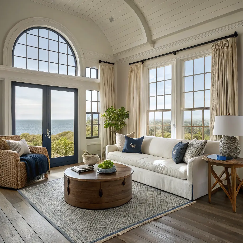
Rooms it suits best: living rooms, primary bedrooms, dens, dining rooms, and small reading nooks. Tiny rooms can pull it off, but I’d say 150–300 sq ft is the sweet spot — enough wall space to balance dark color with light textiles.
The Palette: Specific Paint Colors That Actually Read Coastal
The wrong navy will make your living room look like a law firm. The right one feels like the sky twenty minutes before a storm hits.
What I’d use:
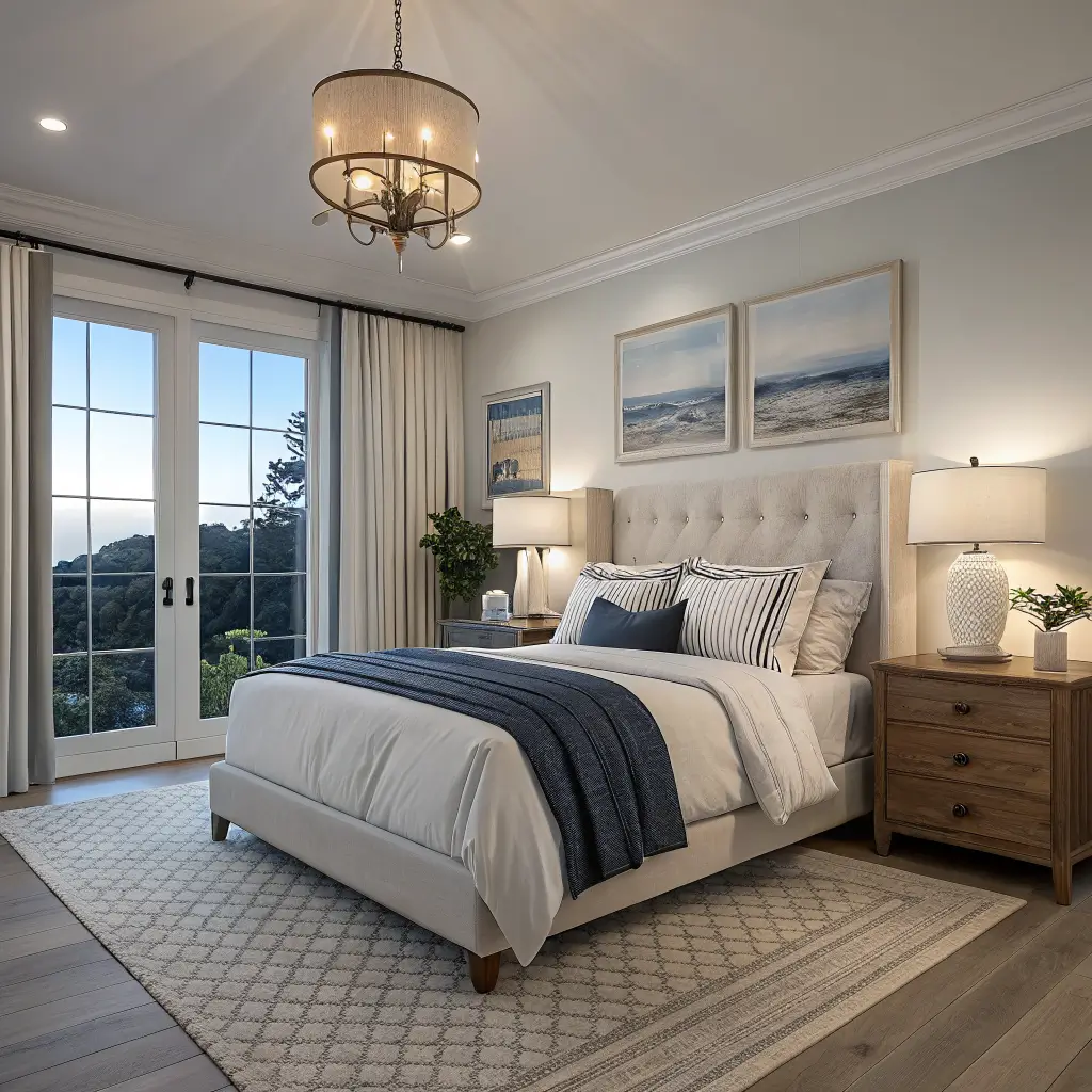
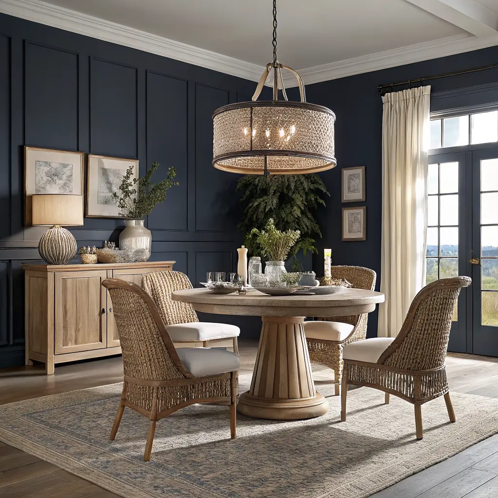
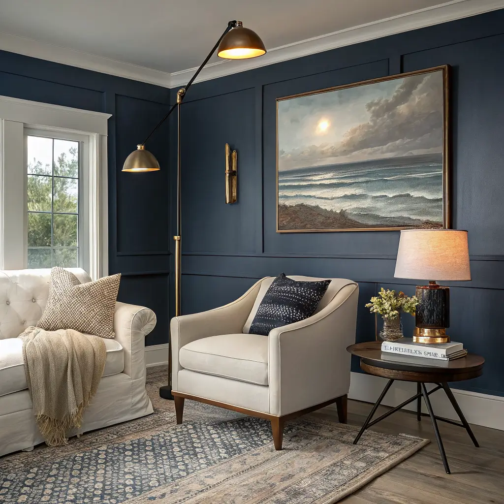
– Benjamin Moore Hale Navy (HC-154) — the one I painted my dining room. Reads almost black at night, deep ocean blue at noon.
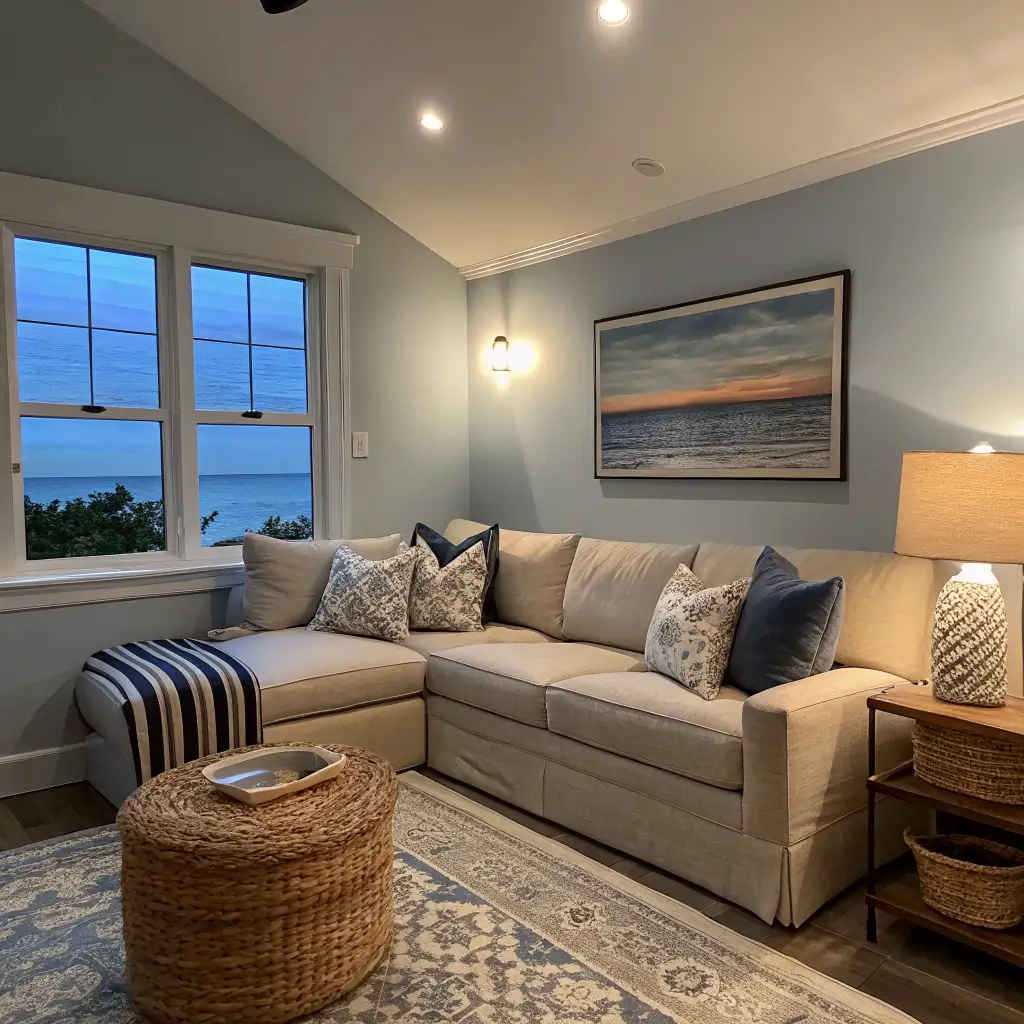
– Sherwin-Williams Naval (SW 6244) — slightly bluer, less green than Hale Navy. Great behind a bed.
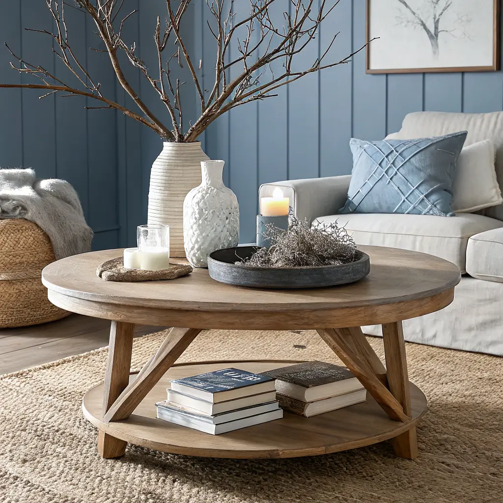
– Farrow & Ball De Nimes — a softer, dustier blue if you want moody-but-not-dramatic.
– Benjamin Moore Wrought Iron — a charcoal that isn’t black, perfect for trim or a small den.
– Sherwin-Williams Rosemary — deep gray-green for people who want moody without committing to blue.
Get them in matte or eggshell, not satin. Satin reflects light and ruins the depth. I learned this after painting an accent wall in a satin navy and watching it look like a glossy gym locker for six weeks before I repainted.
For the 60-30-10 to actually work, balance the dark with warm whites and oatmeal — Benjamin Moore White Dove on trim and ceilings is my default.
Hero Pieces That Carry the Whole Look
If you only buy four things, make them these.
1. A moody focal wall.
One gallon of premium matte paint runs about $50–$70. A single accent wall behind your sofa or bed is the highest-impact $60 you’ll ever spend. Renters: peel-and-stick grasscloth wallpaper in a deep navy or charcoal does the same job.
2. One large piece of seascape art.
Not a print of a sailboat. A moody, abstract horizon or a vintage-style oil of a gray ocean. Go big — 30″×40″ minimum over a sofa or bed. Etsy and Minted have good ones in the $120–$400 range with frames. The first piece I bought was too small (18″×24″ over a 7-foot sofa) and it floated there like a postage stamp for months before I admitted it.
3. A natural fiber rug.
Jute, sisal, or a wool-jute blend in a 6’×9′ or 8’×10′. Budget around $150–$450 for something that won’t shed itself into oblivion. The texture is non-negotiable — it’s what stops the dark walls from feeling formal.
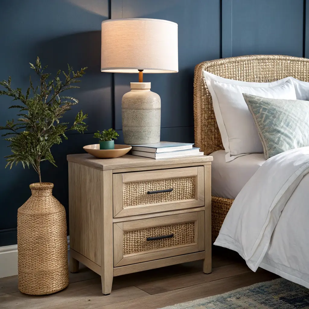
4. Warm wood furniture.
Light to medium oak, ash, or light walnut. Coffee table, console, or nightstands. The wood is what keeps “moody” from sliding into “goth.” A round oak coffee table at $300–$500 mid-range is a workhorse.
How to Put It Together
Lighting Is 50% of the Job
Dark walls plus a single overhead fixture equals dungeon. You need at least three light sources per room, all on warm bulbs (2700K to 3000K — anything cooler kills the mood instantly).
What I run in my living room:
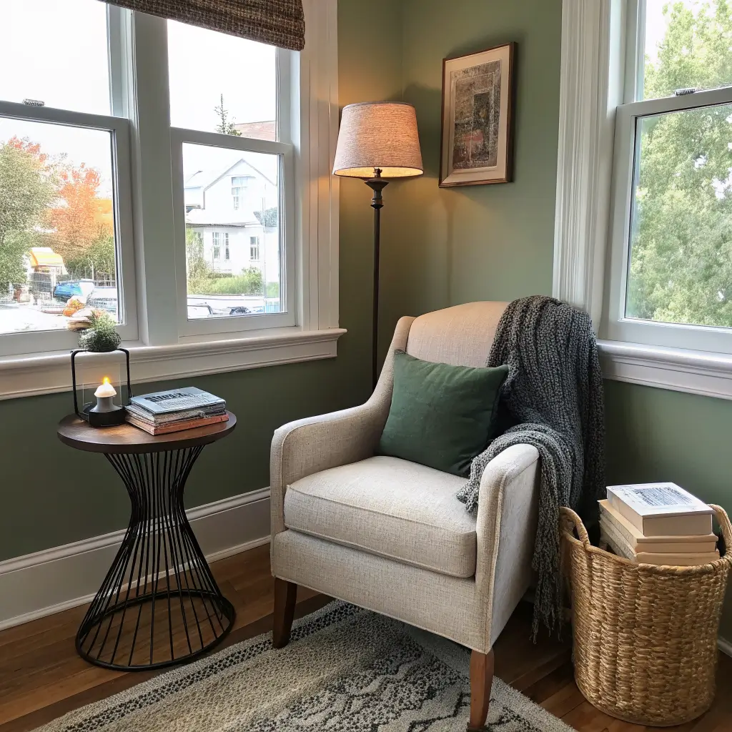
– One floor lamp by the reading chair.
– One table lamp on the console with a linen shade.
– A pair of wall sconces flanking the art over the sofa.
– Every overhead on a dimmer.
Look for lamp bases in black metal, woven rattan, ceramic in deep glazes, or antique brass. A capiz shell pendant over a dining table is the one place I’d allow a literal ocean reference — it’s so pretty it stops being kitsch.
Layering Without Going Overboard
The trick is texture variety, color restraint. In one room I want to see:
– Smooth (linen curtains, ceramic lamp base)
– Rough (jute rug, woven basket)
– Soft (cotton throw, slipcovered sofa)
– Hard (wood table, stone tray)
– One metallic in small doses (antique brass picture frame or lamp base)
Pillows: odd numbers, 3 or 5 on a sofa, mixing one solid, one stripe, one subtle pattern. Stick to navy, cream, oatmeal, charcoal, with maybe one muted rust or terracotta for warmth. Two to three patterns max per room.
The Focal Point Rule
One focal point per room. Pick the wall and commit. If the dark paint is on the wall behind the sofa, don’t also put a giant gallery wall on the opposite wall — you’ll create visual whiplash. Build around the focal wall with quieter art, lighting, and textiles.
Budget: Where to Spend, Where to Save
Spend on:
– Lighting (cheap lamps look cheap, always)
– The rug (a flimsy jute will pill and unravel within a year — ask me how I know)
– One large art piece
Save on:
– Paint brand within reason — go premium for the dark colors specifically, since they cover better and need fewer coats
– Pillow covers (H&M Home, Target’s Studio McGee line, and IKEA do the look for $15–$30 each)
– Baskets and woven storage (HomeGoods is full of them)
Realistic room budgets:
– Refresh with existing furniture: $400–$900 (paint, pillows, one art piece, a lamp, a rug)
– Mid-range overhaul: $1,000–$3,000
– Designer-level: $3,000–$7,000+
I did my living room for about $850 because I kept the sofa and coffee table and put the money into paint, a new rug, two lamps, and one big piece of art.
Mistakes I Made So You Don’t Have To
Going too literal. My first attempt had a rope-wrapped lamp, a wooden oar leaning in the corner, and a print with the word “BEACH” on it. It looked like a chain restaurant. I sold all of it. The fix: abstract ocean art, sculptural driftwood (one piece, not five), and zero text-based decor.
Too dark with no balance. Dark walls + dark sofa + dark curtains = cave. You need at least one big light element per wall: cream curtains, a pale wood table, a large mirror, white ceramic lamp bases. The mirror across from a window is the single best trick for keeping a dark room from feeling closed-in.
Cluttered surfaces. Eight small tchotchkes on a coffee table dilute everything. Style in groups of three: one vertical (vase with eucalyptus or branches), one horizontal (stack of books or a tray), one sculptural (a chunky candle, a ceramic bowl, a piece of driftwood).
Ignoring real life. I bought a white linen slipcovered chair and then remembered I have a dog. Indoor-outdoor performance fabrics in oatmeal or sand look identical and survive everything.
Seasonal Swaps Without Redecorating
The bones stay. Only the soft stuff changes.
Fall and winter:
– Chunky knit throws in cream or charcoal
– Pillow covers in rust, ochre, or deeper navy
– More candles, lower lighting
– Branches and eucalyptus in tall vases
Spring and summer:
– White linen pillow covers
– A lighter cotton throw
– Fresh greenery — olive branches, fig stems
– Dried pampas or grasses for that dune feeling
A set of new pillow covers (3–5 at $20–$30 each) shifts a room dramatically for under $150.
Variations If You Want to Bend the Style
Boho moody coastal: Add a layered vintage rug on top of the jute, handmade pottery, more plants. Same palette, looser feeling.
Minimalist moody coastal: Strip it back. One dark wall, one large piece of art, one statement light fixture, one warm wood piece. Nothing else on the surfaces. This is the version that ages best.
Landlocked moody coastal: Skip every shell. Lean on the palette and natural textures and let one abstract horizon painting do all the coastal work. Nobody walking in will think “beach house” — they’ll think “this room feels good,” which is the whole point.
The bedroom I redid last spring — Hale Navy behind the bed, oatmeal linen duvet, oak nightstands, one big stormy seascape, two rattan lamps — is the room I get the most compliments on, and not one person has said the word “nautical.” That’s how you know it’s working.
Conclusion
The moody coastal decor that works is not dark for the sake of being dark. It is the study where the walls are painted a deep navy that looks black at night, the shelves are filled with leather-bound books and driftwood, and the only light comes from a brass desk lamp and the moon over the water. The owner says she painted the room that color because the fog on the coast is not white — it is gray and heavy and full of secrets. That is what moody coastal is — the coast at night, not the coast at noon.